
Riorganizzazione della cucina con un unico elemento
La tua cucina bianca non è noiosa: aspetta solo un colore decisivo.
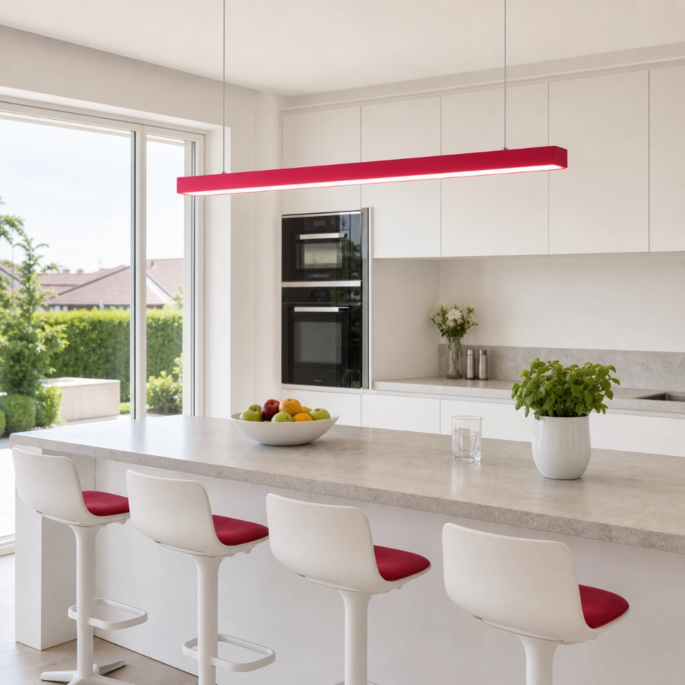
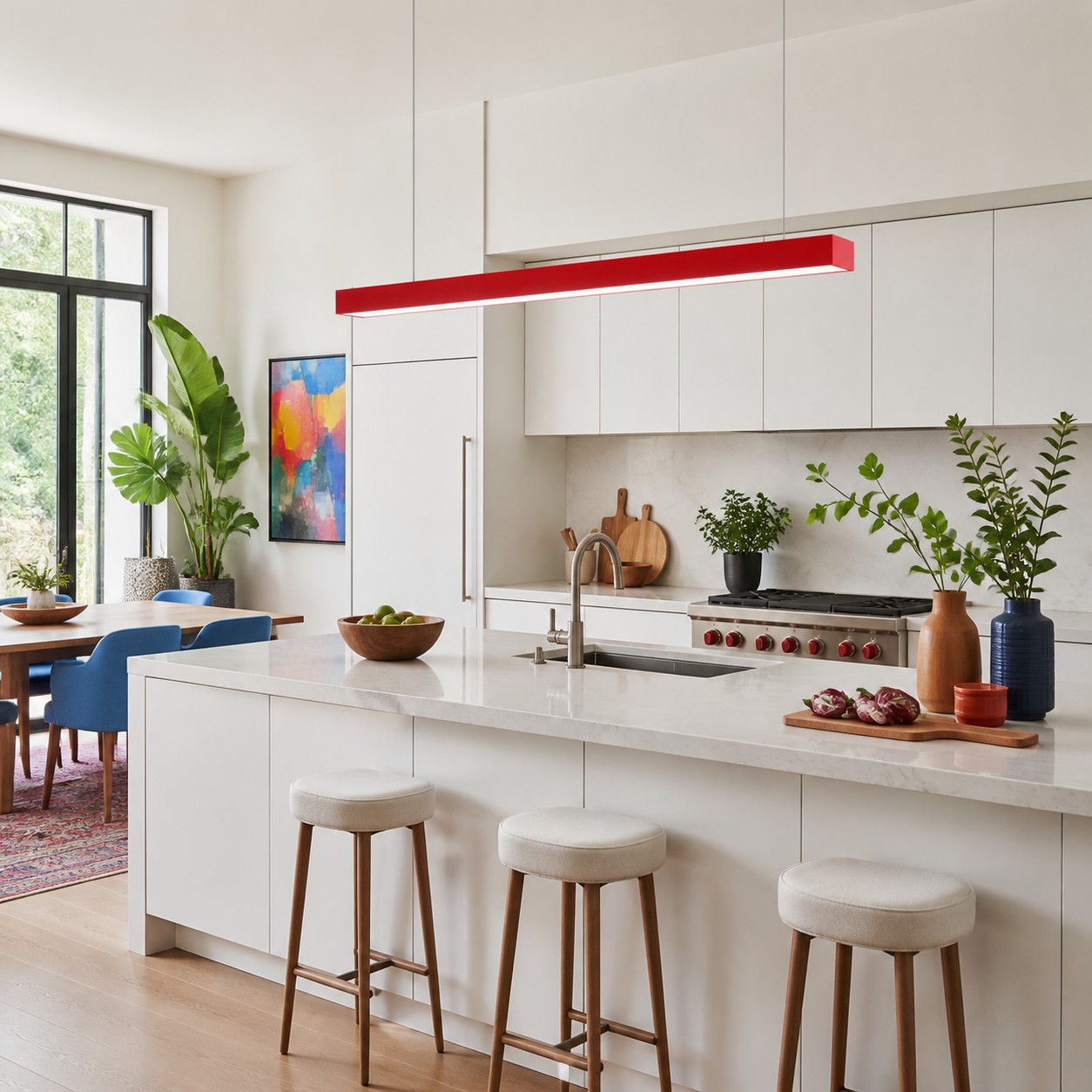
Una cucina bianca spesso risulta anonima perché ogni grande superficie ha lo stesso peso visivo. La soluzione più efficace non è un insieme di accessori colorati, bensì un unico colore ben definito posizionato sopra l'isola, la penisola, il tavolo da colazione o il piano di lavoro indipendente. Una singola lampada a sospensione lineare può creare questo punto focale, a patto che rispetti il piano di lavoro, le linee visive della stanza e l'illuminazione già presente.
Utilizza la regola del colore singolo e dei due echi
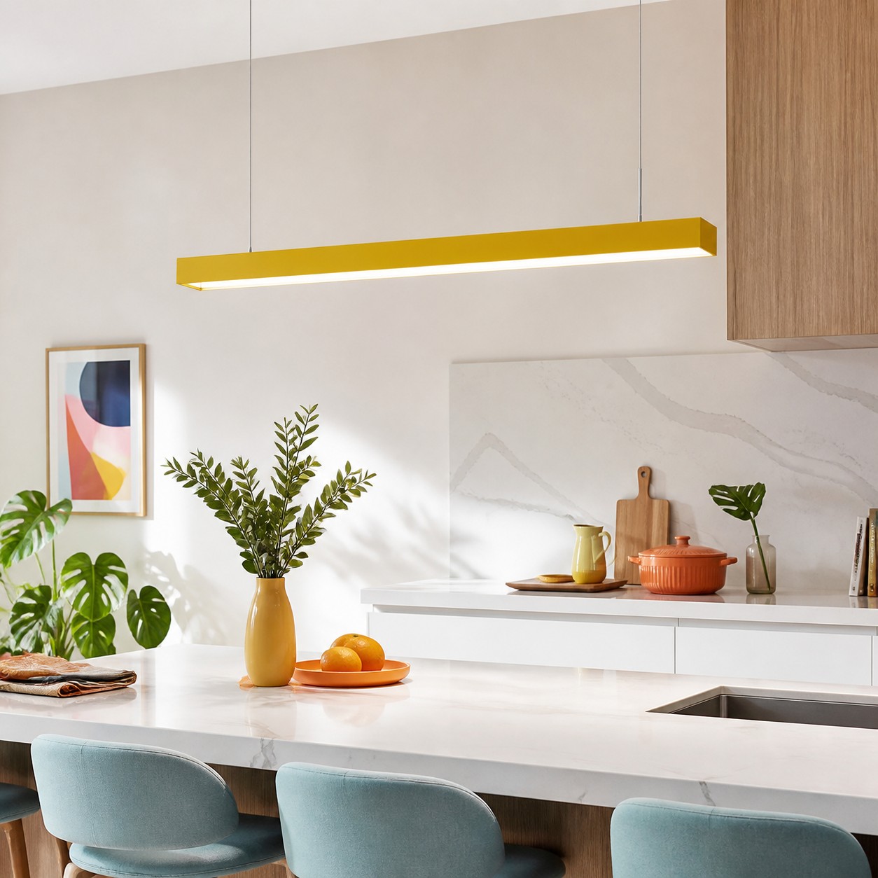
Scegliete un colore per gli elementi d'arredo, poi ripetetelo solo due volte in piccoli dettagli discreti in altri ambienti: magari una stampa incorniciata e un canovaccio, oppure una fruttiera e la cucitura di una sedia. La lampada a sospensione rimane l'elemento principale; le ripetizioni del colore conferiscono un senso di scelta consapevole. Se il colore compare in dieci oggetti diversi tra loro, la cucina inizia ad assumere un tema preciso. Se invece non compare in nessun altro ambiente, potrebbe sembrare casuale.
Si tratta di un test di design, non di una formula universale per l'arredamento. Rimuovi i due elementi ripetuti in una rapida simulazione fotografica. Se la lampada a sospensione si integra comunque con l'ambiente circostante tramite mobili, pavimenti, opere d'arte o uno spazio adiacente, le ripetizioni potrebbero non essere necessarie.
Innanzitutto, decidi qual è la funzione prevista per il ciondolo.
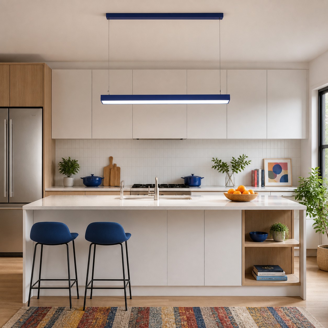
IL La Illuminating Engineering Society definisce l'illuminazione da lavoro come illuminazione diretta su una superficie o area specifica per compiti visivi. Questa distinzione è importante in cucina. Una lampada a sospensione colorata può essere un punto focale, una fonte di luce per svolgere un compito, o entrambe le cose, ma il colore da solo non può dire se il piano di lavoro sarà comodo da usare.
UN Guida all'illuminazione residenziale del Dipartimento dell'Energia degli Stati Uniti Descrive l'illuminazione ambientale, funzionale e d'accento come livelli separati e identifica la preparazione del cibo come un'attività in cucina. Il suo messaggio pratico è utile anche se la guida è datata: non ci si può aspettare che una singola fonte luminosa decorativa svolga tutte le funzioni di illuminazione. Mantenete un'illuminazione sottopensile o di sfondo efficace, e lasciate che la lampada a sospensione organizzi visivamente l'isola o il tavolo.
Se la tua cucina ha già una buona illuminazione funzionale e manca solo di personalità, la lampada a sospensione può funzionare principalmente come elemento decorativo. La definizione IES di illuminazione d'accento Si concentra sull'attirare l'attenzione su un oggetto, una caratteristica della superficie o una parte del campo visivo. In questo caso, l'elemento colorato stesso diventa parte di tale campo.
Scegli il colore in base al contrasto, non in base a un test della personalità.
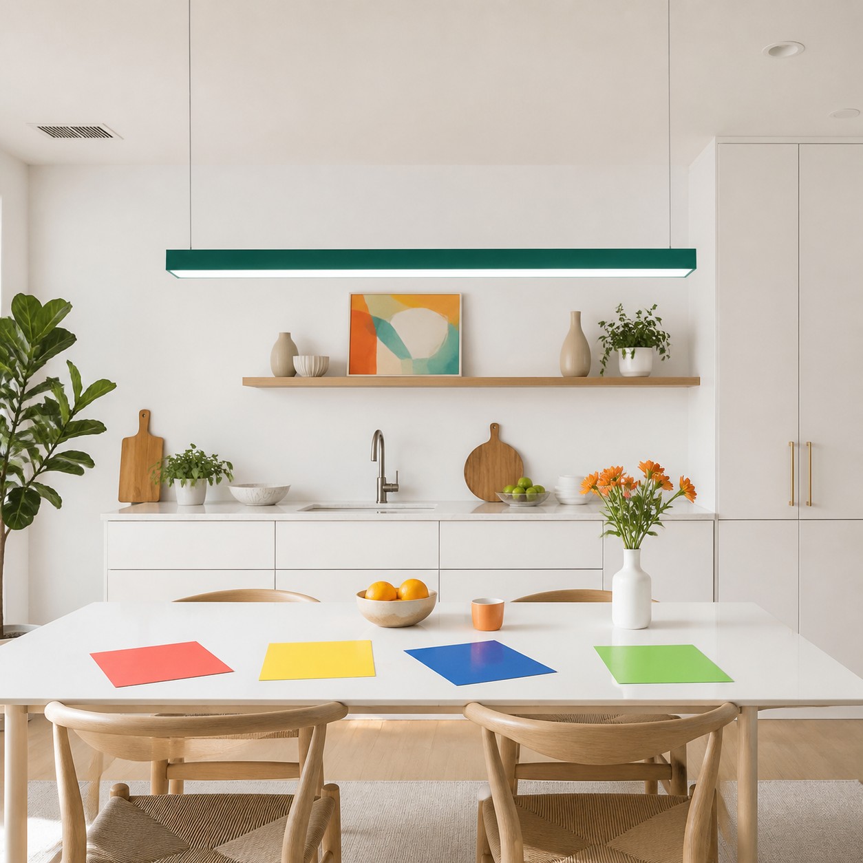
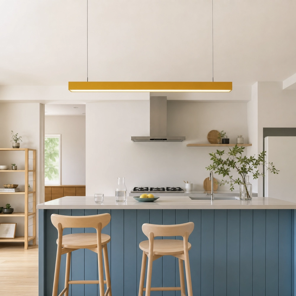
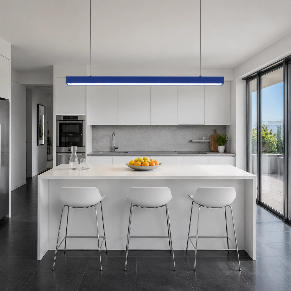
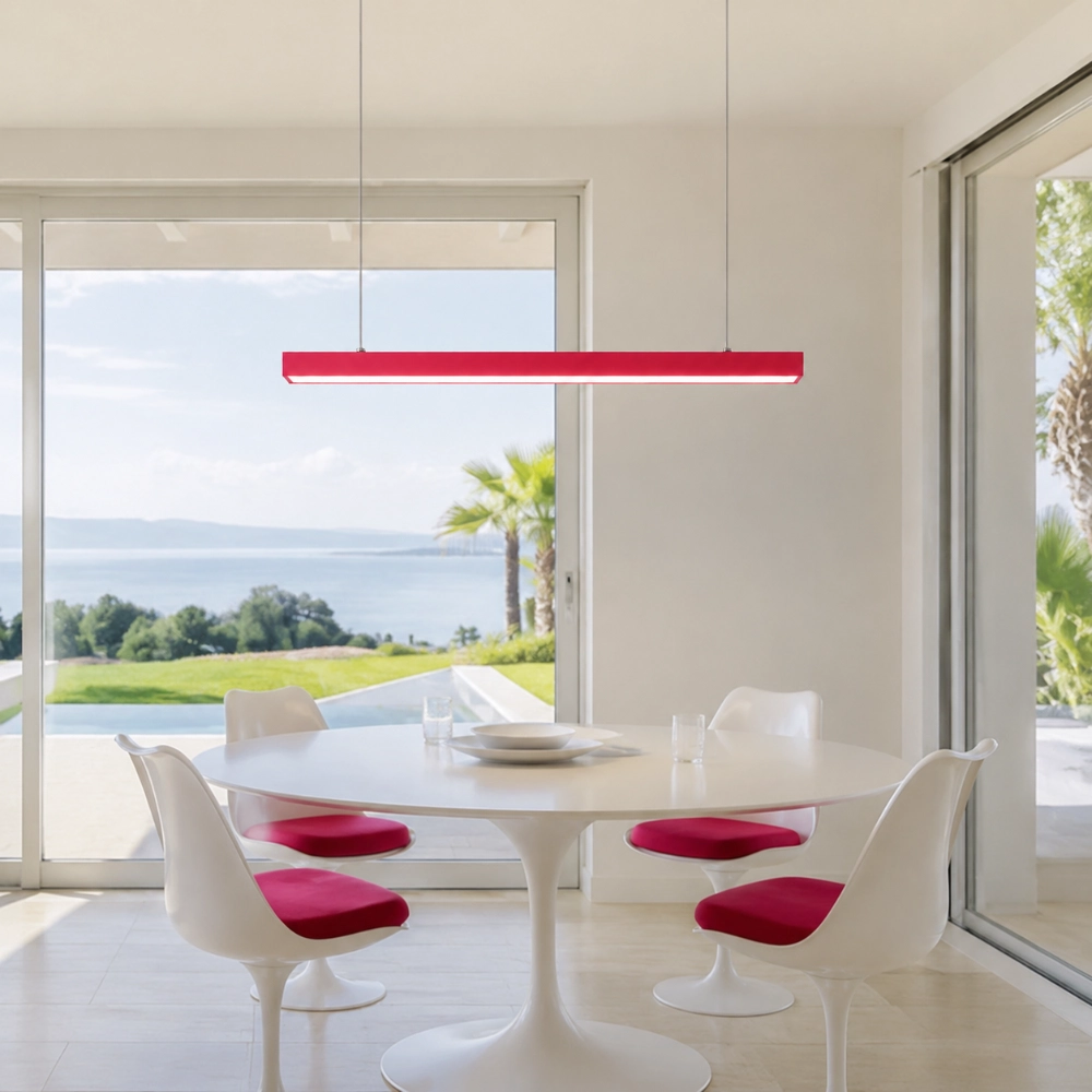
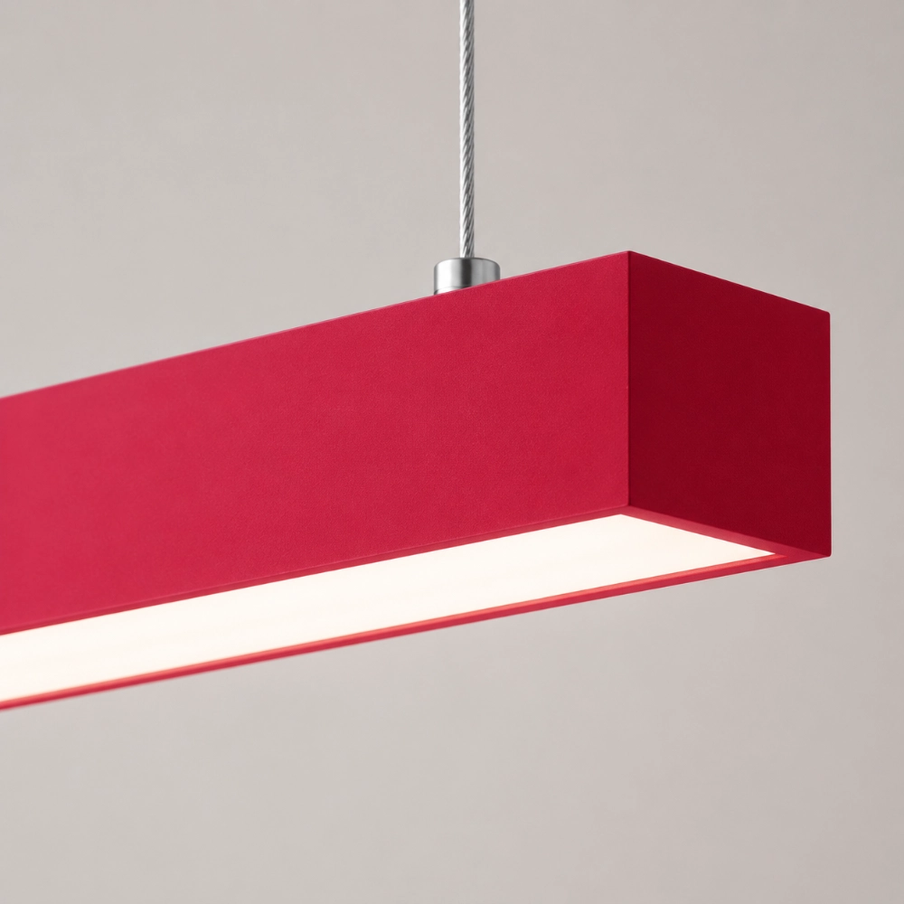
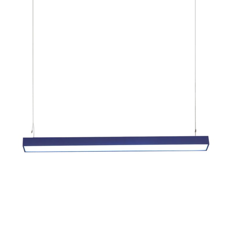
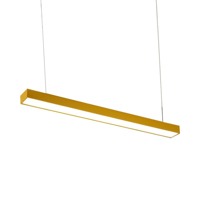
Rosso Crea un contrasto molto netto con il bianco freddo e può reggere il confronto con pietre scure o noce. Giallo Risulta più leggero e si abbina facilmente a legni chiari, color crema o metalli caldi. Blu può valorizzare un abbinamento bianco e acciaio o richiamare opere d'arte e ceramiche di colore blu. Verde Si abbina armoniosamente a legno, piante e a numerose tonalità di pietra naturale.
Si tratta di relazioni visive, non di affermazioni secondo cui un colore cambia l'umore in modo prevedibile. Posiziona una striscia di carta colorata dove verrà appeso l'apparecchio e fotografala dalla porta, dalla posizione di cottura e dalla stanza adiacente. Se disponibile, prova il campione di finitura effettivo; gli schermi e le fotografie di prodotto modificate non garantiscono l'aspetto di una finitura sotto la tua illuminazione. Se desideri che tale decisione rimanga un singolo gesto dall'alto invece di estendersi ad altri accessori, La tendenza dei soffitti colorati per chi odia il disordine sviluppa la stessa idea per altre stanze ordinate.
Dai al lungo bancone un vero e proprio progetto architettonico.
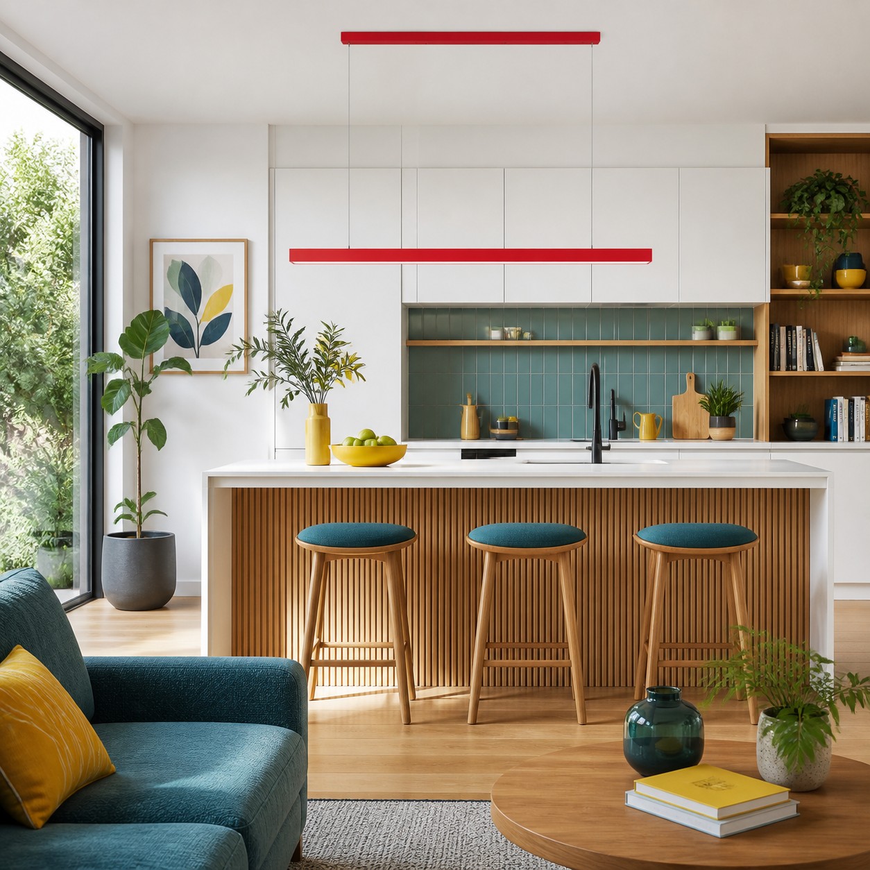
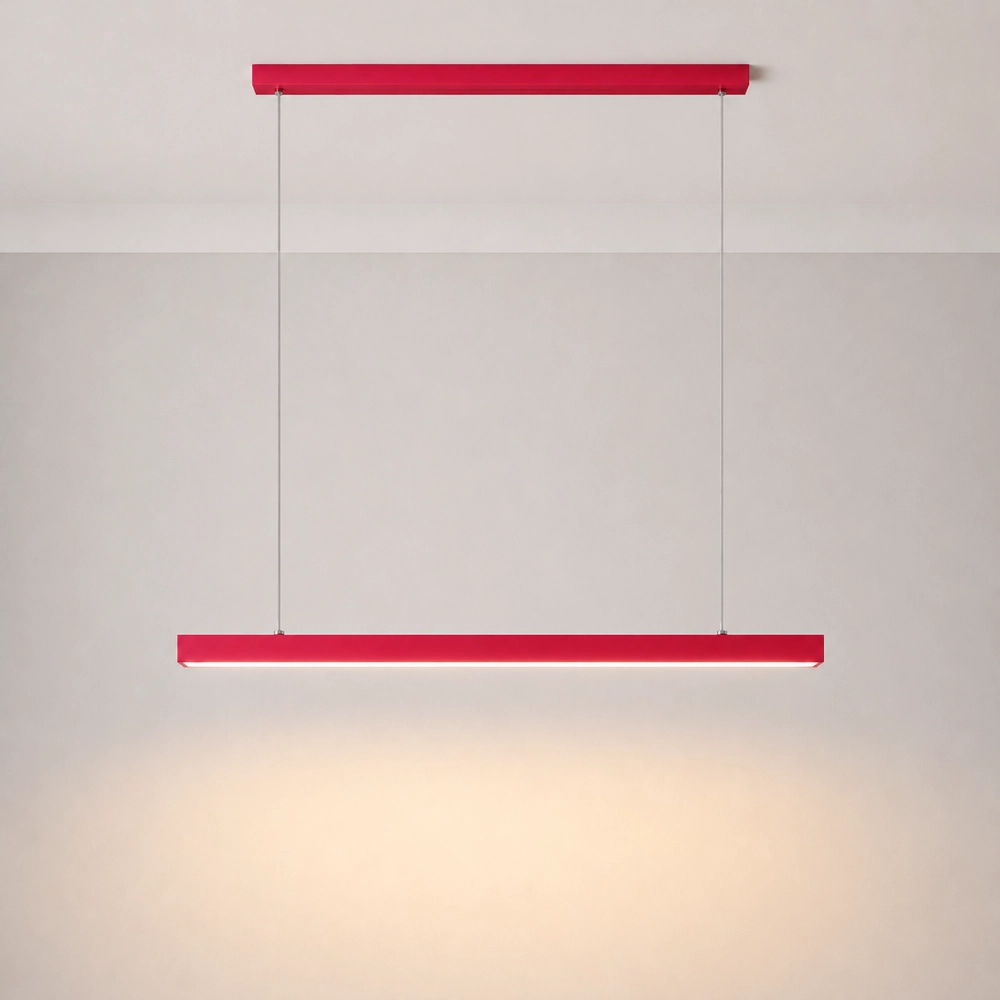
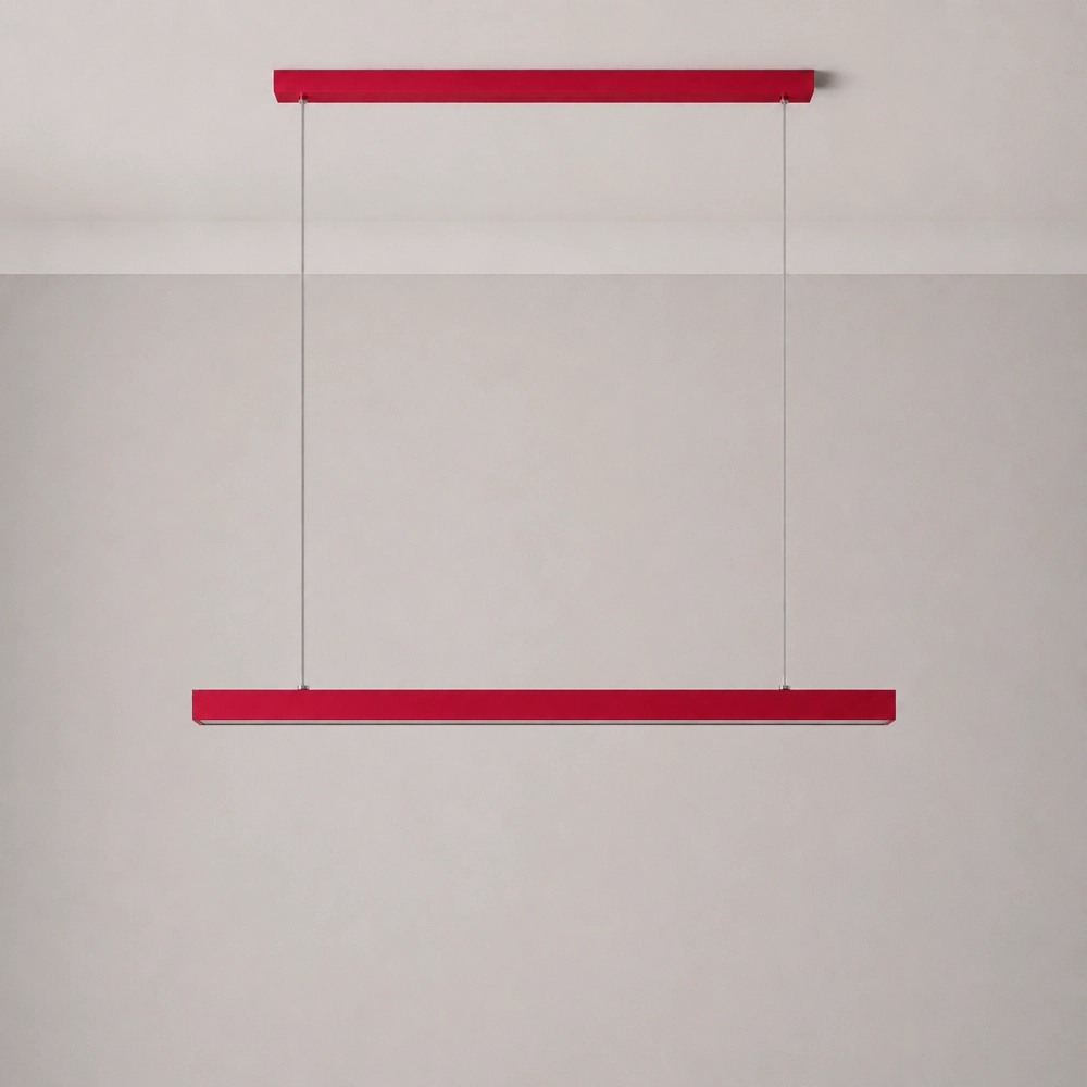
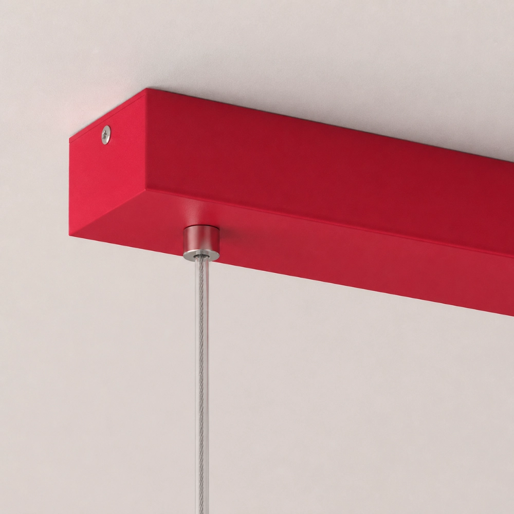
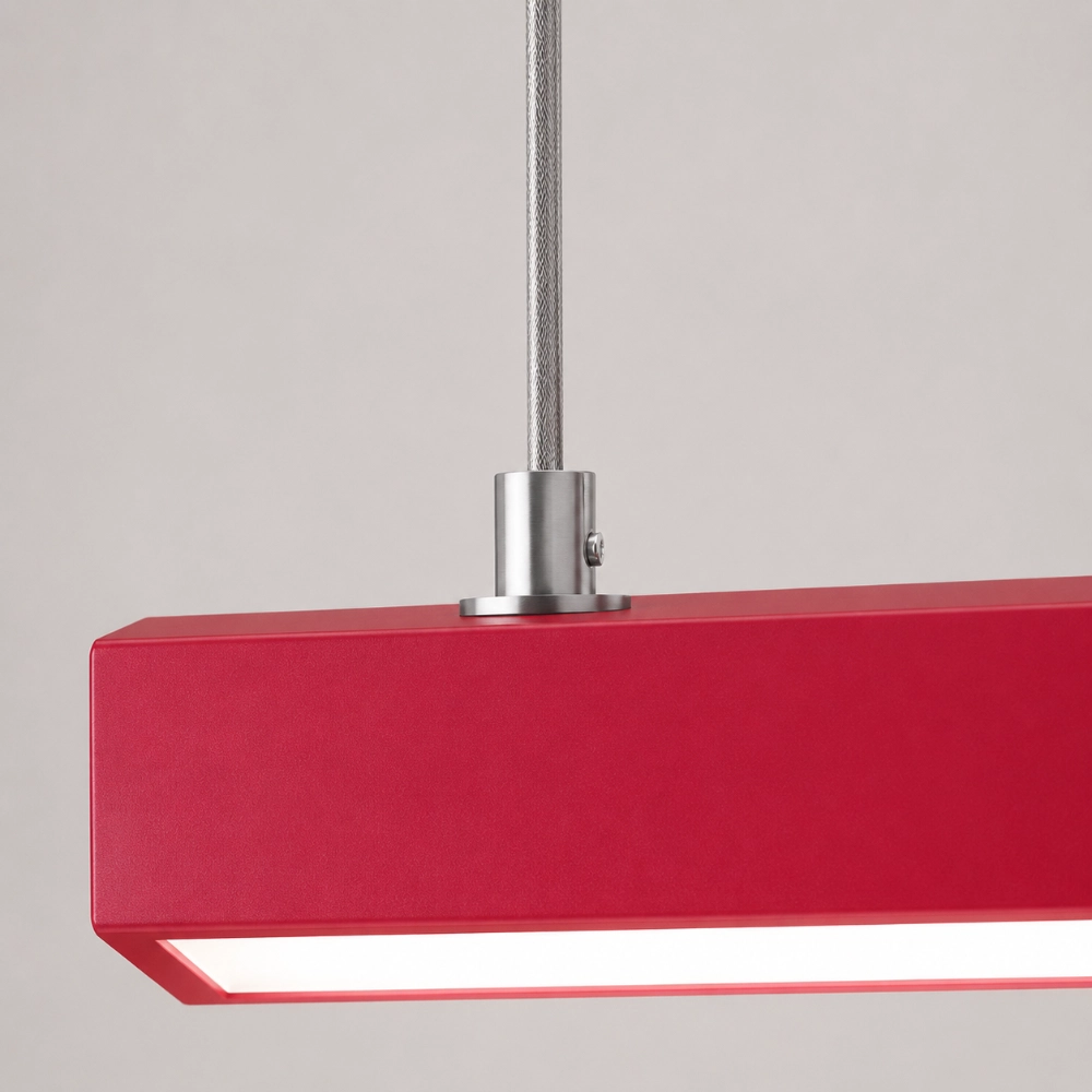
Una lampada a sospensione lineare risulta più convincente quando segue un elemento già allungato: un'isola, una penisola, un tavolo da pranzo o una fila di mobili. Allineate la barra con la zona di lavoro occupata, anziché posizionarla ciecamente al centro della stanza. Verificate l'intero assemblaggio – rosone rettangolare, due cavi di sospensione verticali e barra orizzontale – perché il fissaggio al soffitto influisce sulla composizione tanto quanto il corpo colorato.
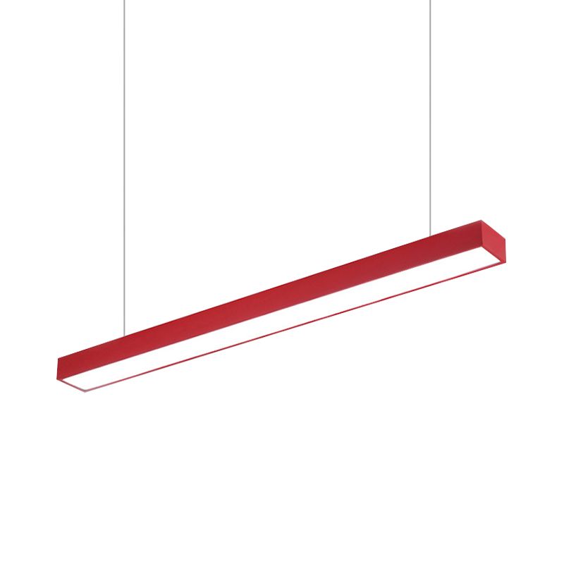
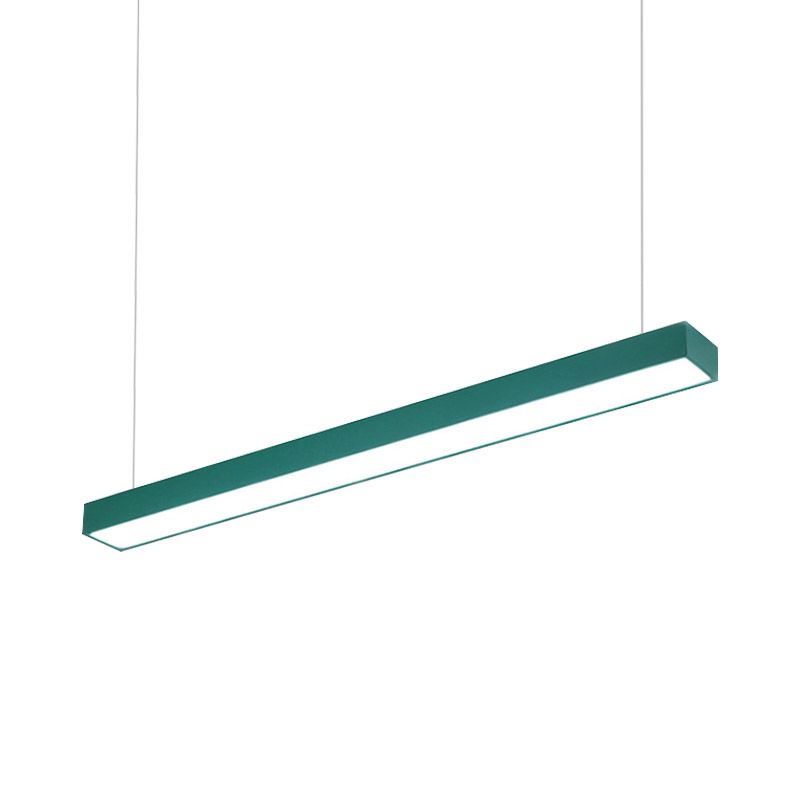
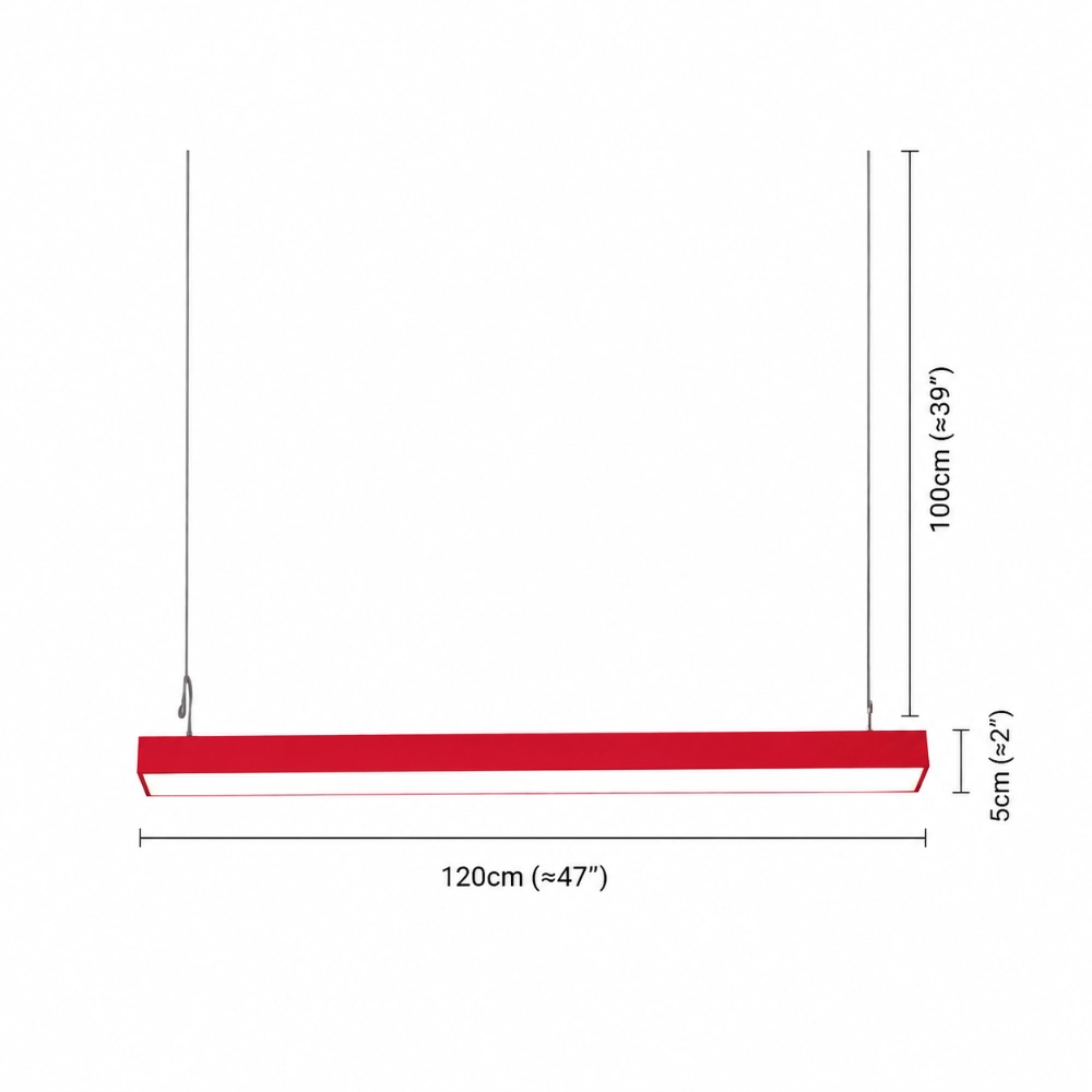
La lampada a sospensione rettangolare lineare minimalista Edge Office è descritta come un apparecchio in metallo di 120 cm x 5 cm con una sorgente LED integrata nella parte inferiore. È a cablaggio fisso, disponibile nei colori rosso, giallo, blu e verde, e offre opzioni di luce calda, luce bianca, luce naturale e cambio colore a tre tonalità. La descrizione non riporta la copertura fotometrica, la potenza, l'indice di resa cromatica (CRI), i valori Kelvin o la gamma di sospensione. Considerate 120 cm come una dimensione fisica verificata, non come una garanzia che illuminerà ogni punto di una superficie lunga.
Quando quel contorno misurato si adatta alla tua cucina, confronta i colori e le impostazioni di illuminazione attuali di Edge con il tuo prototipo.
Scegli questa soluzione quando la stanza ha bisogno di un punto focale, non di una ristrutturazione.
Una lampada a sospensione colorata è particolarmente utile quando i mobili bianchi, i piani di lavoro chiari e le maniglie semplici sono tutti in buone condizioni ma tendono a confondersi visivamente. Funziona anche quando una cucina a pianta aperta necessita di un confine visibile sopra l'isola senza dover aggiungere un'altra mensola, un rivestimento a parete o un insieme di ornamenti.
È meno indicato quando il punto luce sul soffitto non è allineato con il piano di lavoro, quando la lampada a sospensione ostruirebbe la visuale o quando la cucina non dispone di un'illuminazione adeguata e sicura per le attività di lavoro. Risolvete prima questi problemi. Una lampada colorata può rendere più leggibile una planimetria, ma non può correggere un posizionamento elettrico inadeguato né sostituire i calcoli illuminotecnici specifici del progetto.
Cinque modi in cui l'idea può andare storta
- Abbinamento perfetto per ogni accessorio. Mantieni solo uno o due echi in modo che la stanza non diventi un insieme di colori monocromatici.
- Ignorando la vista dalla zona giorno. Testare l'apparecchio dalle stanze adiacenti, non solo da sotto di esso.
- Rimozione della luce di sfondo utile. Mantieni i livelli di attività e di ambiente che funzionano già.
- Scegliere solo attraverso uno schermo. Quando possibile, utilizzare un campione fisico o un prototipo a colori restituibile.
- Misurare solo la barra. Prima dell'installazione, contrassegnare la copertura, entrambi i cavi, le linee di visuale da seduti e la zona di lavoro.
Un modello di cucina realizzabile in dieci minuti
- Tracciare un contorno orizzontale di 120 cm sopra la superficie effettivamente occupata.
- Segna la copertura e due linee di sospensione dritte.
- Aggiungi un colore di carta, poi solo due piccole sfumature di colore.
- Controllalo da ogni porta e da ogni posto a sedere.
- Confermate cosa fornirà l'illuminazione ambientale e quella necessaria per le attività da svolgere sul piano di lavoro.
Prima di considerare il prototipo come finito, L'errore più comune con le lampade a sospensione lunghe non è la dimensione offre un controllo separato per l'asse, la posizione della cappottina e le linee di visuale da seduti. Se il layout rimane calmo e le specifiche note corrispondono al piano, consulta la pagina del prodotto Edge, quindi confermare i dettagli dell'installazione con un installatore locale qualificato.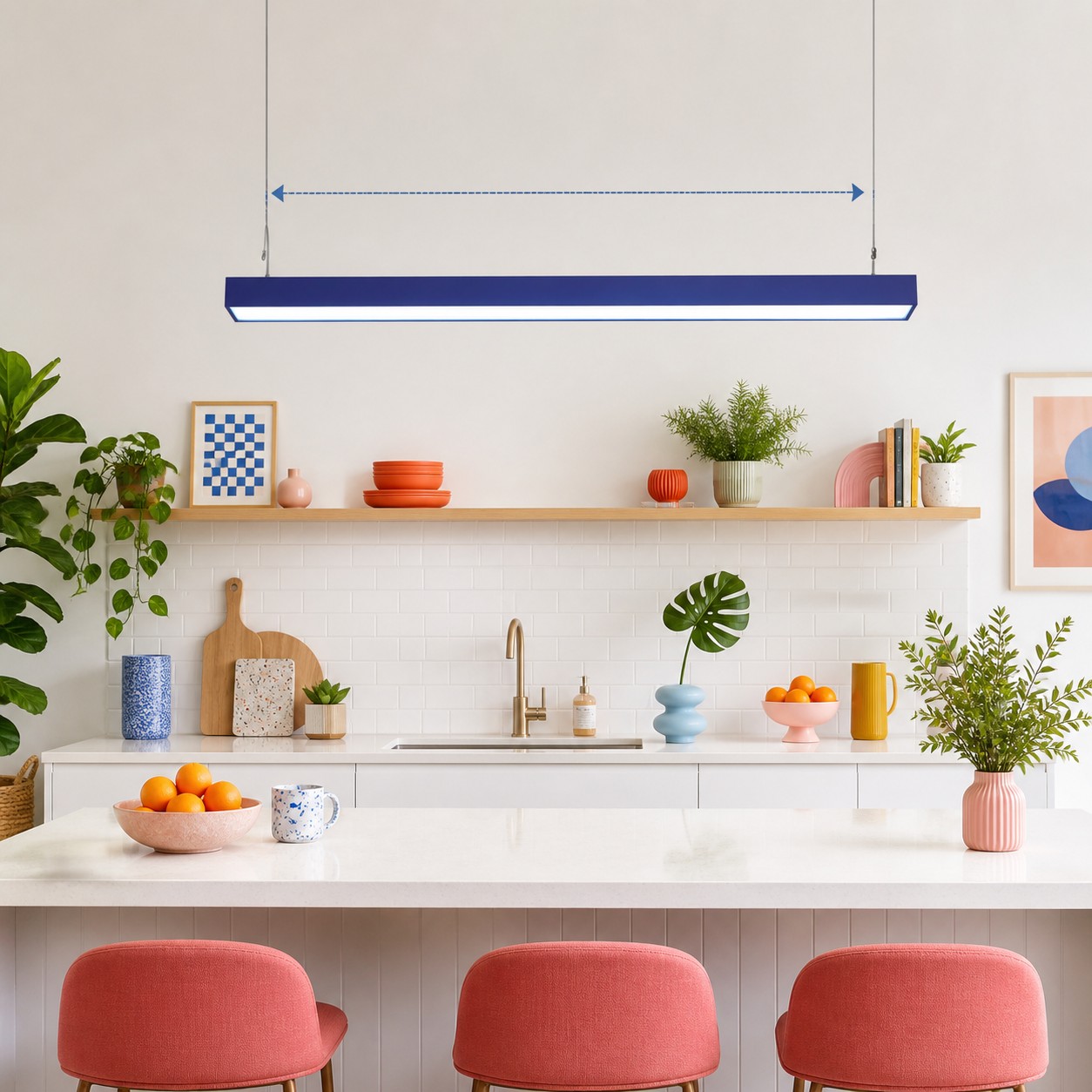
Domande frequenti sull'uso del colore in una cucina bianca
Come posso rendere più colorata una cucina bianca senza ridipingerla?
Utilizzate un elemento decorativo dominante e rimovibile, come ad esempio un ciondolo, e riprendetene il colore una o due volte nei piccoli dettagli.
Qual è il colore migliore per le lampade a sospensione da cucina?
Non esiste una soluzione migliore in assoluto. Provate il rosso, il giallo, il blu o il verde sul pavimento, sul piano di lavoro e osservando la vista dalle stanze adiacenti.
Le lampade a sospensione devono abbinarsi alle maniglie dei mobili?
No. Un contrasto deliberato può funzionare meglio; l'apparecchio deve solo avere una chiara relazione con la gamma cromatica più ampia.
È sufficiente una lampada a sospensione per illuminare tutta la cucina?
Non date nulla per scontato. Le cucine in genere necessitano di illuminazione ambientale e di illuminazione specifica per le attività svolte, e per effettuare previsioni accurate sono necessari dati fotometrici specifici per il prodotto.
Un ciondolo lungo può sostituire diversi ciondoli piccoli?
Può creare una linea più uniforme, ma è necessario verificare l'allineamento, le linee di visuale e la copertura utile della superficie effettiva.