
¿Buscando luz natural? El truco de la Bauhaus en tonos pastel para combatir el síndrome de las habitaciones lúgubres.
En cada casa hay una habitación así. Puede que dé al norte, que la valla del vecino la bloquee o que tenga ventanas pequeñas. Por mucha luz que haya fuera, esta habitación parece estar siempre atrapada en una tarde gris y nublada. Los interioristas lo llaman el "Síndrome de la Habitación Sombría", y aunque el instinto nos lleva a pintar todo de blanco impoluto o a llenar el espacio de bombillas de luz fría y brillante, estas soluciones suelen ser contraproducentes. En lugar de un santuario acogedor, acabamos con un espacio apagado, frío y completamente inhóspito.
¿Qué es el síndrome de la habitación lúgubre en la arquitectura moderna?
El síndrome de la habitación lúgubre describe un espacio interior con una distribución deficiente de la luz natural, lo que provoca baja energía emocional y fatiga visual en sus ocupantes. Generalmente se debe a limitaciones arquitectónicas, como pozos de luz profundos o sombreado estructural excesivo. Para solucionarlo, se requieren luminarias que no solo proyecten la luz hacia abajo, sino que también la reflejen activamente sobre superficies horizontales, imitando el comportamiento de las nubes de luz natural.
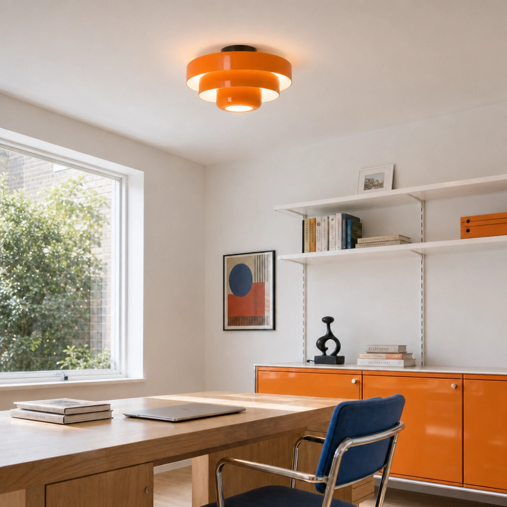
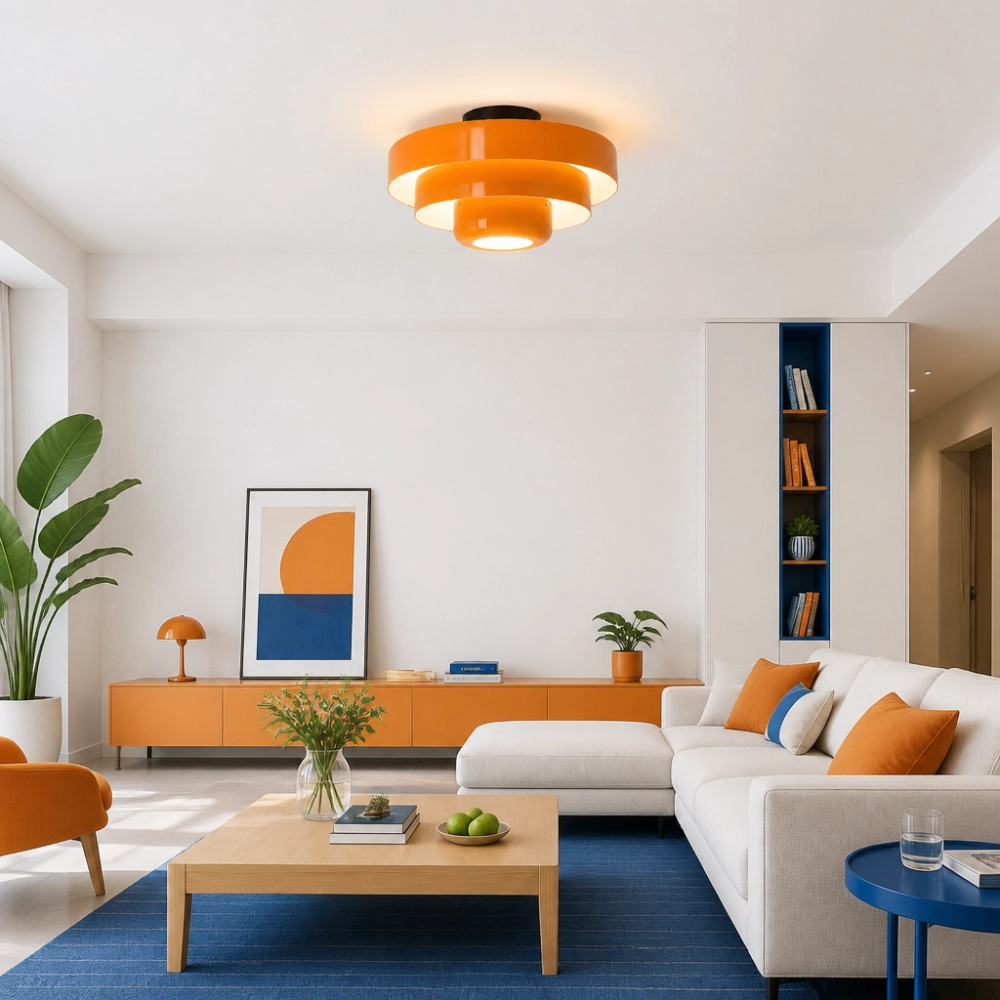
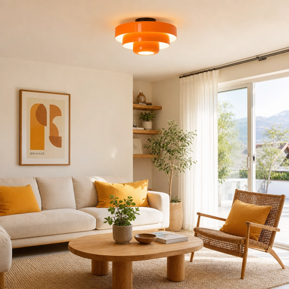
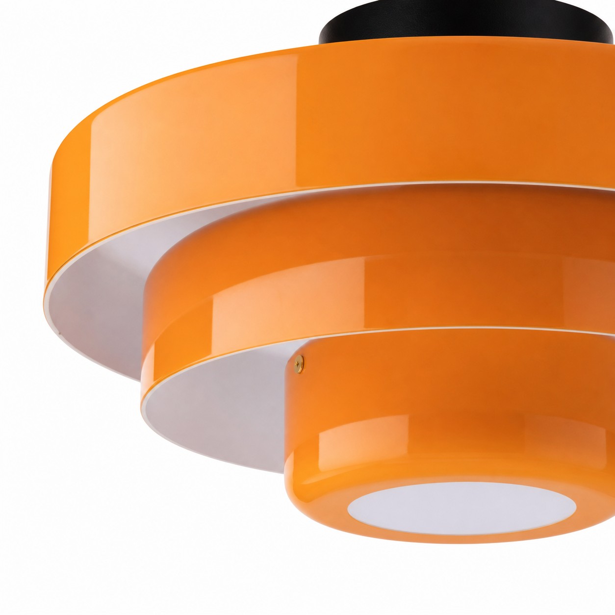
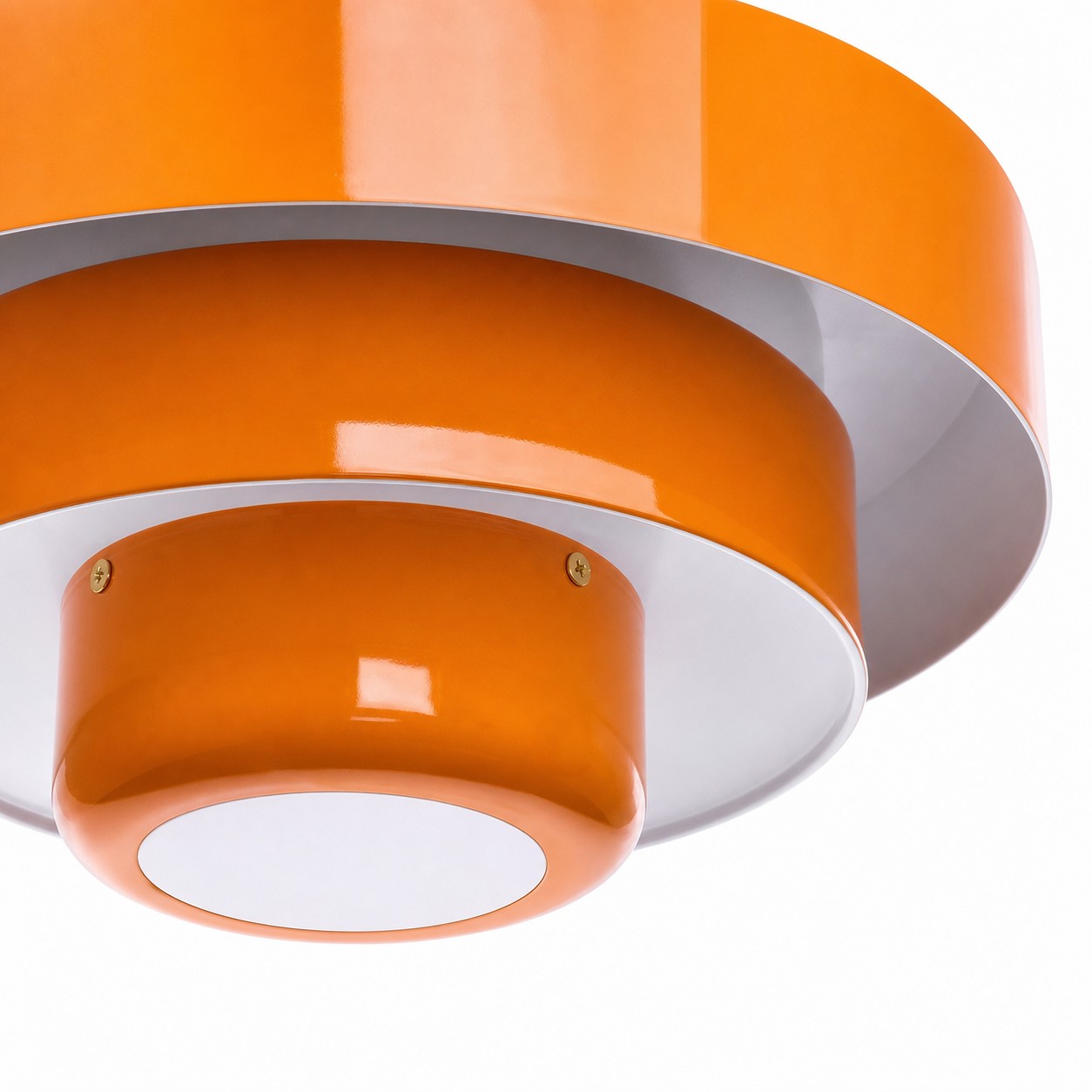
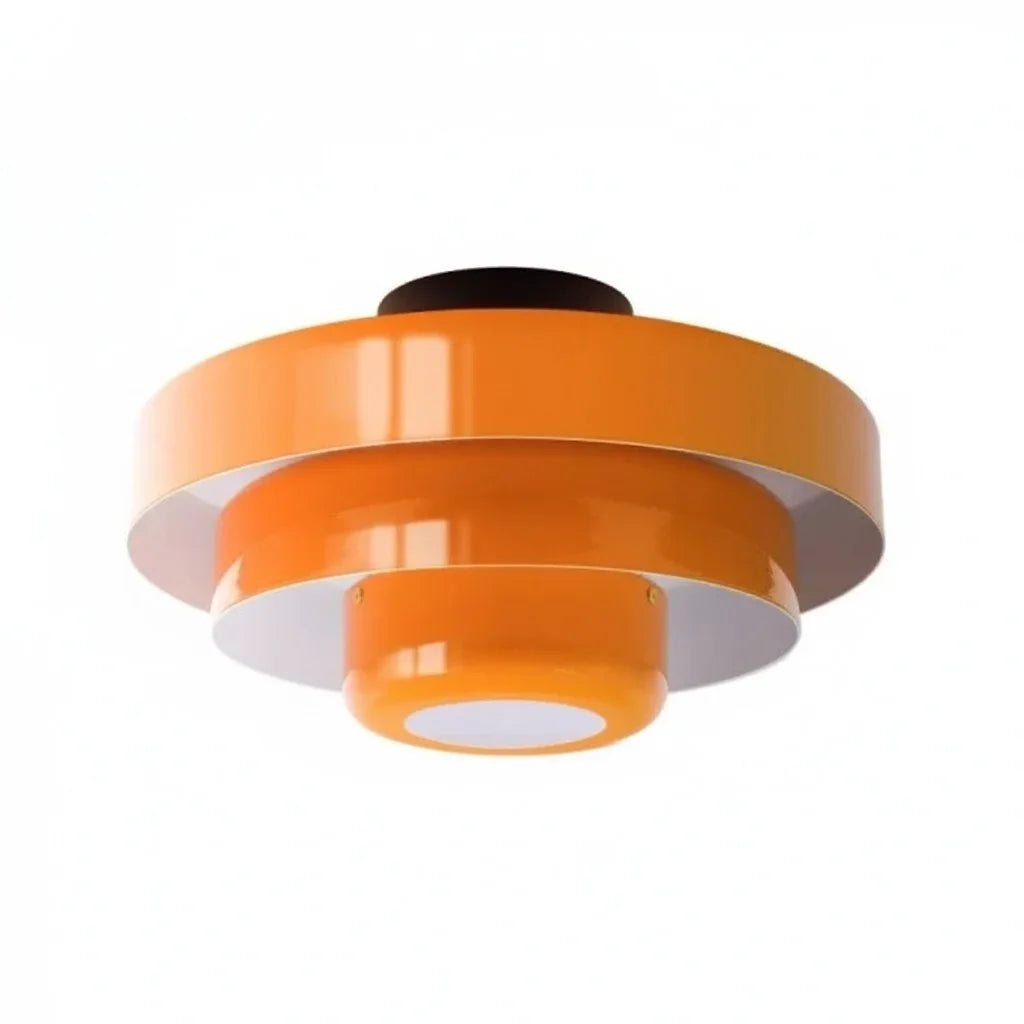
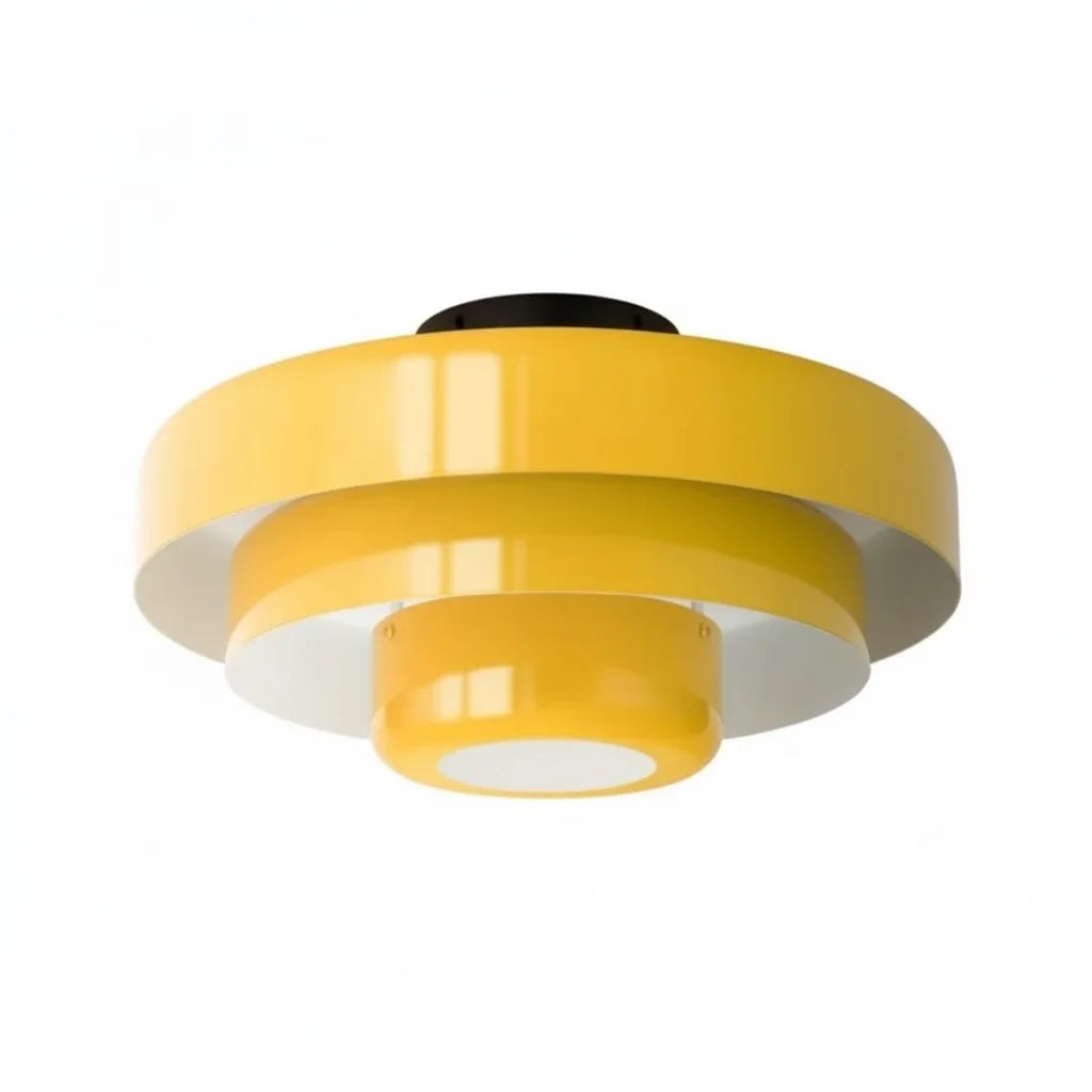
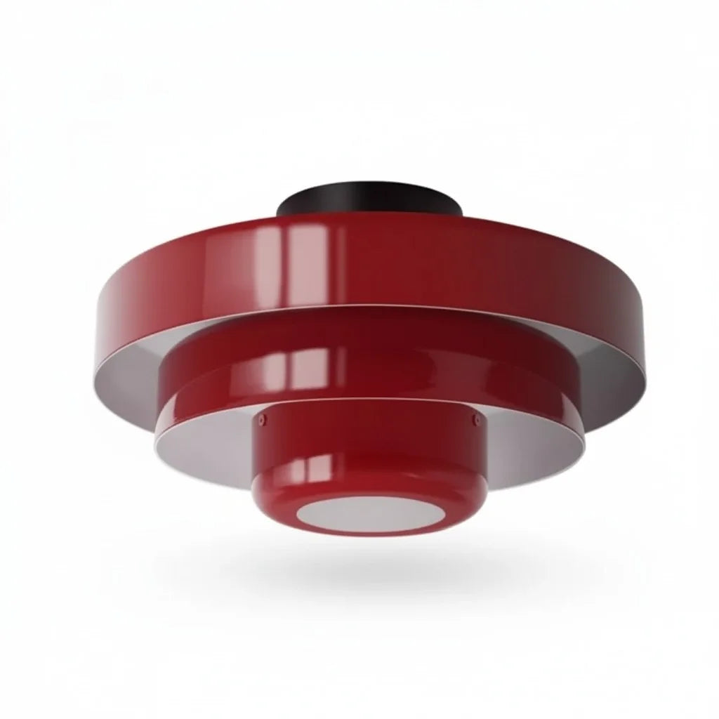
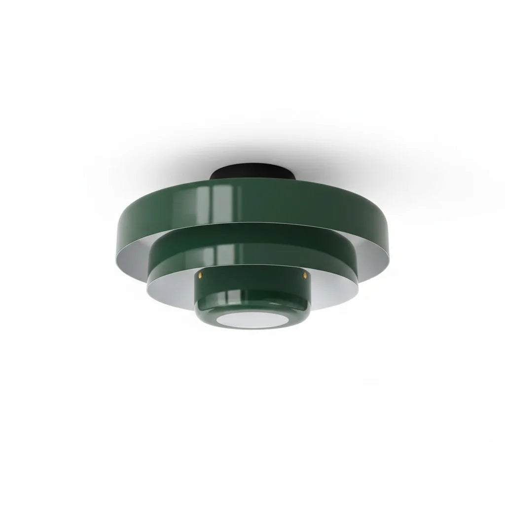
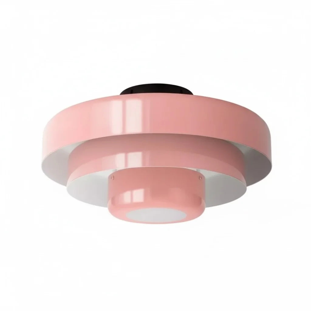
Para curar una habitación oscura, es necesario comprender cómo interactúa la luz con el color y la forma. La solución reside en una filosofía de diseño desarrollada hace más de un siglo: la Bauhaus. Al combinar la geometría funcional con la teoría del color calculada, Lámpara de techo redonda de tres niveles con diseño de macaron de Kael Bauhaus Proporciona el antídoto perfecto para interiores oscuros. Utiliza su diseño multicapa para dispersar la luz de manera uniforme, mientras que sus acabados mate especializados elevan el peso visual de toda la habitación, ilustrando bellamente La psicología de la iluminación: cómo afecta a tu estado de ánimo en casa. Transformando un espacio oscuro y estancado en un entorno estimulante y sereno.
La ciencia de la difusión de los tonos pastel: por qué importan los acabados mate
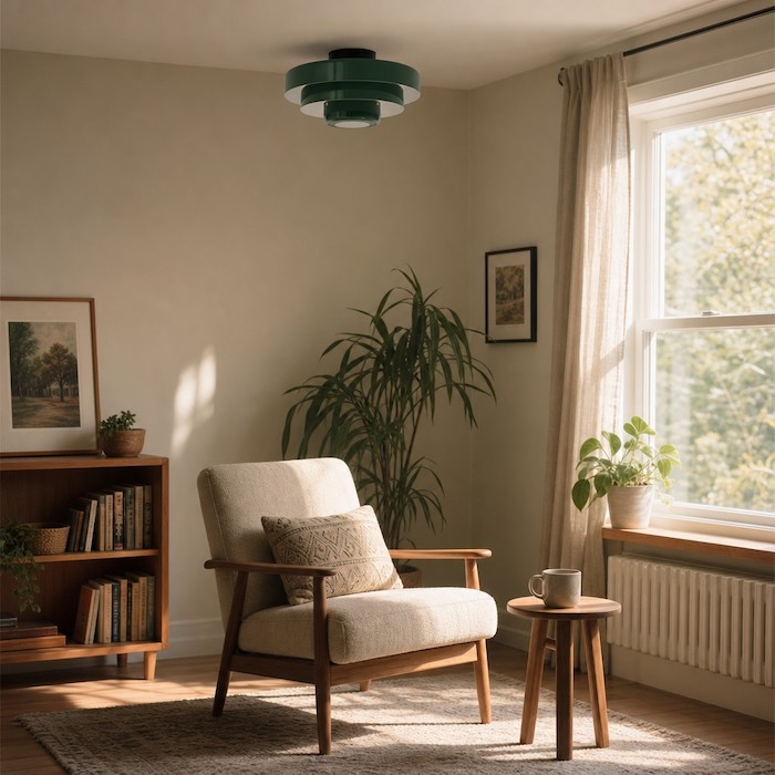
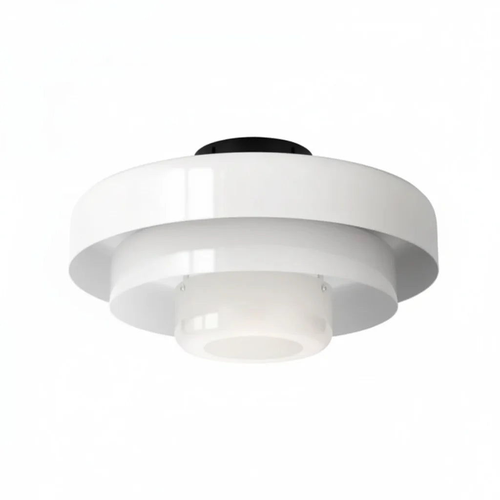
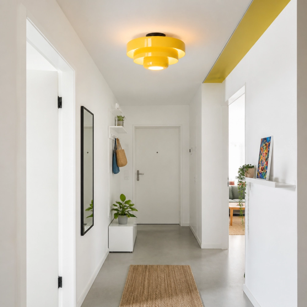
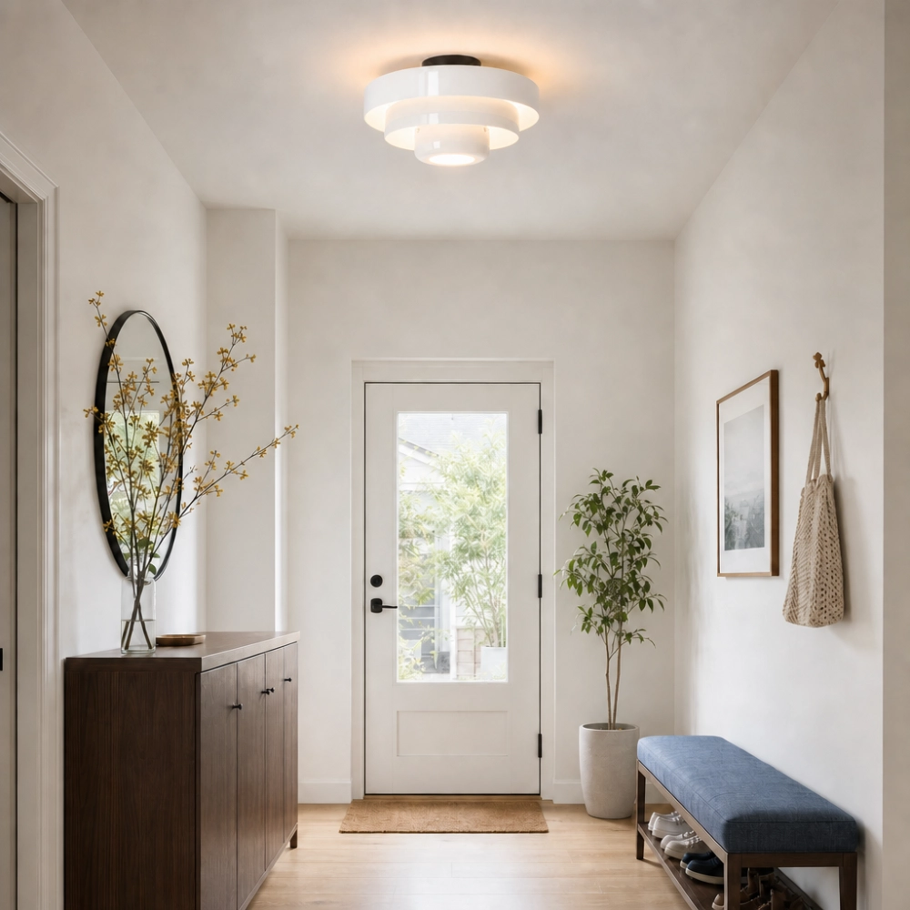
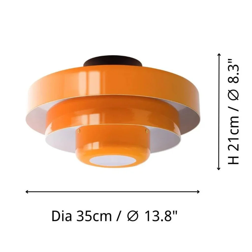
Cuando se trata de un espacio naturalmente oscuro, las superficies brillantes o los colores intensos y saturados son tus peores enemigos. Las superficies brillantes crean reflejos intensos y puntuales que resaltan la oscuridad circundante, haciendo que las sombras parezcan aún más profundas. Los colores oscuros simplemente absorben la poca luz disponible. La lámpara Kael soluciona este problema ofreciendo tonos pastel cuidadosamente seleccionados: rosa suave, verde y crema/naranja, además de las opciones clásicas en blanco.
Pregunta: ¿Por qué los tonos pastel mejoran la luminosidad de las habitaciones con poca luz?
Los colores pastel tienen un alto valor de reflectancia lumínica (VRL), lo que significa que reflejan un porcentaje considerable de la luz que incide sobre ellos. Sin embargo, a diferencia del blanco puro brillante, que puede verse frío y gris en ambientes con poca luz, los tonos pastel suaves como el verde menta o el crema aportan una calidez simulada. Este matiz sutil engaña a la vista, haciéndole percibir un ambiente soleado y natural al aire libre, incluso cuando el cielo está completamente nublado.
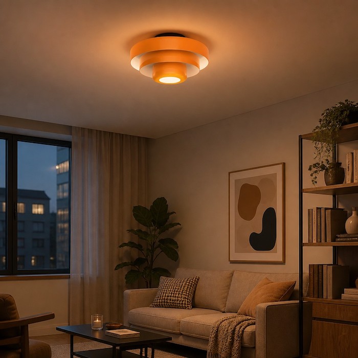
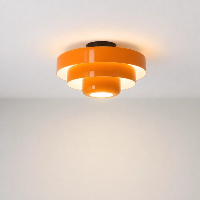
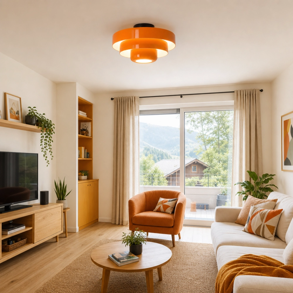
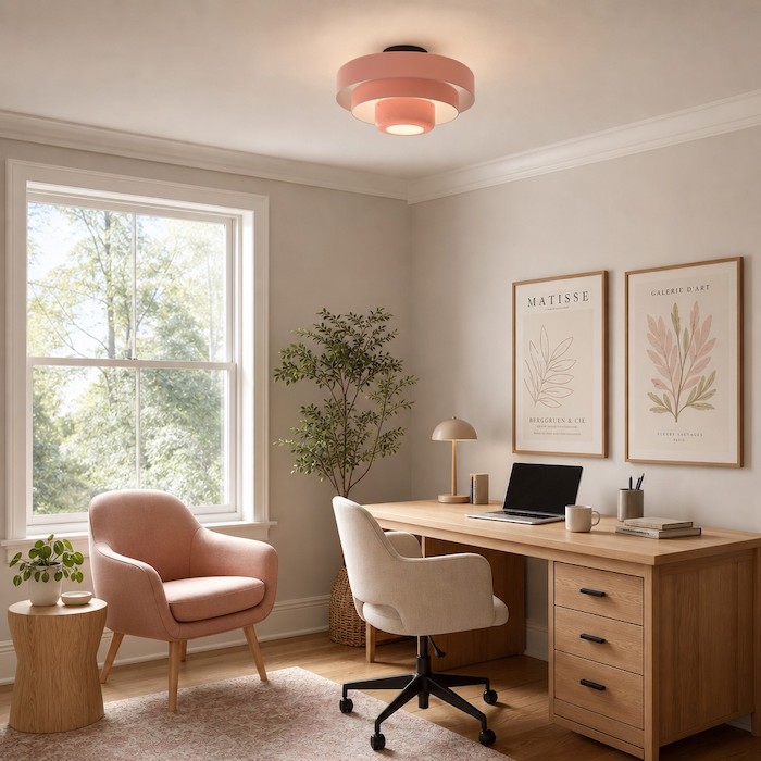
Al instalar la variante rosa suave o crema/naranja de la Lámpara de techo Kael Bauhaus, aportas un toque permanente de mañana primaveral al espacio. La textura mate de estas pantallas inspiradas en macarons asegura que la luz se difunda suavemente por toda la habitación. No hay puntos brillantes intensos, solo una iluminación suave y continua que suaviza las esquinas duras y elimina el ambiente pesado asociado con las habitaciones llenas de sombras, ofreciendo un ejemplo perfecto de ¿Cómo puede la iluminación realzar la estética y el estilo general del hogar? Al convertir la iluminación funcional en una declaración artística.
Sustituyendo el efecto de foco por iluminación volumétrica
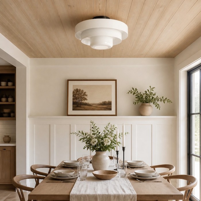
La mayoría de las lámparas de techo convencionales funcionan como focos; proyectan la luz directamente hacia el suelo, dejando las esquinas superiores de las paredes y el techo completamente a oscuras. Este fuerte contraste hace que una habitación parezca pequeña y claustrofóbica. La estructura multinivel de la lámpara Kael rompe por completo con este patrón. A medida que la luz atraviesa las capas concéntricas, se expande hacia afuera, creando círculos de luz superpuestos que recorren el techo.
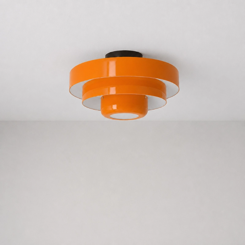
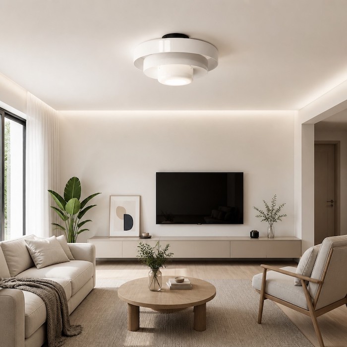
Este enfoque volumétrico es un sello distintivo de los movimientos de diseño moderno americano y nuevo nórdico. Enfatiza cómo se ve y funciona un objeto a lo largo del día. Incluso cuando se apaga durante la tarde, la alegre geometría del Lámpara de techo redonda tipo macaron de Kael Bauhaus Añade interés arquitectónico a un techo blanco liso. Rompe con la monotonía de la superficie plana y sin inspiración del pladur, funcionando como un elemento escultórico que capta la poca luz natural que entra por la ventana.
En definitiva, transformar un espacio sombrío no se trata de usar la mayor potencia posible, sino de elegir una luminaria que conciba la iluminación como una experiencia ambiental. Al combinar tonos pastel con una estructura abierta y escalonada, se crea una sensación de amplitud. La habitación deja de sentirse como una caja cerrada y se convierte en un refugio luminoso y diáfano donde uno realmente desea pasar las mañanas.