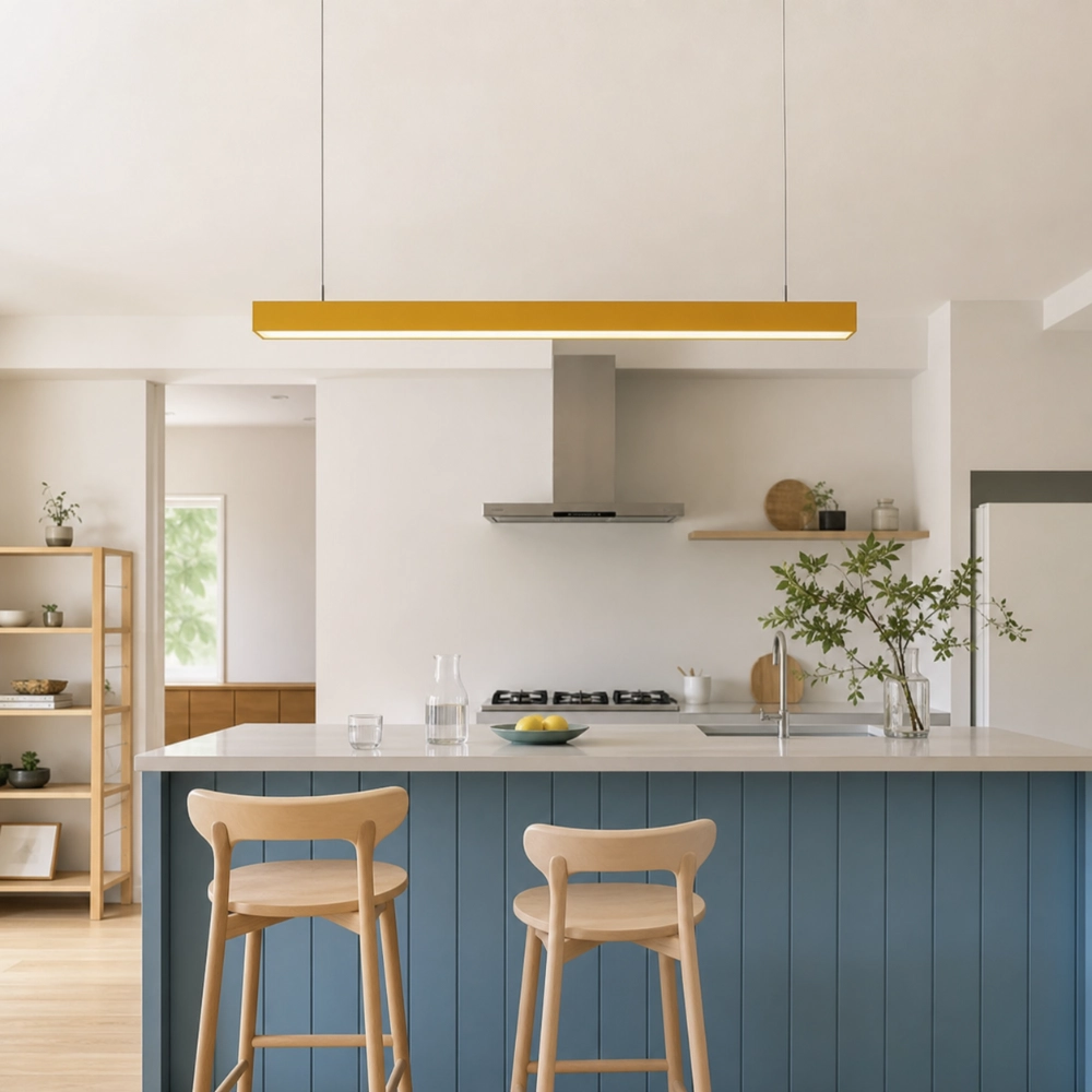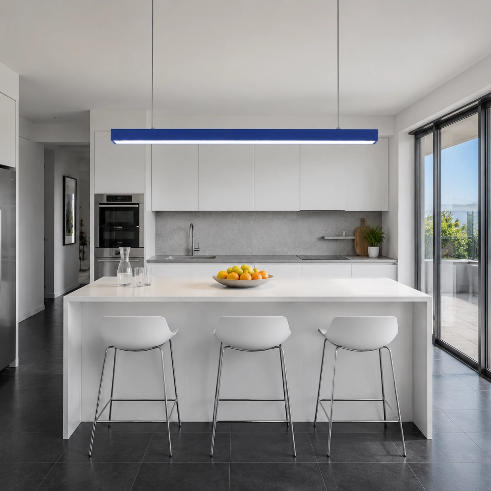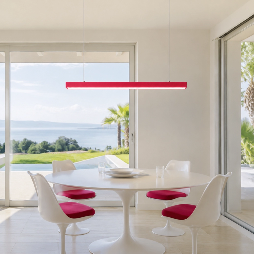

The Color Is Fine. The Room Just Has Not Introduced It Properly.
A bright pendant can become the easy suspect in a room that feels “off.” Before you exile the color, run a better investigation. Most design accidents leave fingerprints: a bad axis, timid scale, conflicting undertones, a lonely lighting layer, or one accessory too many.
Random Is Usually a Relationship Problem
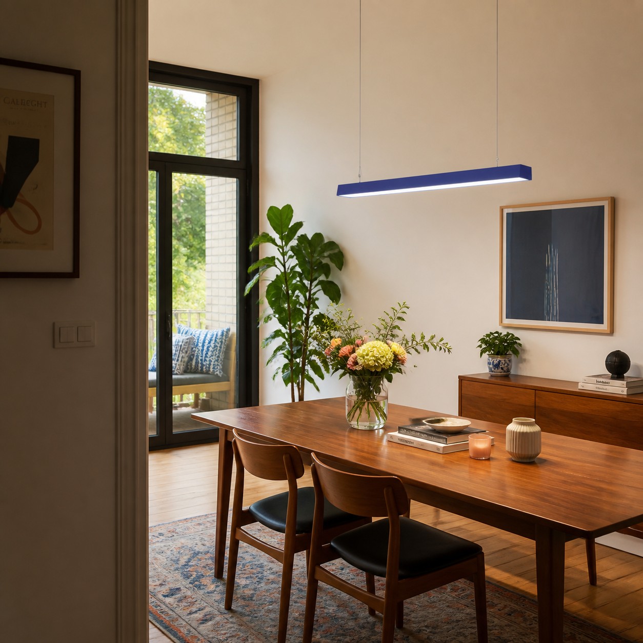
People often blame the boldest object first. The pendant is green, the room feels off, therefore green must be the mistake. But color is only one variable. A fixture can look random because it is centered on the room instead of the table, too short for the occupied surface, visually crowded by cabinet lines, or unsupported by any nearby material relationship.
Do not return it yet. Photograph the room from the main entrance, convert the photo to grayscale, and cover the fixture with your thumb. If the composition still feels unsettled, the color did not create the problem. Start with placement and proportion, then compare the current Edge dimensions and assembly with a full-size mock-up.
Check Whether the Room Needed a Focal Point
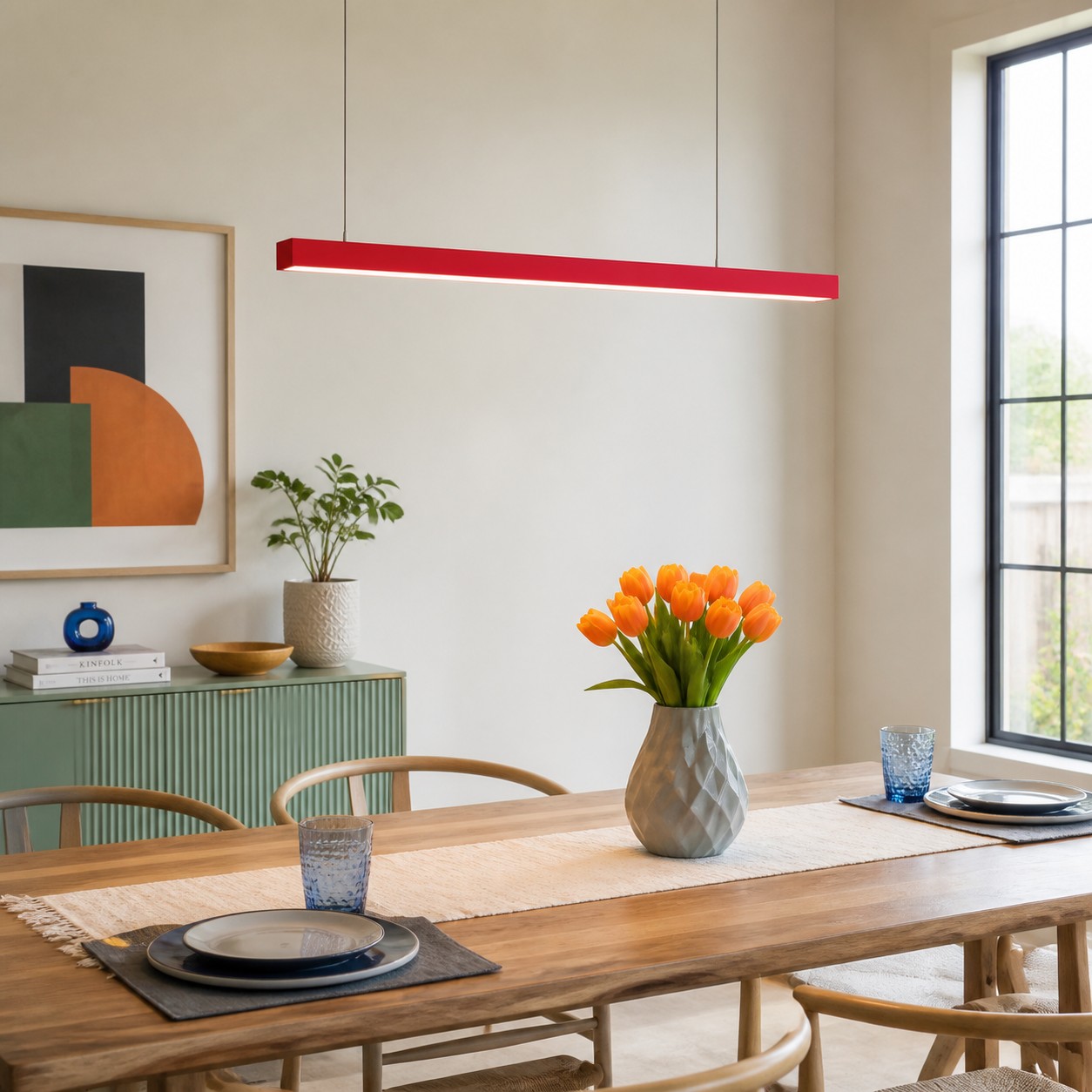
A colored pendant works best when the room has a clear place for emphasis. A Colorful Linear Pendant Light Is the Easiest Way to Wake Up a Plain Room explains how to choose that place from the surface and fixed materials you already own. The diagnosis here begins one step later: did the fixture land over the thing you actually use and notice?
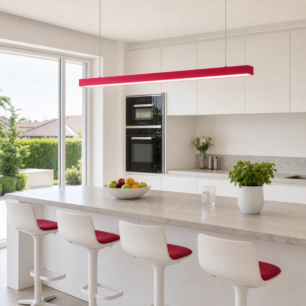
Mark the occupied part of the table or island—not just its outer rectangle. Stools may cluster at one end; a sink may split the counter; a walkway may make the geometric center feel irrelevant. Align the long bar with the lived zone. A half-foot shift in the mock-up can matter more than changing blue to red.
Scale Is the Silent Accomplice
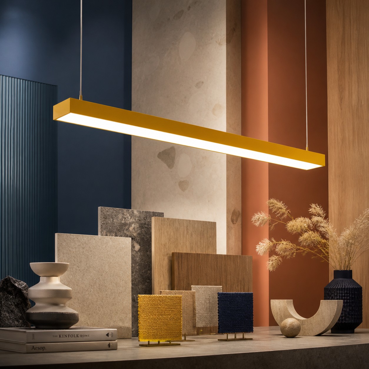
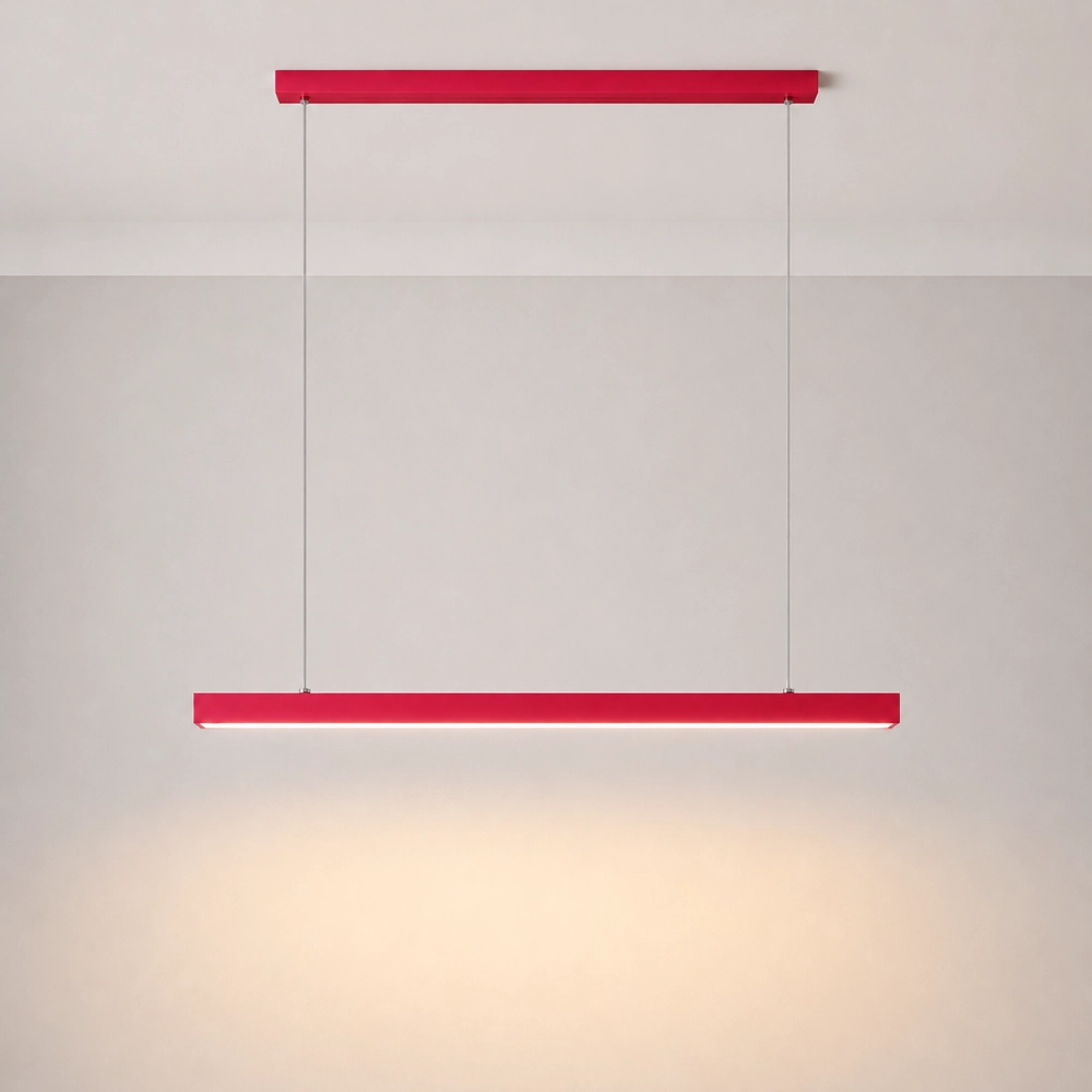
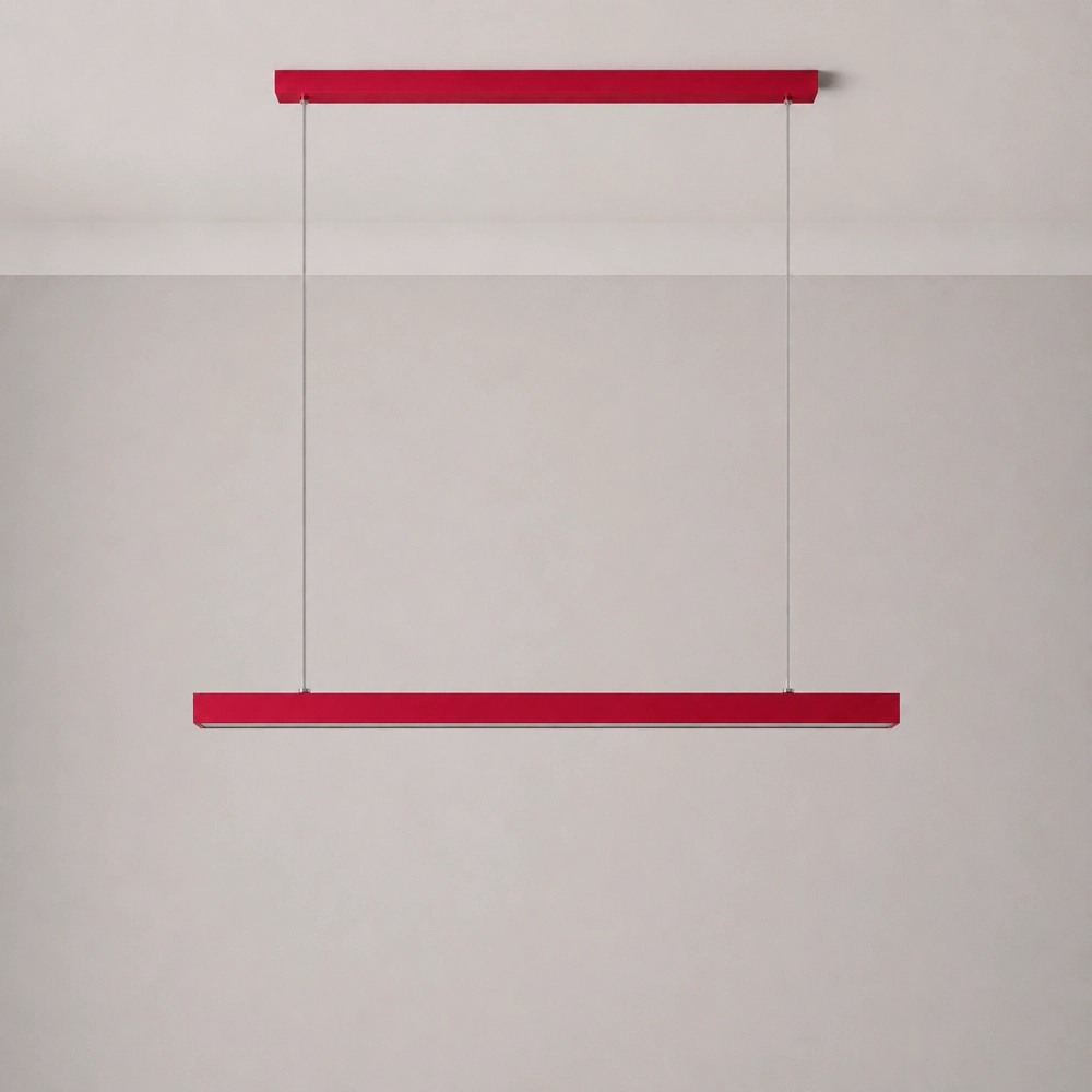
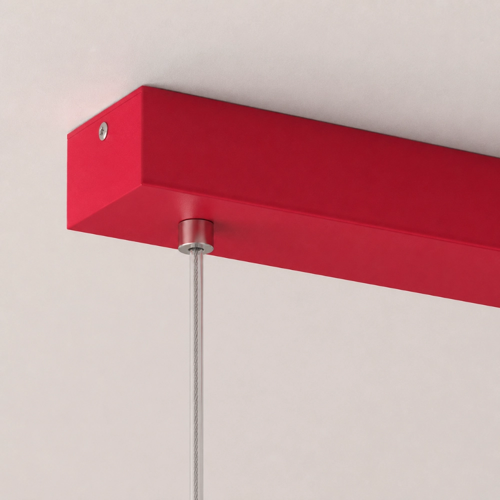
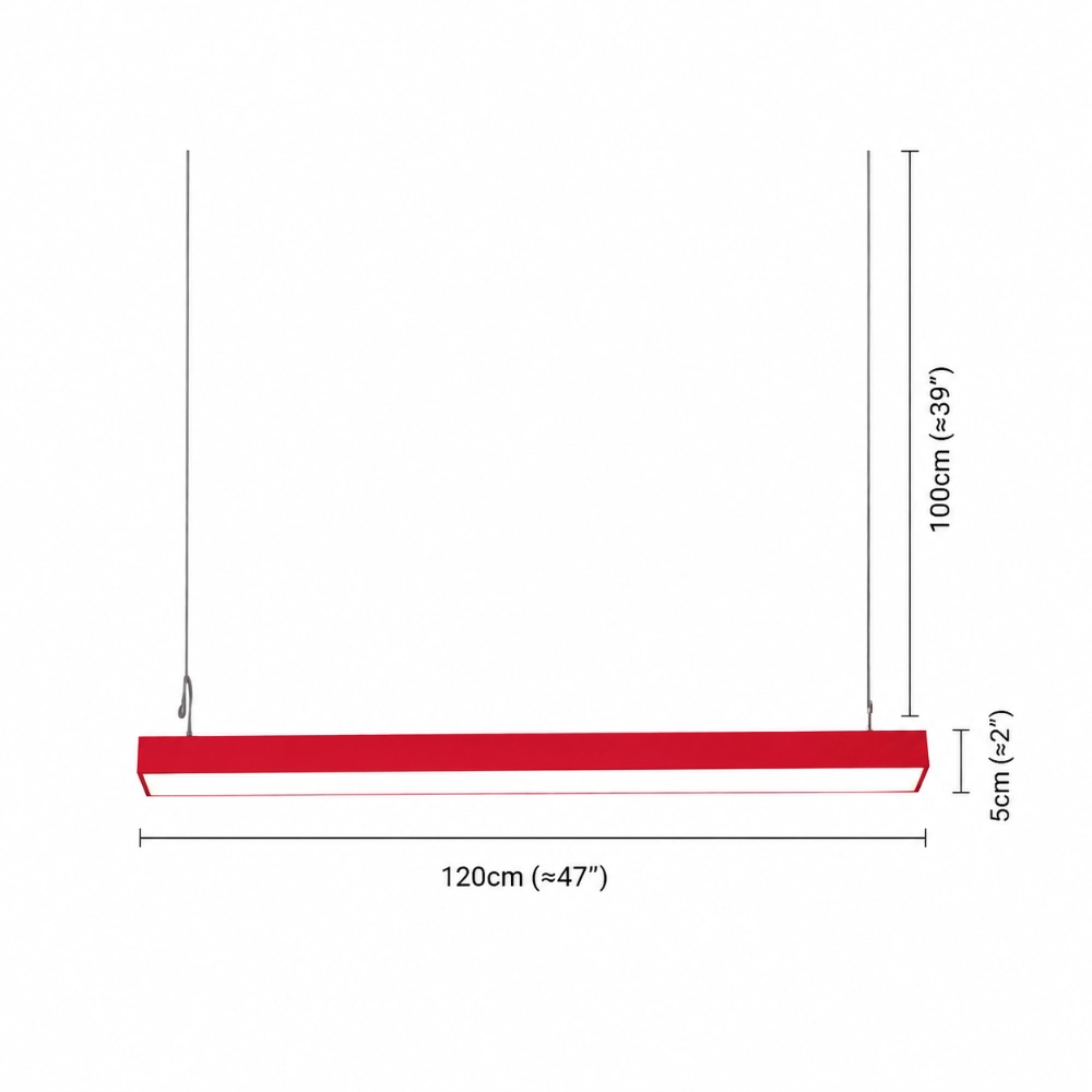
A thin colored bar may look like a stray dash above a long table. A large bar can look as if it is trying to underline the entire room. Use painter’s tape or cardboard to reproduce the actual 47-inch length, 2-inch height, canopy, and cable positions shown for the Edge. Then inspect it from the doorway, the end seat, and the nearest adjacent room.
Do not judge scale from a cropped product image. A photograph can hide ceiling height, camera distance, and the amount of open space beyond each end. The goal is not a magic percentage. It is a convincing relationship among the fixture, the occupied surface, and the architectural lines around them.
Undertones Can Make a Good Color Look Wrong
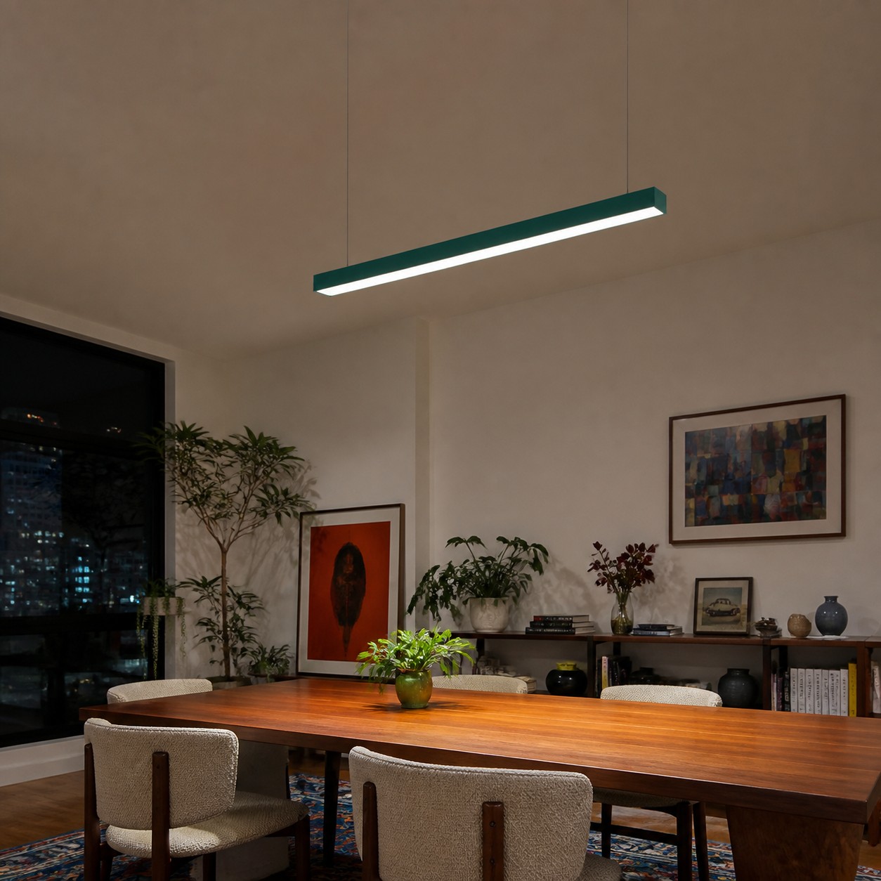
Put a painted metal sample—or the closest reliable physical reference you can obtain—beside the countertop, cabinet, floor, and dominant textile. Look in daylight and after dark. A green that feels crisp against cool gray may turn muddy beside yellow-beige stone. A red can look lively with blue-gray and unexpectedly brown beside warm wood.
The RMCAD discussion of color relationships notes that nearby hues can create harmony while opposites produce stronger contrast. That framework is more useful than calling a room “warm” or “cool” and stopping there. Identify the specific relationship you want, then test it physically; screens are not finish samples.
A Visual Focal Point Is Not a Lighting Plan
Sometimes the room looks wrong only after sunset. The pendant becomes a bright island while counters and pathways fall away, so the eye reads separation rather than intention. The Department of Energy lighting guide separates ambient, task, and accent layers. Use that division to diagnose the room instead of asking one decorative fixture to erase every dark area.
Keep task lighting where precise work happens and ambient light where people circulate. Then let the colored bar organize the table or island. If the space becomes coherent when the other layers return, the pendant was not random; it was stranded. Review the Edge as one layer in the room, not a guaranteed whole-room solution.
Glare Can Masquerade as Bad Style
An uncomfortable view makes people dislike a fixture without knowing why. Sit at every chair and look across the table. Stand at the prep edge. If the luminous underside sits directly in your line of sight, the reaction may be visual discomfort rather than a failed palette.
According to the Illuminating Engineering Society, glare depends on the source’s size, position, and luminance, the number of sources, and the eye’s adaptation. That complexity is why you should test viewpoints and confirm mounting or light-control details rather than assuming a different finish will fix the feeling.
Repeat With Restraint, Then Stop
Once alignment, scale, and light layers work, add one quiet connection. How to Use a Colorful Pendant as an Accent Without Making the Room Feel Busy gives a two-echo method for doing that without turning the room into a matching set.
Choose an echo that earns its place: a chair you already need, one line in existing art, or a bowl used every day. Avoid buying three decorative objects whose only job is to prove the pendant belongs. If the room needs evidence that badly, revisit the undertone or axis instead.
The Five-Minute Final Test
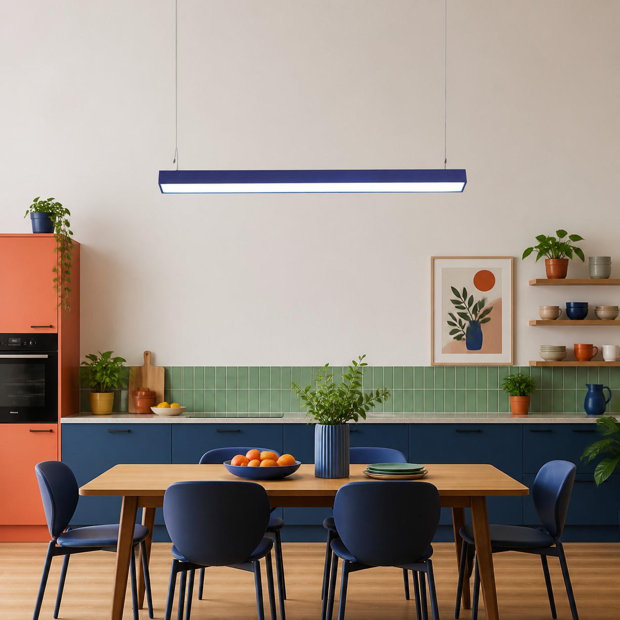
Stand at the main doorway. Can you name the visual center immediately? Sit down. Can you see faces and the room beyond without the fixture becoming an obstacle? Look at the table ends. Does the bar relate to the occupied surface? Turn on the evening lighting. Are work zones and pathways still legible? Finally, remove one nearby decorative object. If the room improves, keep editing.
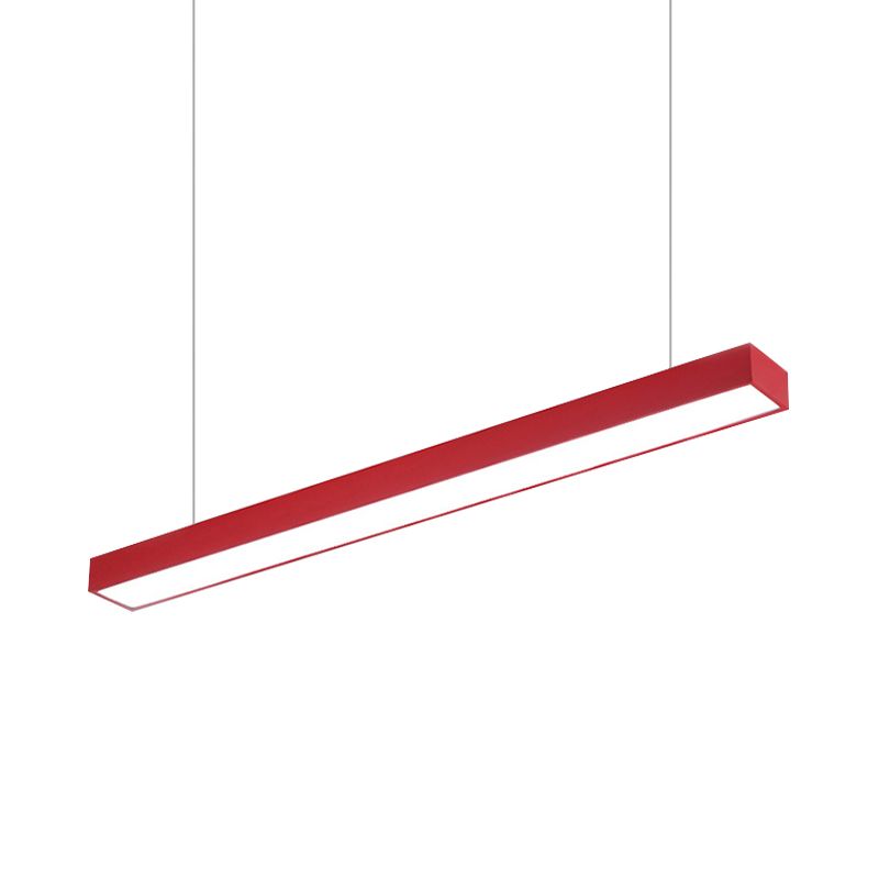
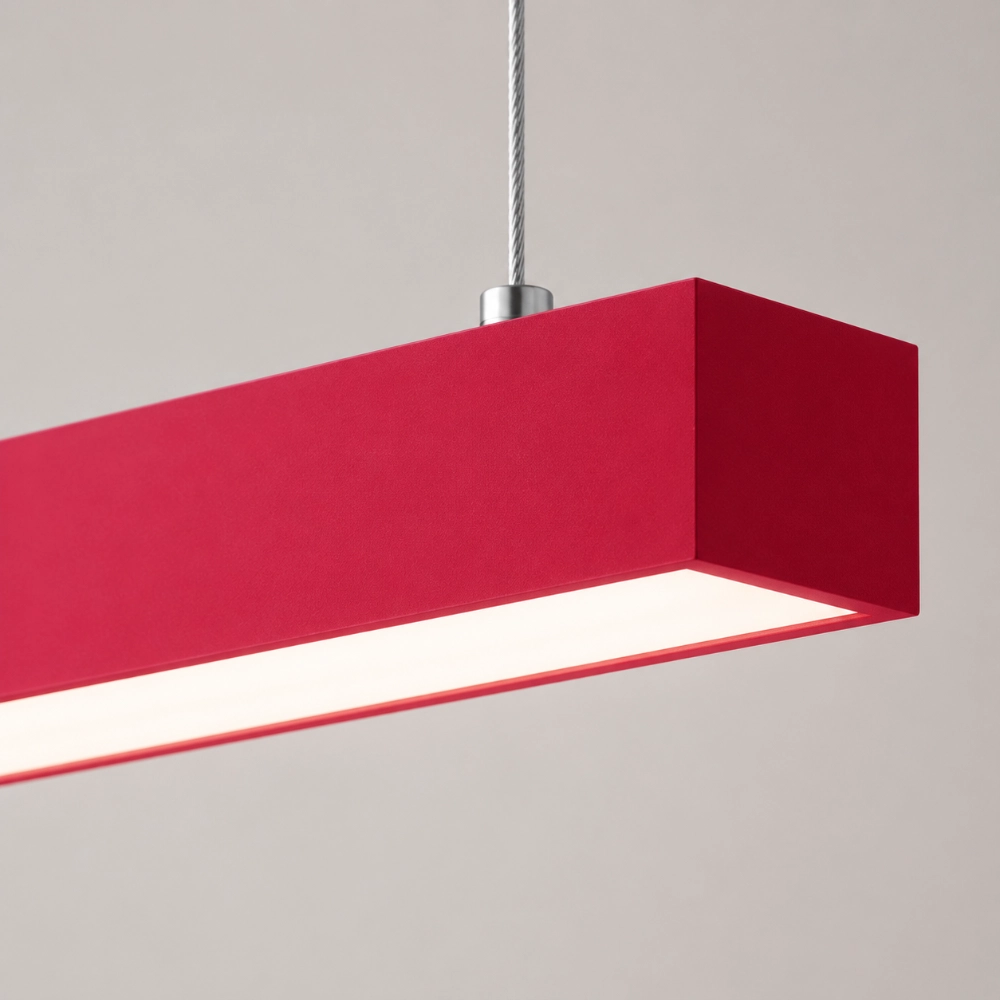
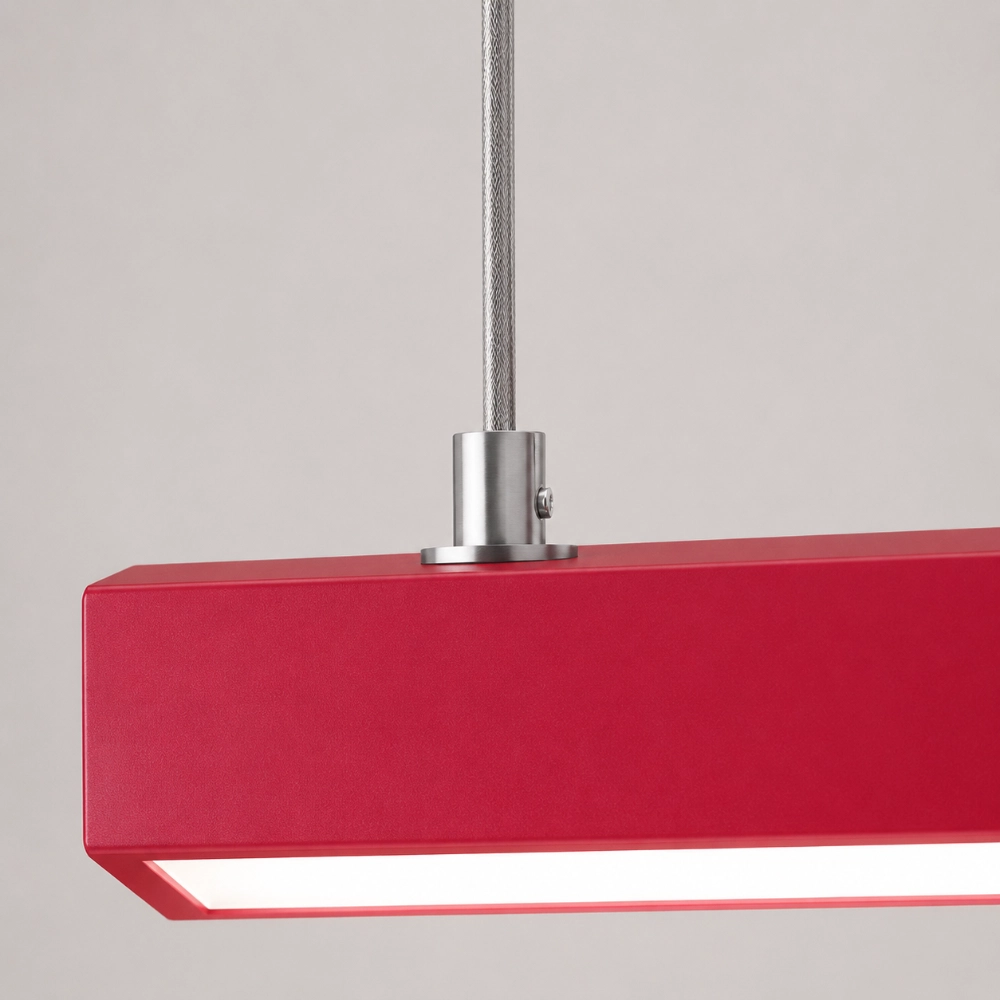
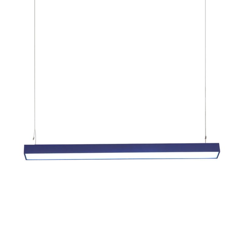
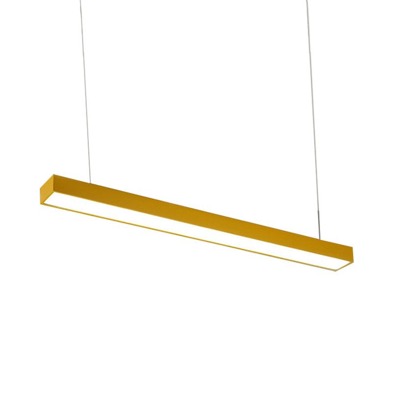
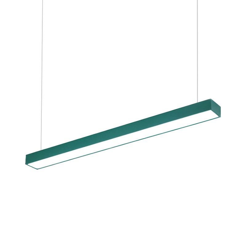
The current Edge listing describes a straight metal pendant in red, yellow, blue, or green, with a rectangular top base, two suspension connections visible in its imagery, LED source, hardwired 110–240V installation, and a listed 120 × 5 cm body. It does not provide every performance detail. If the complete assembly passes these tests, check the current Edge options and ask about any unanswered project requirement.
Questions Behind the “Something Feels Off” Feeling
Why does my pendant look off-center when it measures centered?
The occupied surface, furniture arrangement, doorway view, and ceiling architecture may create a different visual center from the room’s geometric center.
Should I add more objects in the same color?
Not first. Correct alignment, scale, sightlines, and lighting layers; then add one useful, restrained echo if the color still feels isolated.
Can warm and cool colors be mixed?
Yes. What matters is the specific undertones and the intended contrast. Test physical samples beside fixed materials under daytime and evening light.
Could the hanging height be the real problem?
Yes. A fixture can interrupt seated sightlines or expose a bright underside. Mock up the complete assembly and consult a qualified installer.
How can I test the idea before buying?
Use a full-size strip, canopy outline, and two strings; photograph it from key viewpoints in color and grayscale.