
One Bright Pendant, Zero Visual Hangover
Color is not what makes a room chaotic. Unmade decisions do. A single bright pendant can feel cleaner than a shelf full of neutral accessories when the room knows exactly which object is in charge.
Accent Means a Clear Winner
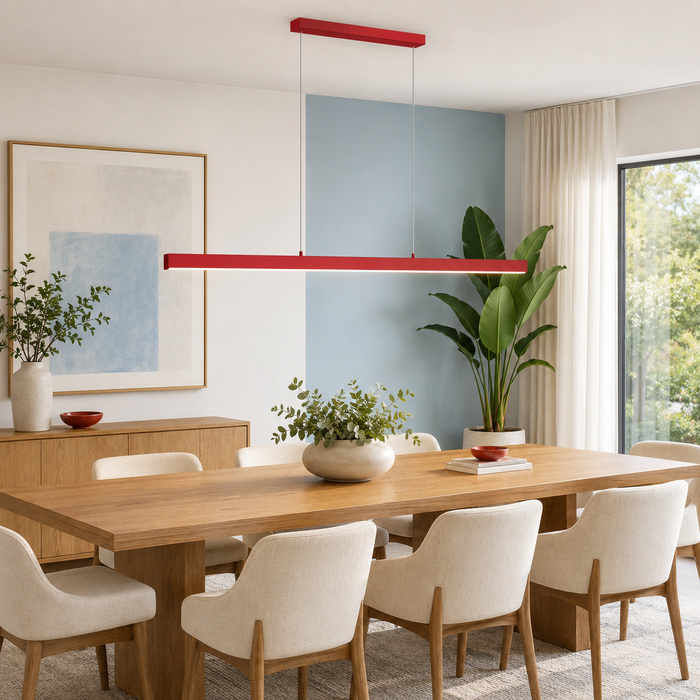
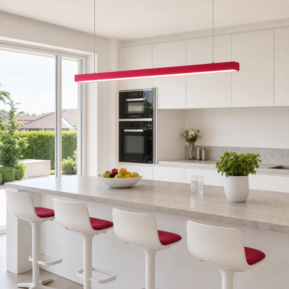
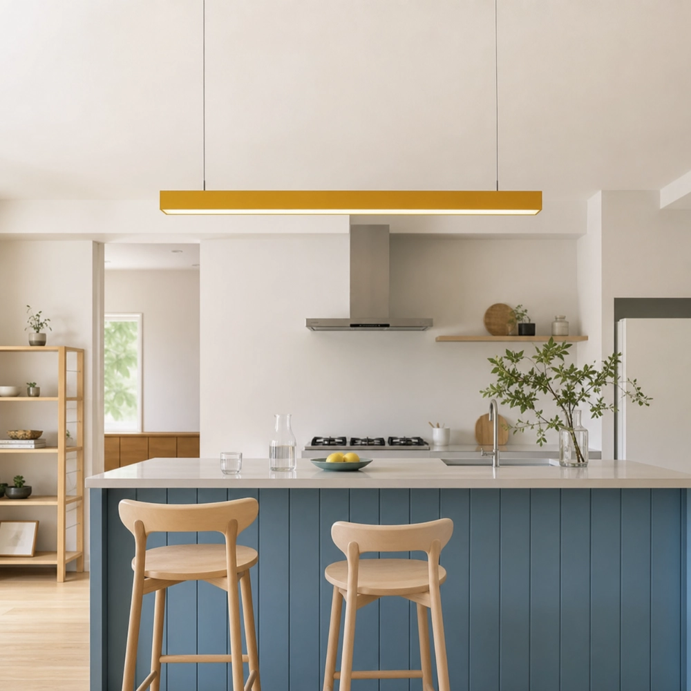
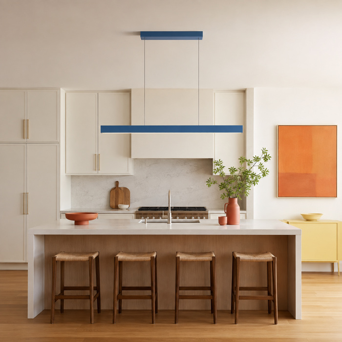
A room feels busy when everything is asking to be noticed at the same volume. The cure is not necessarily beige. It is hierarchy. Give the colorful pendant first place, choose one or two quieter supporting notes, and let ordinary objects remain ordinary. The toaster does not need to join the color story. Neither does every throw pillow.
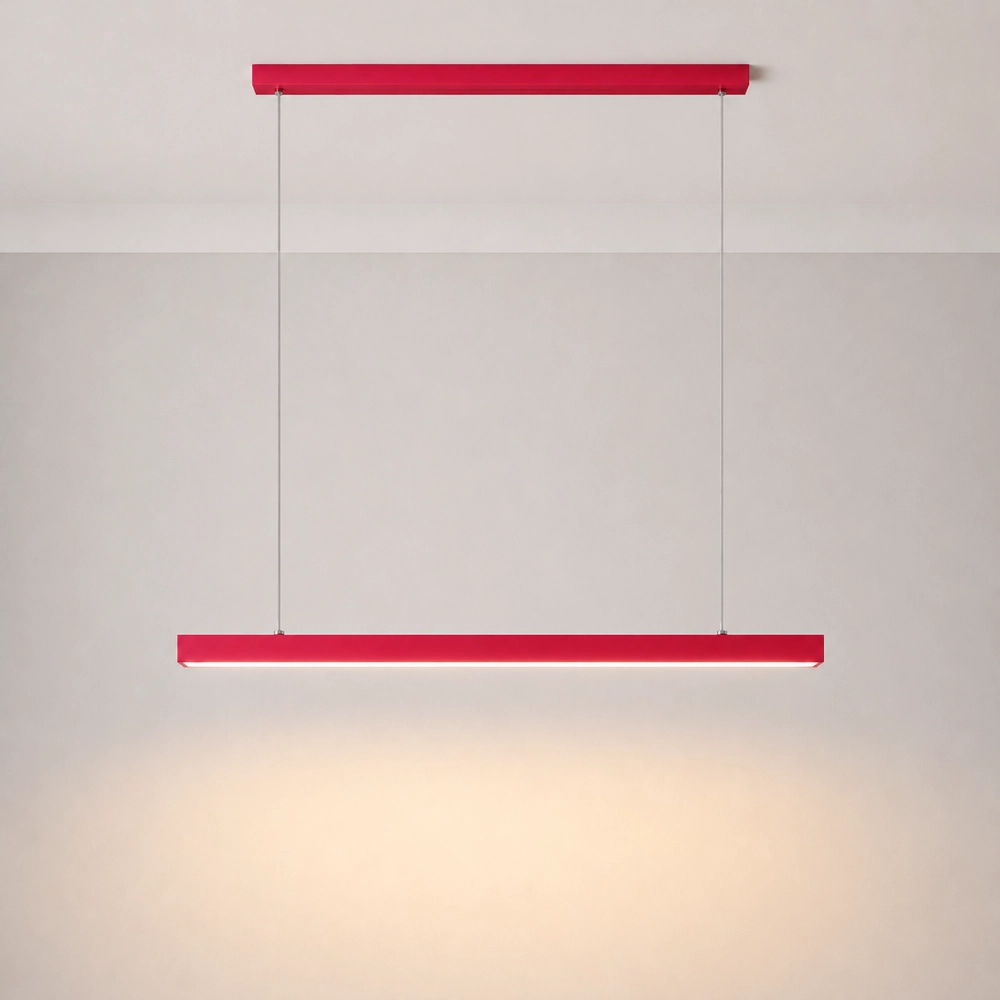
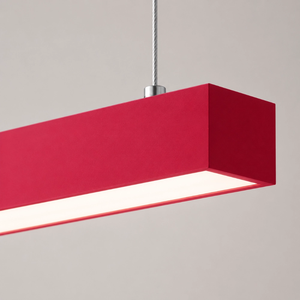
Before buying accessories to “tie it in,” remove the portable clutter around the table or island. Then compare the Edge’s full straight silhouette with the cleared space. If the fixture reads clearly without help, that is useful information: the room may need less repetition than you expected.
Borrow the Energy, Not the Entire Palette
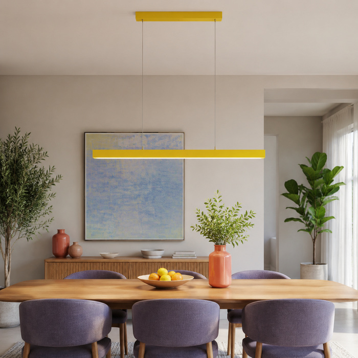
If you are still deciding whether a colored fixture is the right first move, A Colorful Linear Pendant Light Is the Easiest Way to Wake Up a Plain Room starts with the fixed materials and the room’s real axis. Here, assume the pendant has earned its place. Your next task is to prevent enthusiasm from turning into a scavenger hunt for matching objects.
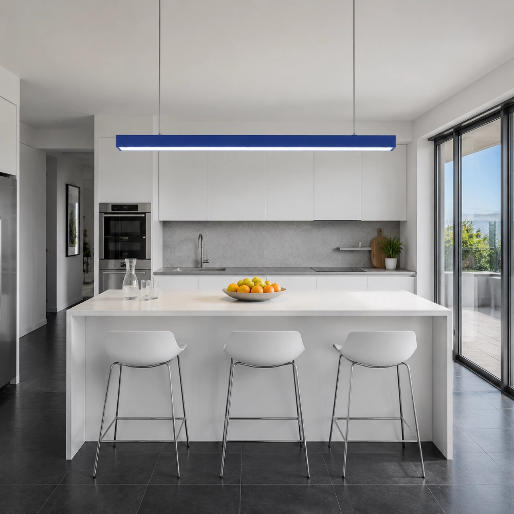
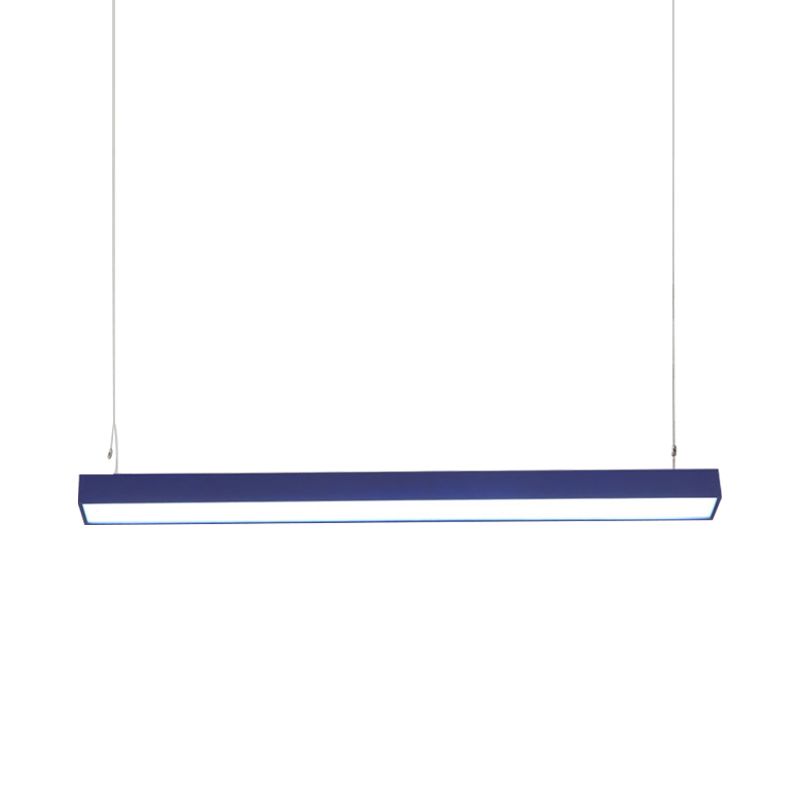
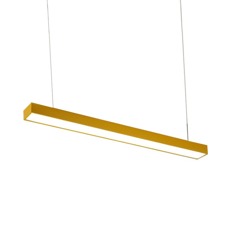
Repeat one quality, not necessarily the exact hue. A blue pendant might connect to the cool cast of a gray stone, a thin stripe in artwork, or the shape of a long bench. A yellow one might answer warm oak without requiring yellow stools. The repetition should be discoverable, not announced.
Use the Two-Echo Test
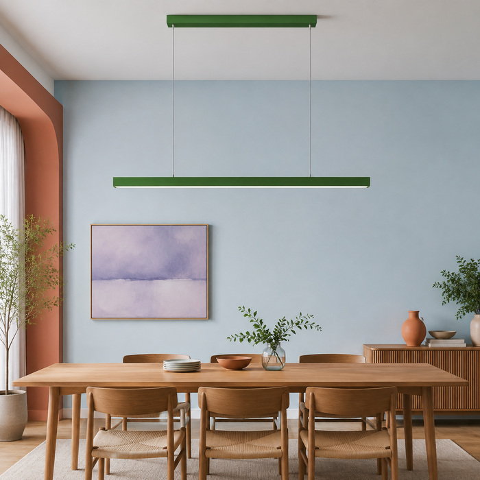
Stand at the doorway and identify the pendant. Now find no more than two echoes: one near the middle of the room and one lower or farther away. If you can count five or six, edit. If you cannot find any relationship at all, add one small, useful object—a fruit bowl, book spine, textile thread, or framed shape—rather than a themed collection.
This is a working test, not a mathematical law. The RMCAD color-theory guide explains how analogous colors can create harmony while complementary relationships produce stronger contrast. Use those relationships to choose an echo; do not force an exact retail color match under different materials and light.
Negative Space Is Part of the Design
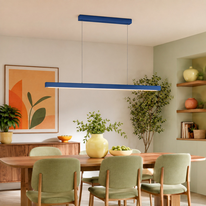
The open air around a pendant is not wasted space. It is what lets the outline register. Keep the ceiling zone free of competing decorative objects and avoid filling the nearest wall with many tiny frames at the same visual intensity. On the surface below, group daily items instead of scattering them end to end.
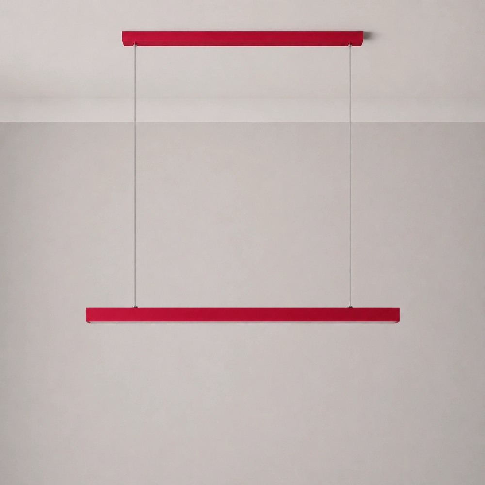
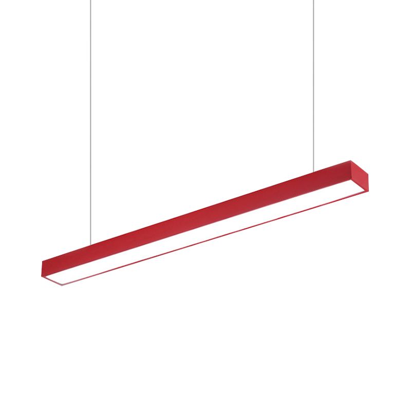
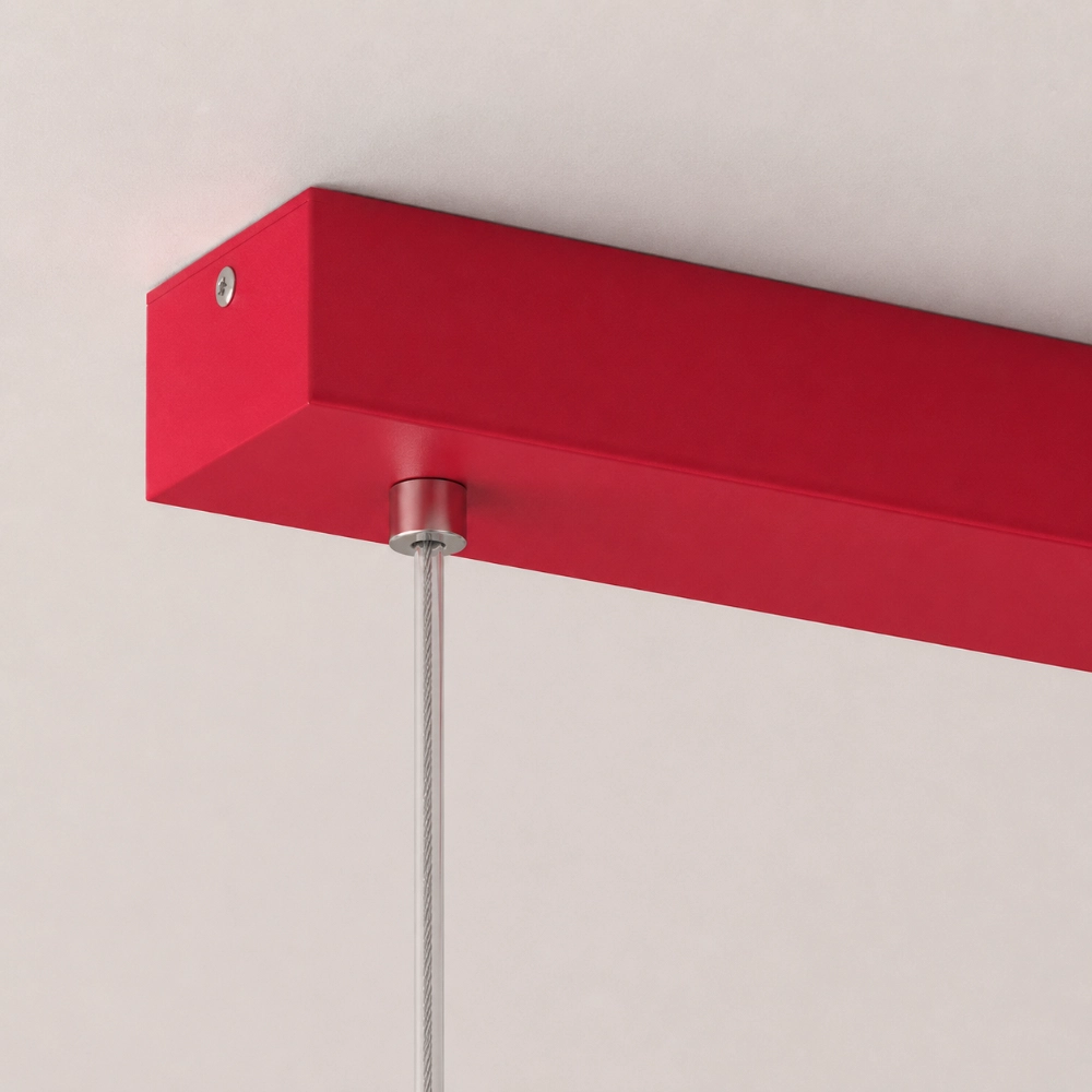
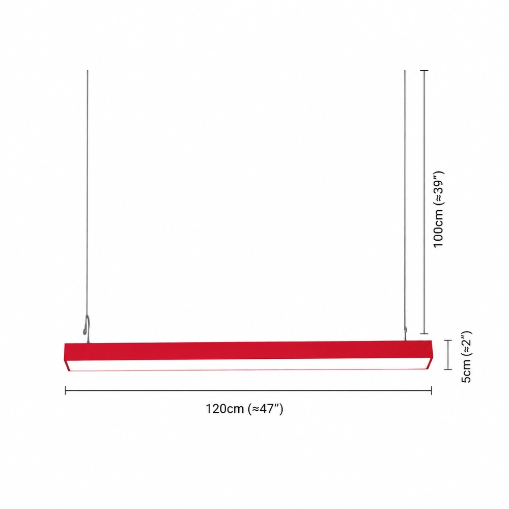
A long horizontal fixture needs breathing room at both ends. Make a 47-inch paper strip for the Edge, add the canopy and two strings, and view the whole assembly from the busiest doorway. If it crowds tall cabinets or seems to collide with a beam, color is not the problem. Geometry is. Use the official listing to verify the current dimensions while the mock-up is still movable.
Let Lighting Keep Its Separate Jobs
A colorful pendant can carry the room’s visual identity and contribute useful light. That does not make it the automatic answer for every work surface or walkway. The Department of Energy residential lighting guide discusses ambient, task, and accent lighting as distinct layers. Keeping those jobs separate prevents an attractive fixture from being judged against a promise it never made.
At night, turn on only the lights you genuinely use. Note where you chop food, read, clean, and walk. Preserve or plan the lighting that supports those tasks. A calm room can have several light sources; visual busyness comes from competition and poor placement, not from the mere existence of layers.
Check the View From Human Height
Ceiling plans are tidy. People are not ceiling plans. Sit down, stand at the island, and walk in from the adjoining room. The underside of a pendant may enter a seated sightline even when it looks perfectly composed in an elevation drawing.
The IES definition of glare notes that discomfort is affected by the source’s size, position, and luminance, among other factors. That is a good reason to test real viewpoints and ask about unanswered lighting details instead of copying a universal height from social media.
When the Accent Still Feels Like an Accident
If you have edited the room and the pendant still looks detached, the problem may be alignment, undertone, or scale—not insufficient matching. Why Your Colorful Light Looks Random Instead of Designed offers a step-by-step diagnosis that starts with placement before blaming the color.
Take two black-and-white photos. If the fixture disappears into the room in grayscale, its color may be doing all the work while its scale and line contribute little. If it dominates even without color, simplify the surrounding shapes. This quick exercise separates hue from visual weight.
A Calm Formula That Does Not Look Formulaic
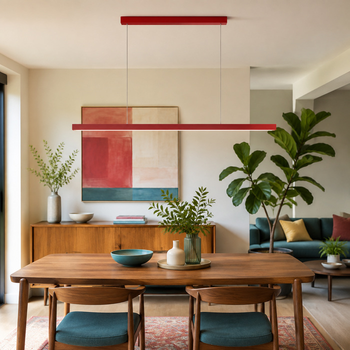
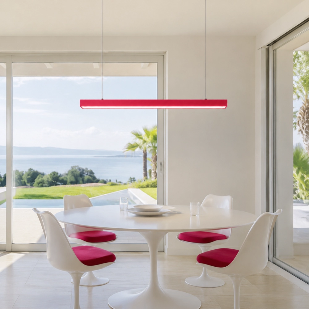
Use one strong overhead line, one mid-level echo, and one quiet low-level relationship. Keep large surfaces restrained, preserve negative space around the fixture, and check that the bar belongs to the table or island below. That is enough structure to make the room coherent without making it look staged for a catalog.
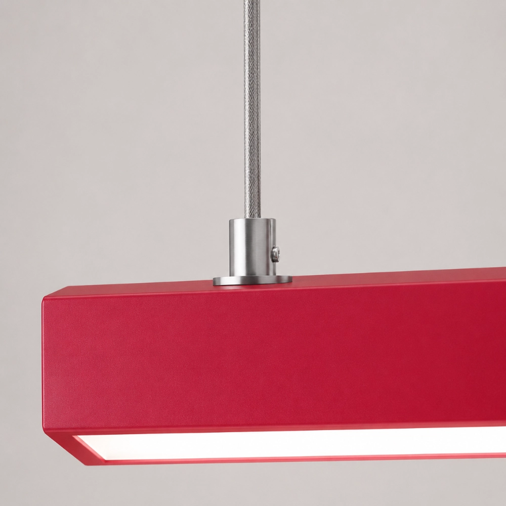
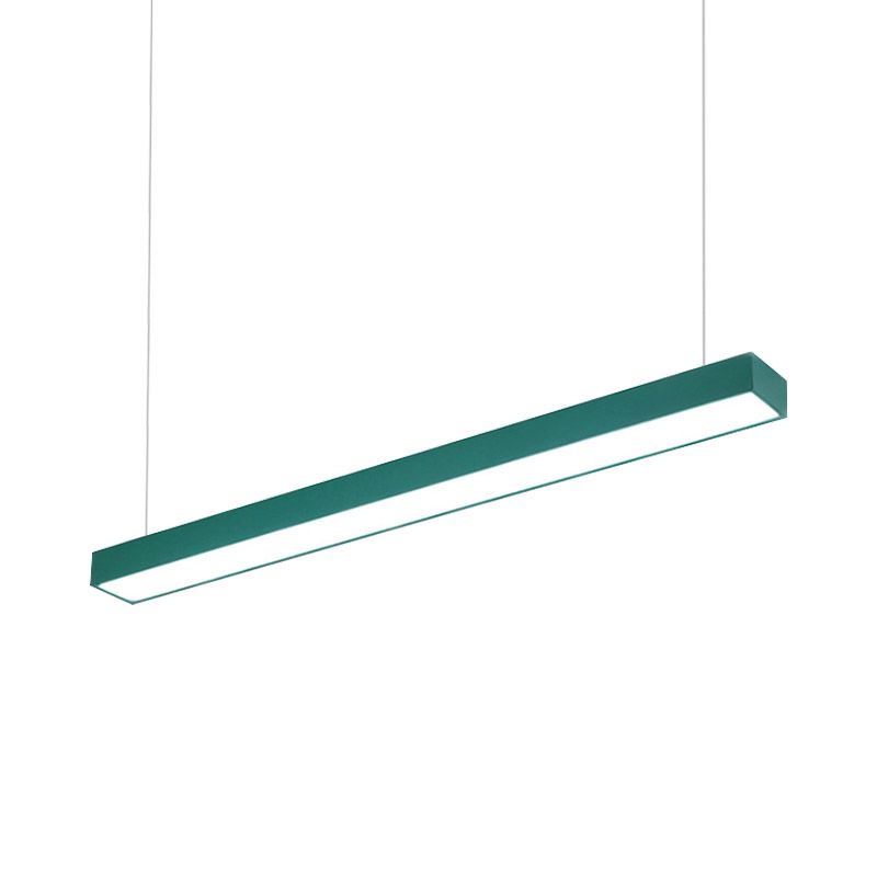
The Edge page currently lists red, yellow, blue, and green metal finishes, with a straight 120 cm body, matching top base, LED source, and several luminous-color selections. It does not answer every technical or installation question. Once the color and geometry pass your mock-up, review the current Edge selections and confirm project-critical details before ordering.
Questions About Color Without Clutter
Does an accent color need to appear three times?
No fixed count works for every room. Start with one or two quiet relationships and judge the whole view rather than collecting matching objects.
Can I use more than one bright color?
Yes, but decide which color leads. Secondary colors should support the focal point rather than compete at the same scale and intensity.
Should the pendant match cabinet hardware?
Not necessarily. Shape, axis, undertone, or contrast may create a stronger relationship than an exact finish match.
How do I keep a colorful kitchen from looking childish?
Use mature materials, clear geometry, negative space, and restrained repetition. The issue is usually hierarchy, not brightness alone.
What should I mock up?
Mock up the body, canopy, both suspension cables, intended height, and the surface below. Check it from seated and doorway viewpoints.