
Your Room Is Not Boring. It Is Just Missing One Good Exclamation Point.
If your room feels as though somebody stopped decorating one decision too early, resist the urge to buy a cartful of little things. One clean shot of color overhead can give the whole space a point of view—and leave every horizontal surface blessedly alone.
The Fix Is Smaller Than a Makeover
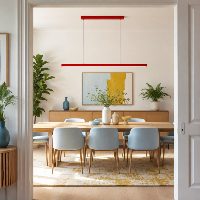
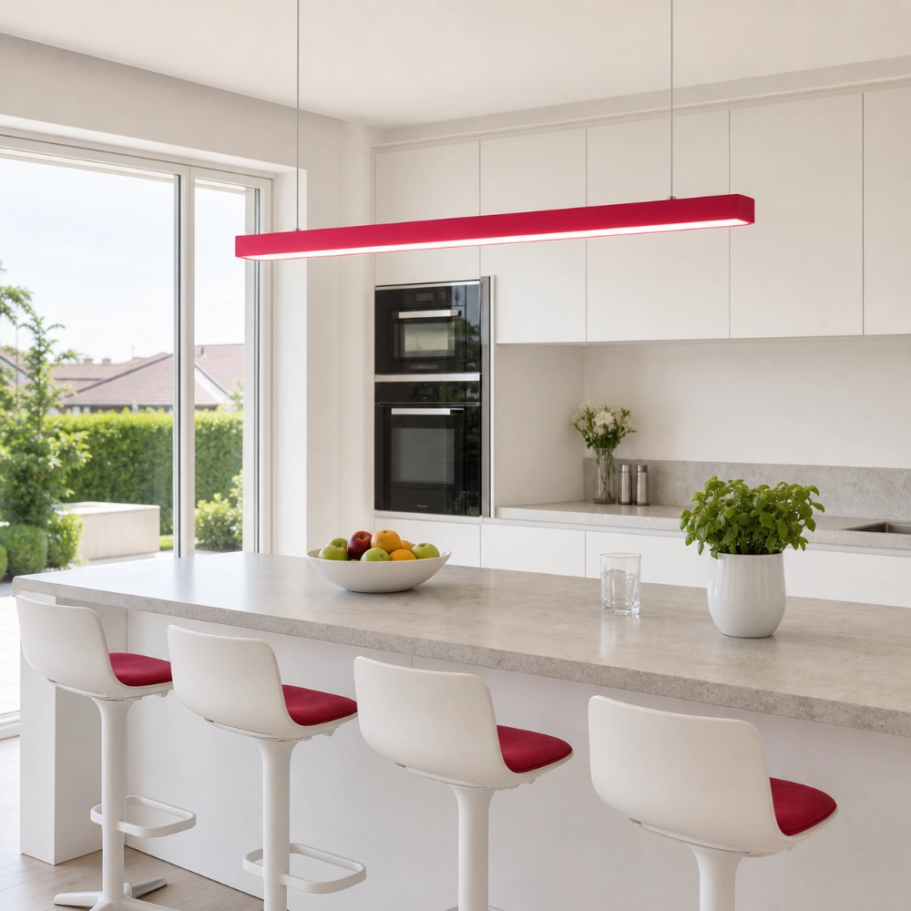
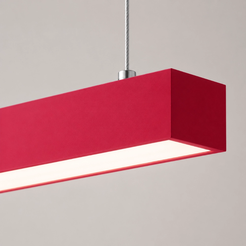
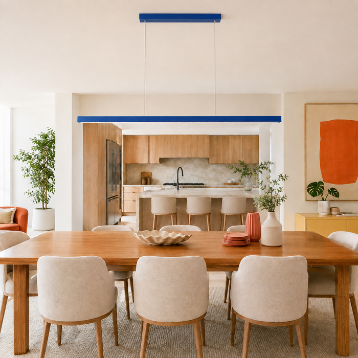
A plain room rarely needs twelve new accessories. More often, it needs one element with enough presence to make the existing furniture look intentional. A colorful linear pendant can do that because it combines hue, height, and a strong horizontal line in one move. It sits above the clutter zone, so it changes the first read of the room without taking over the counters, floor, or walls.
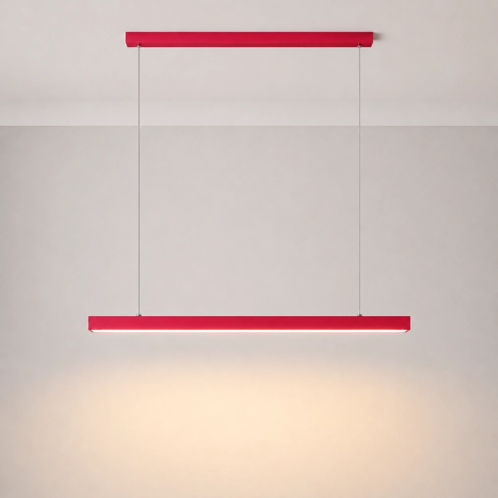
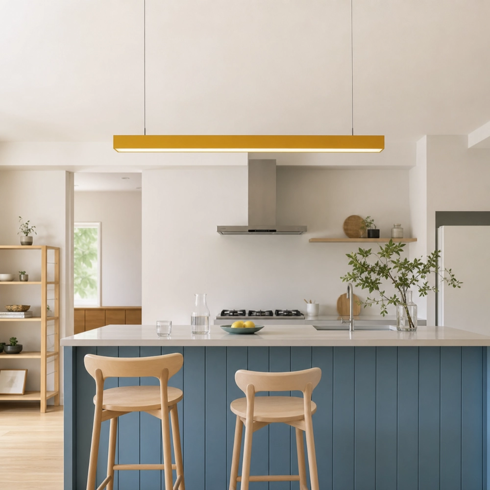
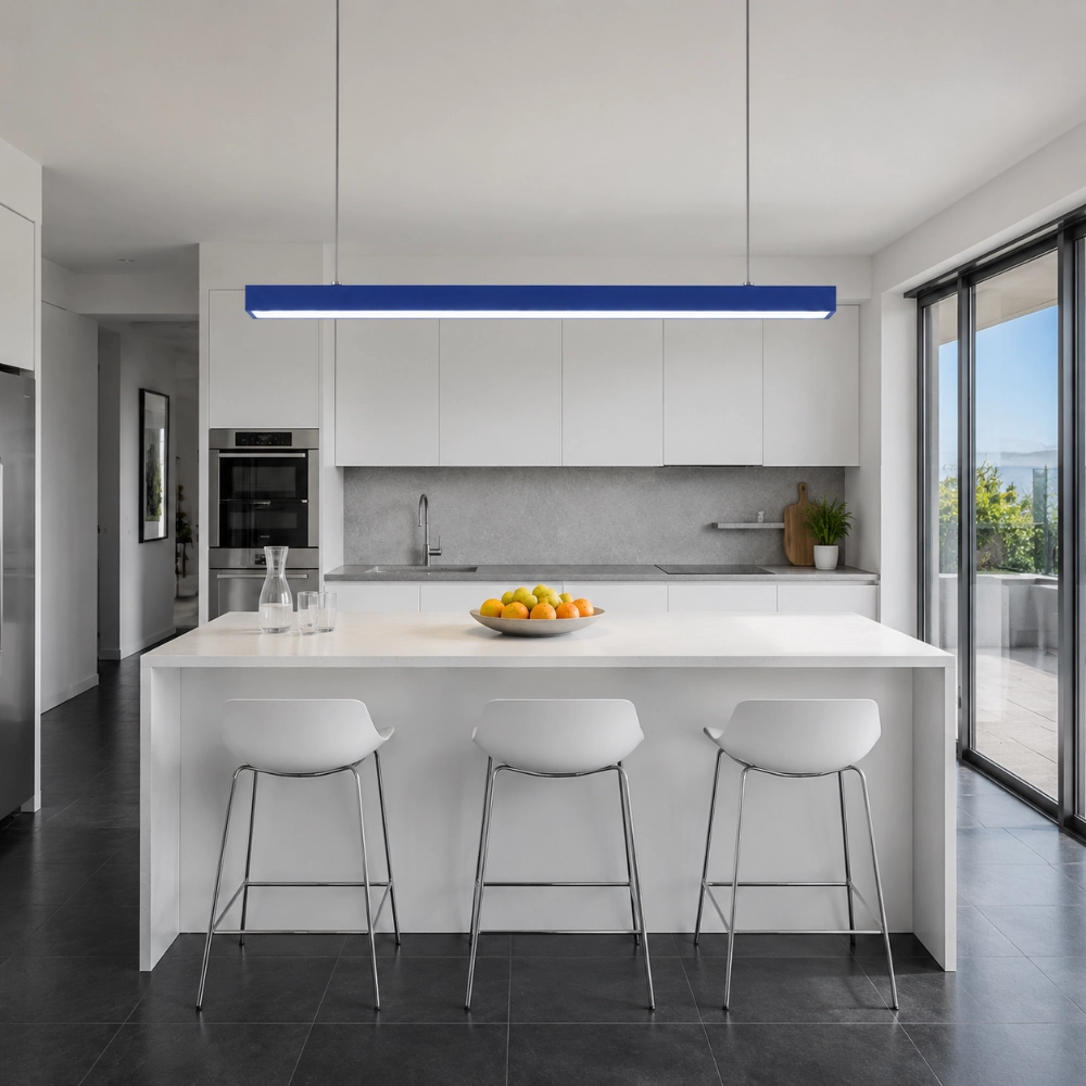
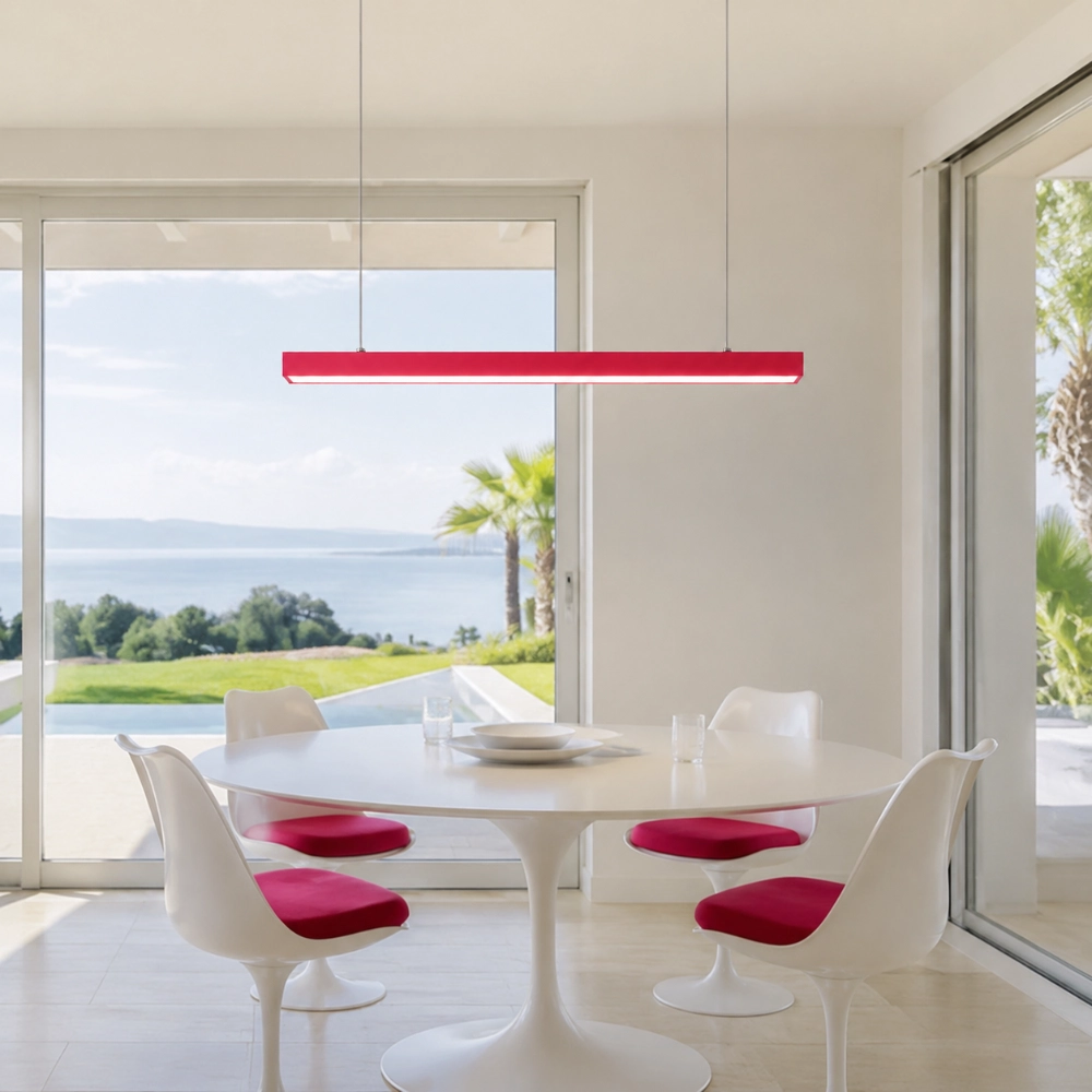
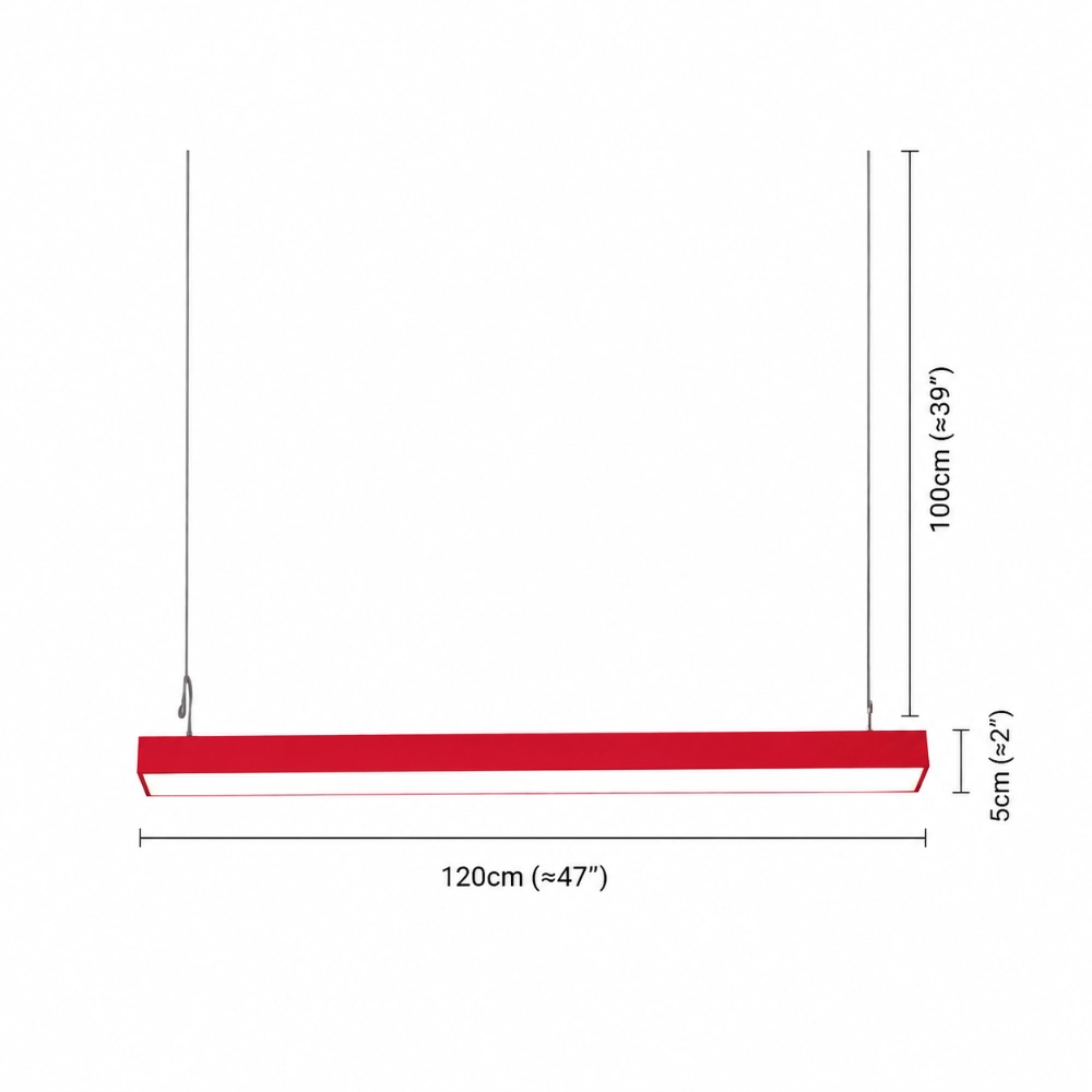
The trick is to treat the fixture as punctuation, not wallpaper. Pick one place that already matters—a dining table, kitchen island, or shared worktable—and give that spot the color. Then let the rest of the room support it. If you are considering the Edge, open the current product listing and compare its full 47-inch span with the surface below before falling in love with a finish.
Start With the Room You Actually Have
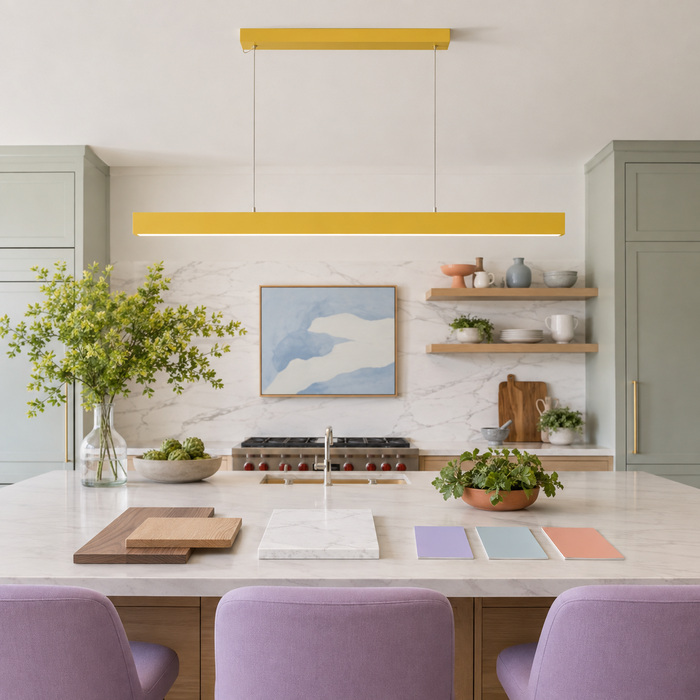
Do not begin with “Should I buy red or blue?” Begin with an inventory. Photograph the room from the doorway in daylight and again after dark. Circle the three largest color fields: usually the walls, floor, cabinets, sofa, or table. Next, note the colors that cannot easily change, such as stone veining, wood undertones, and metal hardware. The pendant should join that cast, not audition for a different movie.
For a practical way to keep the new color from spreading into every object, How to Use a Colorful Pendant as an Accent Without Making the Room Feel Busy explains how to choose a supporting echo and where to stop. The important point here is simpler: the fixture should answer something already present, even if that “something” is only a warm wood tone or a tiny blue thread in the rug.
Choose a Color Relationship, Not a Color Name
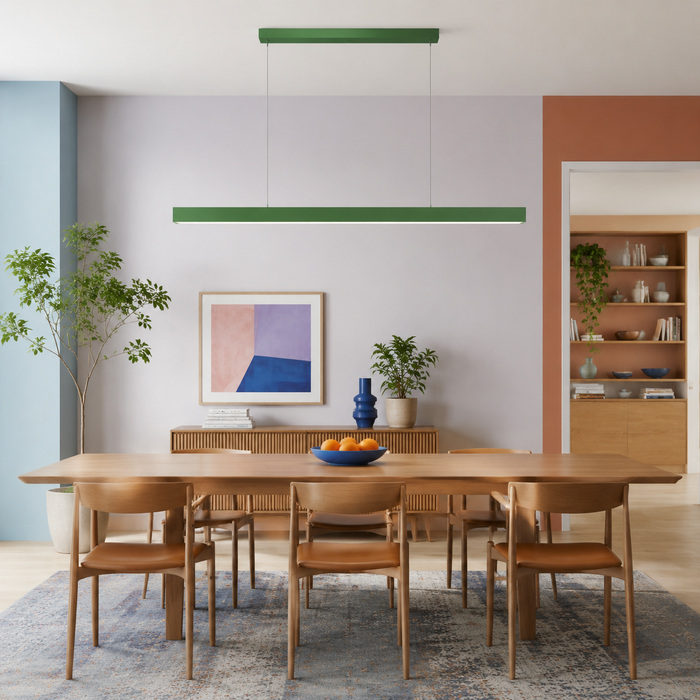
“Green” is too vague to guide a room. A yellow-green bar against honey oak feels related and warm; a blue-green bar against the same wood feels sharper. The color wheel is useful because it describes relationships. The Rocky Mountain College of Art and Design overview of color theory distinguishes analogous colors, which sit near one another, from complementary colors, which create stronger contrast across the wheel.
Use that distinction in plain English. If your room already has terracotta, tan, and warm oak, yellow can feel like a bright cousin. Blue will act more like a deliberate interruption. Neither is automatically better. Decide whether you want the pendant to continue the conversation or change the subject.
Give the Line a Job Below It
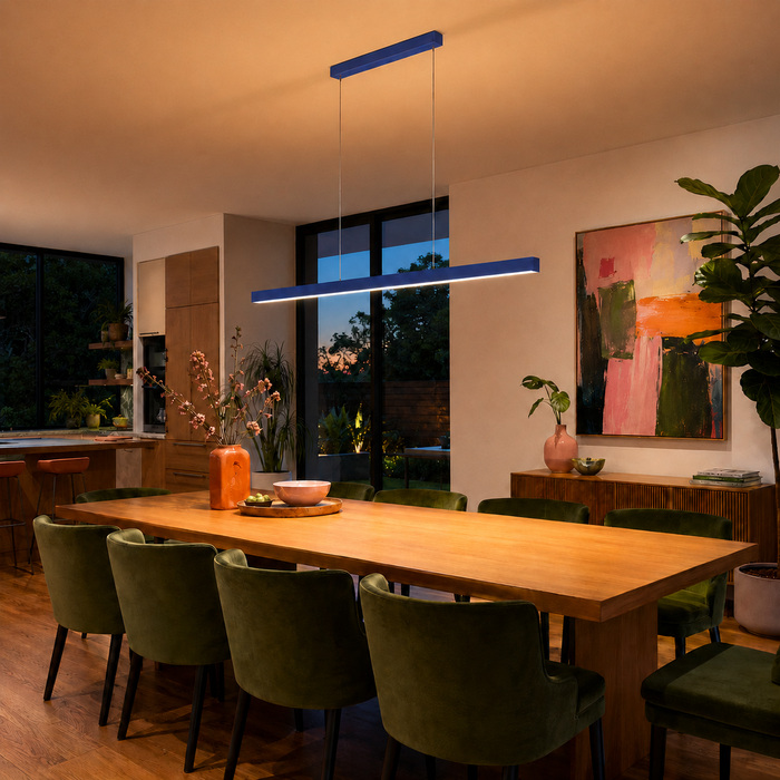
A long pendant looks most convincing when its geometry belongs to something. Align it with the long axis of a rectangular table or island, not merely with the ceiling box. Check it from the doorway and from the seat you use most. A perfectly centered bar can still look adrift if the table is offset, the stools cluster at one end, or the room opens toward another space.
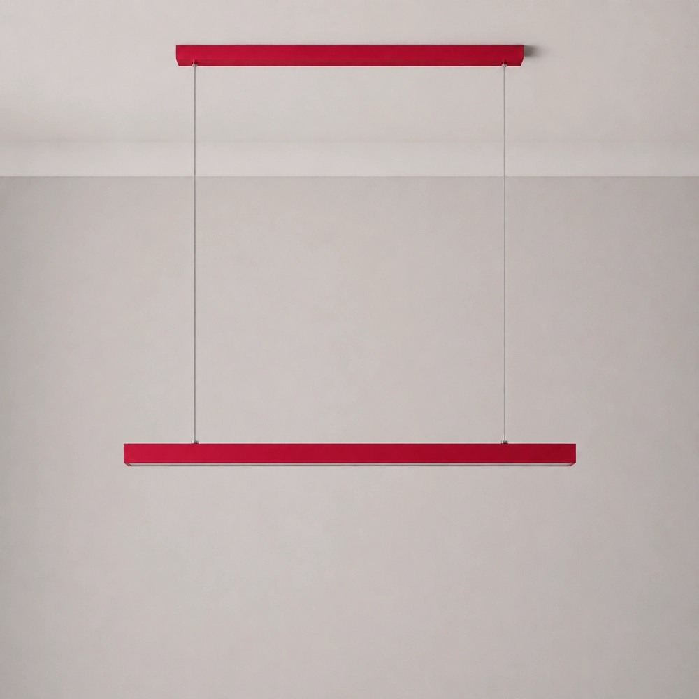
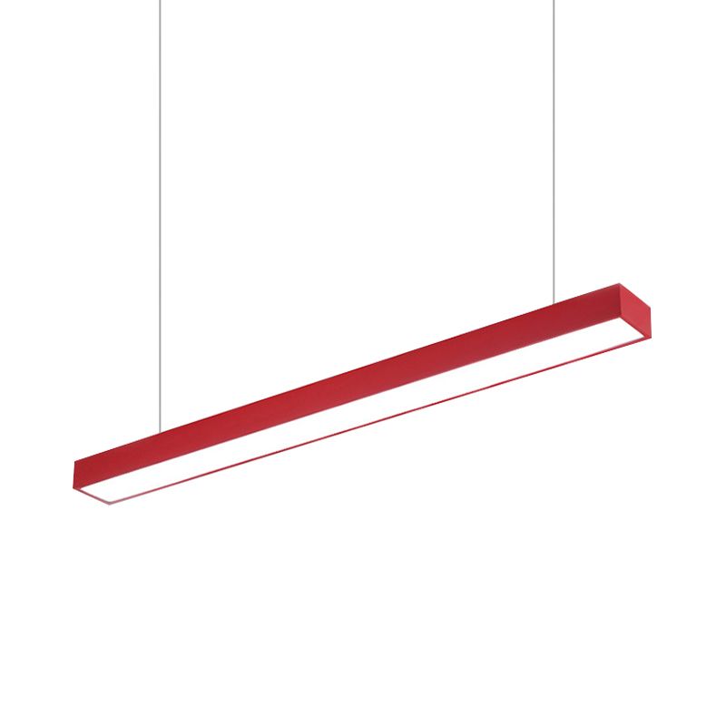
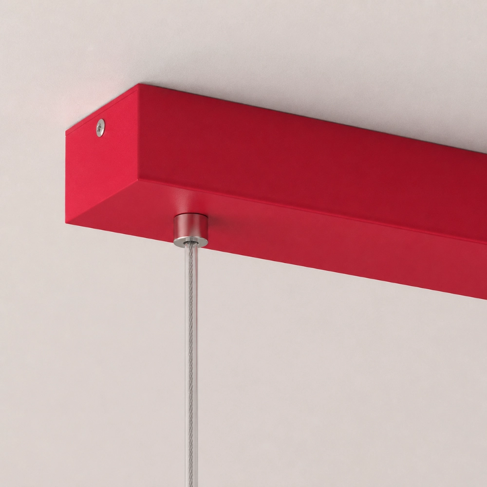
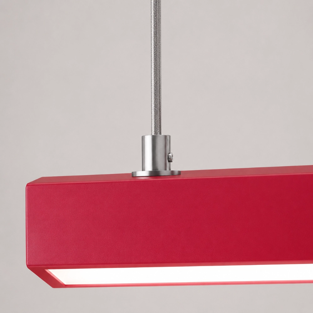
Tape a paper strip at full length and suspend two strings where the cables would appear. Include the canopy in the mock-up. This low-tech rehearsal catches an expensive mistake: choosing the right color for the wrong line. It also lets you check whether the Edge’s straight body and two-cable composition suit the real ceiling rather than an idealized product photo.
Color Cannot Cover a Lighting Gap
A vivid fixture may become the visual center, but visual importance is not the same as complete illumination. The U.S. Department of Energy residential lighting guide separates ambient, task, and accent lighting because rooms ask light to do different jobs. A pendant can contribute to more than one layer, yet it should not be credited with lighting every counter, walkway, and cabinet unless project-specific evidence shows that it can.
Walk the room after sunset. Can you read at the table? See food clearly at the prep edge? Move through the adjacent space without a dark drop-off? Keep the other layers that solve those jobs. The colored pendant is allowed to be the star without playing every character.
Test Brightness From a Chair, Not Just the Doorway
The illuminated underside may look elegant from across the room and distracting from directly below. The Illuminating Engineering Society definition of glare explains that discomfort depends on factors including a source’s size, position, and luminance, as well as the viewer’s state of adaptation. That is why a universal hanging-height slogan cannot replace a seated test.
Mock up the complete body at the intended height, sit in every regular chair, and look toward the person opposite. Also stand at the prep position. If the glowing surface dominates your sightline, ask about mounting and light options before ordering; do not assume a color choice or switch mode will solve geometry.
When “Fun” Starts Looking Random
A colorful pendant looks random when it has no clear axis, no supporting relationship, and too many nearby objects competing at the same intensity. Why Your Colorful Light Looks Random Instead of Designed is the diagnostic companion for that moment: it helps separate a color problem from a placement, scale, or repetition problem.
For now, remove rather than add. Clear the nearest counter, keep one quiet echo of the fixture color elsewhere, and photograph the room again. If the pendant suddenly makes sense, the room did not need more styling. It needed fewer interruptions.
The Confident Version of the Room
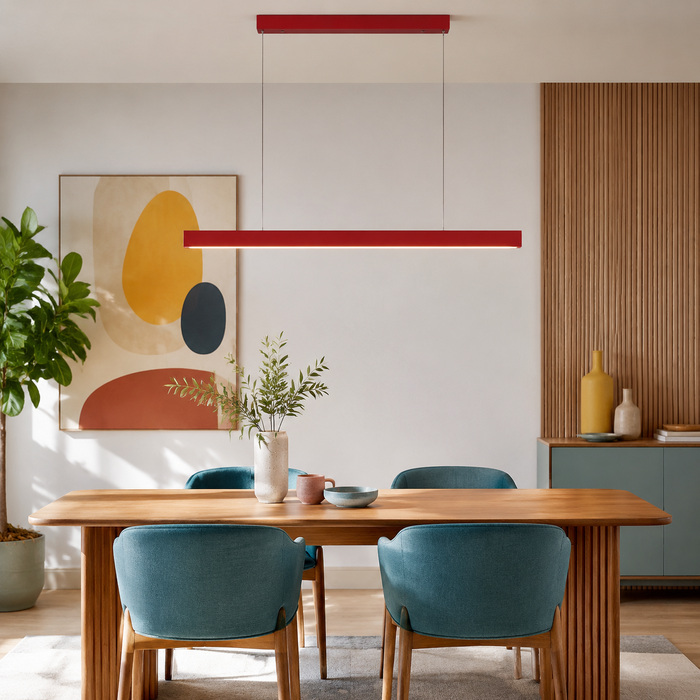
The best result is not a neutral room with a bright object pasted on top. It is a room whose existing materials suddenly look more deliberate because one strong line gives the eye somewhere to land. Choose the surface, confirm the axis, test the sightlines, and decide whether the color should harmonize or contrast.
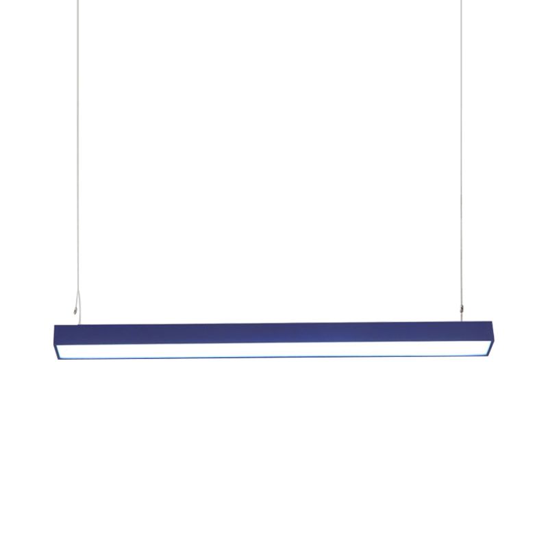
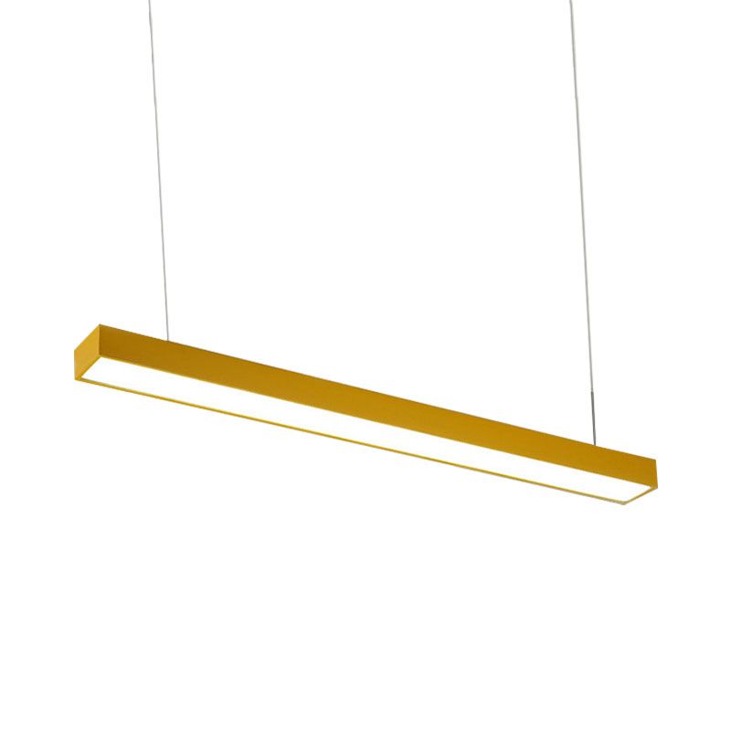
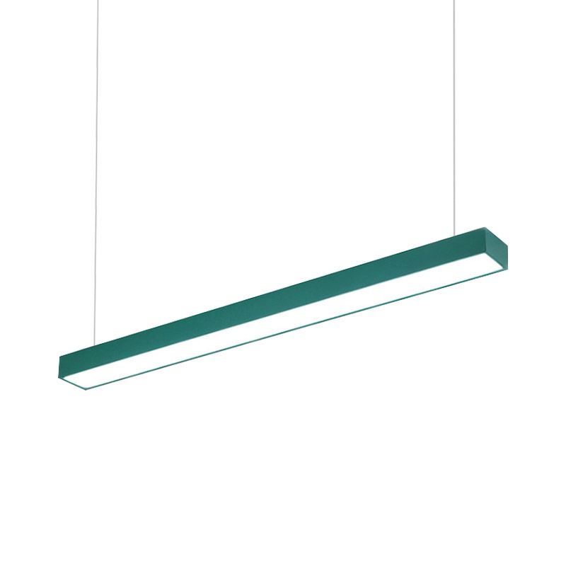
The Edge listing currently shows red, yellow, blue, and green finishes on a straight metal body with a matching rectangular canopy and two suspension cables. It does not publish every project-critical lighting detail. If that exact structure fits your mock-up, review the current Edge options and confirm unanswered installation questions before purchase.
Questions People Ask Before Adding a Colorful Pendant
Will a colorful pendant make a small room feel smaller?
Not automatically. The more useful checks are visual clutter, scale, sightlines, and whether the fixture aligns with a real surface rather than floating in the room.
Should the pendant match the chairs?
It can echo a chair color, but an exact match is not required. A related undertone or one small repeated accent often looks less staged.
Is red, yellow, blue, or green easiest to decorate around?
There is no universal easiest color. Compare each finish with the room’s fixed woods, stone, metals, and largest textiles under the actual light.
Can one pendant be the only light in the room?
Do not assume so. Check ambient, task, circulation, and accent needs separately.
How do I know whether the bar is too long?
Make a full-size paper or cardboard mock-up, align it with the occupied surface, and inspect it from doorways and seats before ordering.