
Color Trend Lighting: Cool Blue, Jade and Persimmon at Home
Pinterest is very good at making a color combination look inevitable. Cool blue, jade, and persimmon appear together in kitchens, dining rooms, and mood boards because the mix has useful tension: blue cools, jade steadies, and persimmon brings warmth. The challenge is translating that palette into a real room without making it look like a showroom display.
The most durable form of color trend lighting is not a room painted in three matching shades. It is one colored pendant supported by materials that already belong in your home. Let the fixture carry the trend, then allow wood, stone, textiles, and daylight to make the palette feel personal.
Why This Palette Works in Ordinary Rooms
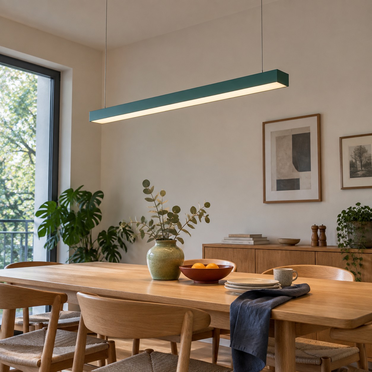
Cool blue brings clarity to warm oak and cream. Jade sits naturally beside plants, brass, and natural stone. Persimmon adds a low, warm note that can stop blue and green from feeling too polite. You do not need all three at equal strength. One can lead, one can support, and one can appear in a small detail.
Reddit color discussions tend to be practical about this. People worry less about whether a palette is theoretically correct and more about whether it survives their existing sofa, floor, and daylight. Start there. A trend that ignores fixed materials will feel temporary no matter how beautiful the reference image is.
Choose One Hero Color for the Ceiling
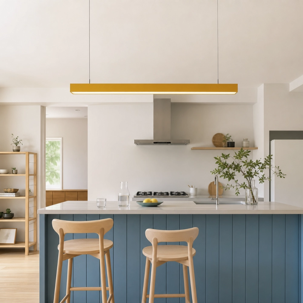
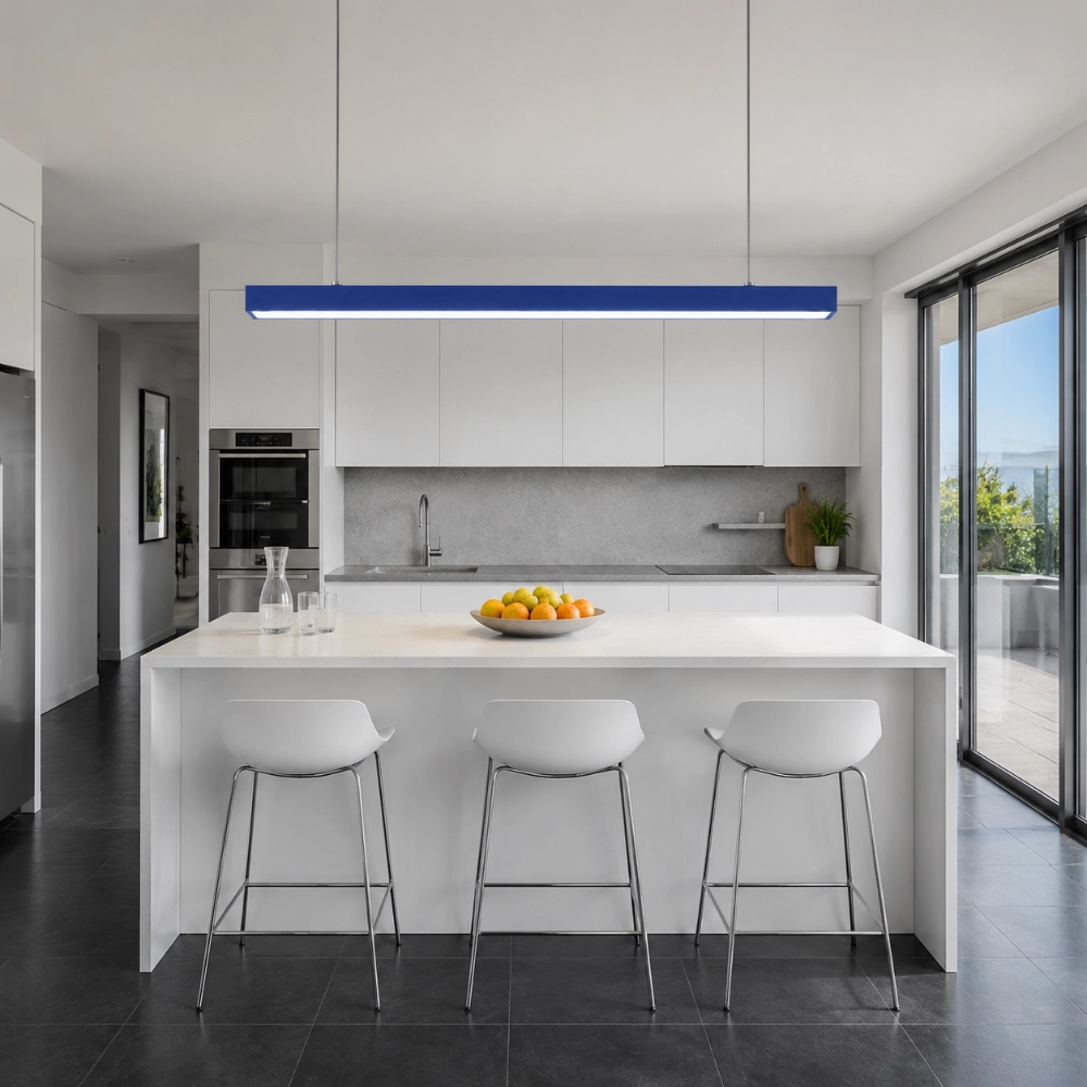
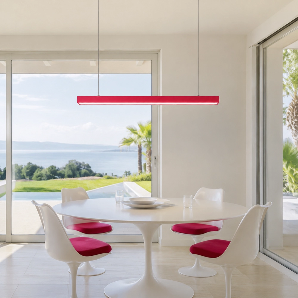
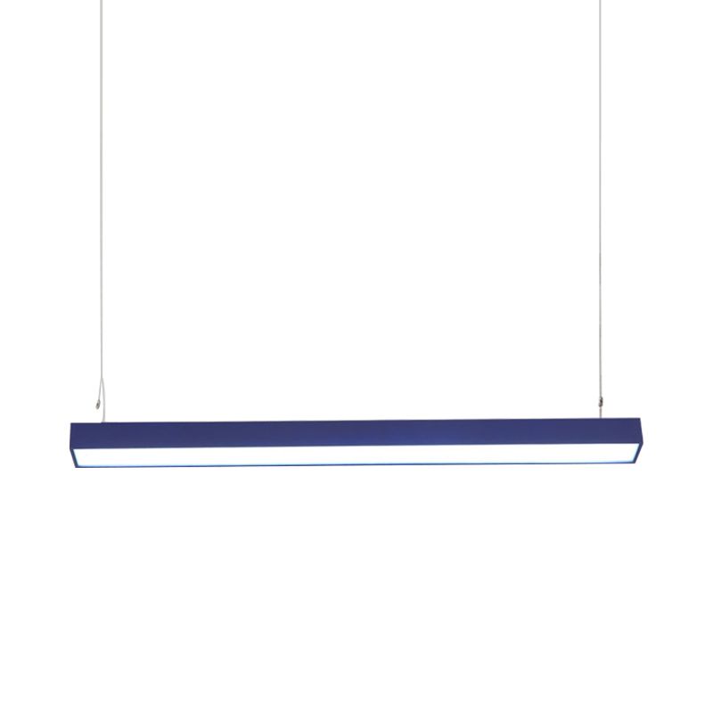
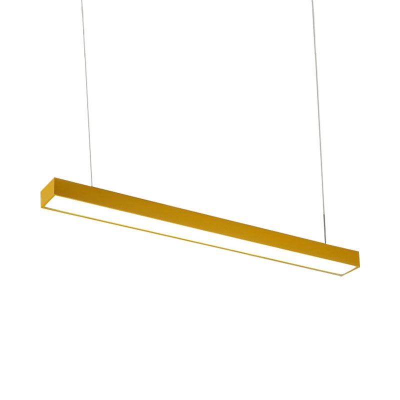
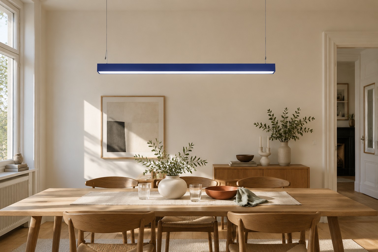
A pendant is a useful place to test a palette because it is visible, contained, and easier to change than cabinetry. A blue linear pendant can make a pale kitchen feel sharper. A jade fixture can soften a white dining area. Persimmon can turn a quiet breakfast corner into a warmer destination.
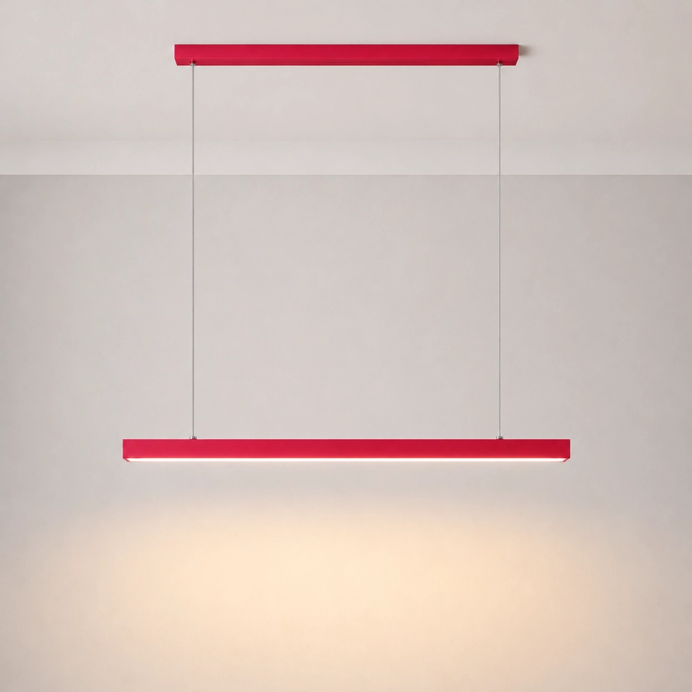
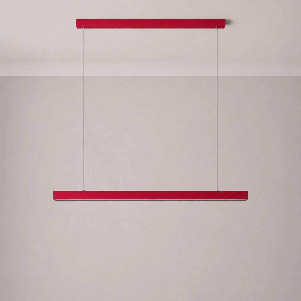
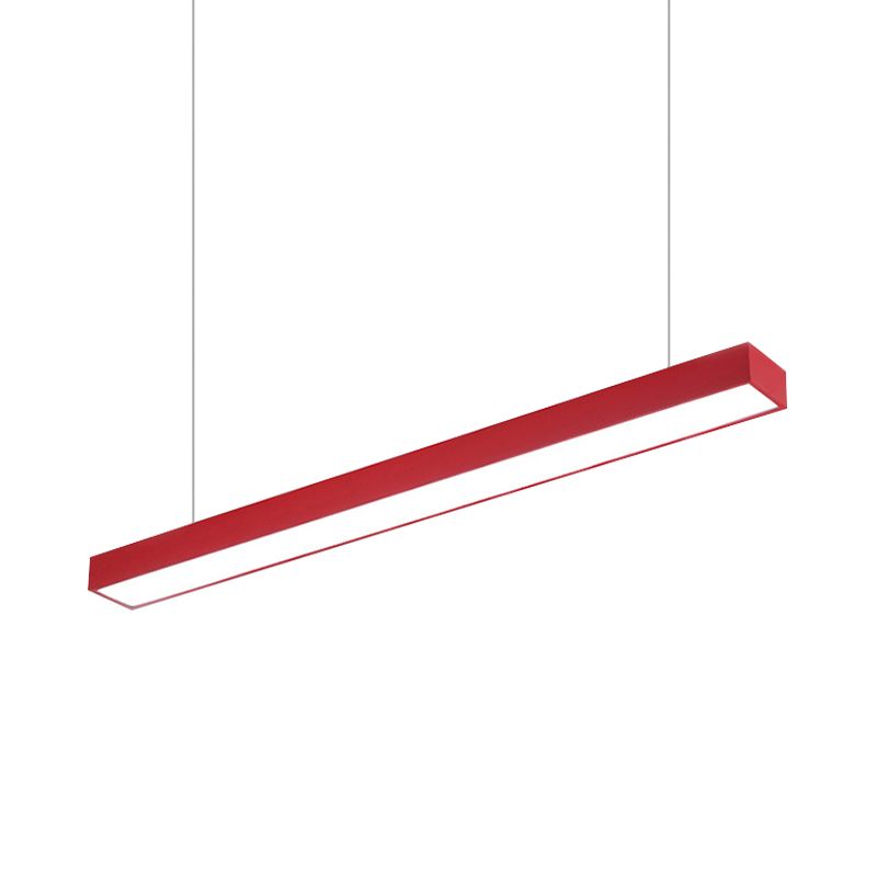
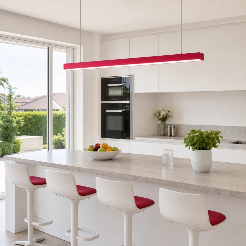
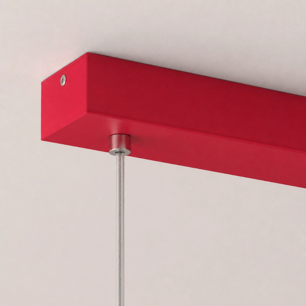
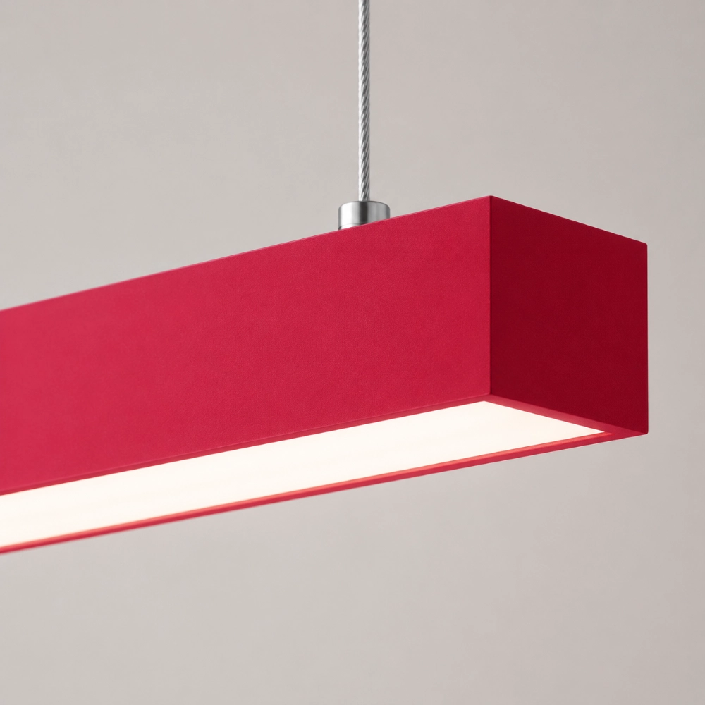
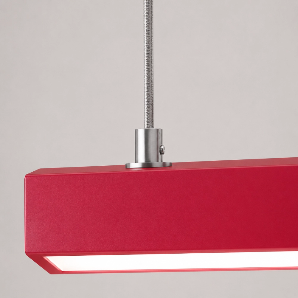
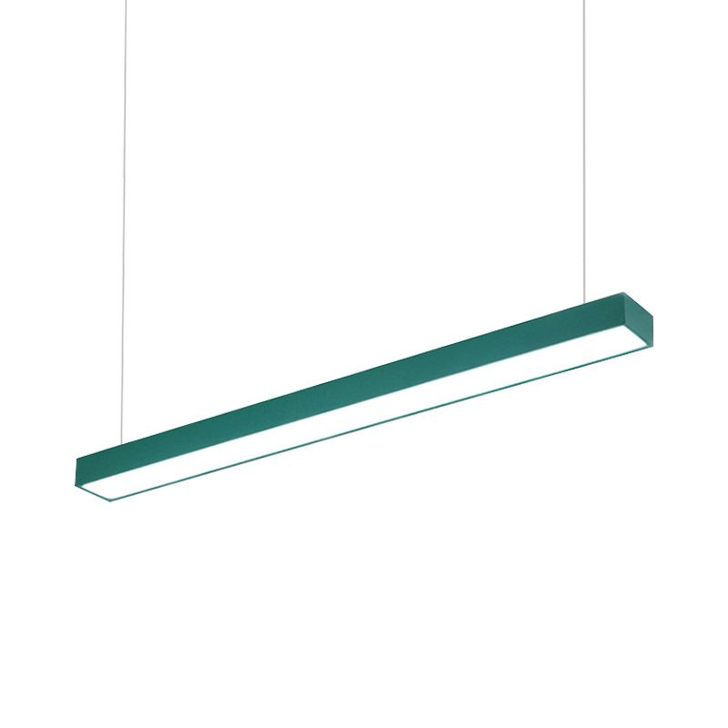
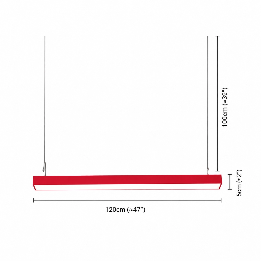
The Edge rectangular pendant keeps the form simple while allowing the finish to lead. Explore the Edge color options when you want the room to read one clear horizontal line instead of a collection of decorative pieces.
Keep the Supporting Colors Quiet
Once the ceiling color is chosen, repeat the palette below eye level with restraint. A jade textile, a blue ceramic bowl, or a persimmon stripe is enough. Exact matching can make the room feel staged. Related undertones make it feel lived in.
Look at the finish under morning daylight and warm evening light. A cool blue may become gray at night. Jade can turn yellow beside warm bulbs. Persimmon may appear more orange than expected next to oak. The sample belongs in the room before the order belongs in your cart.
Compare Shape as Well as Color
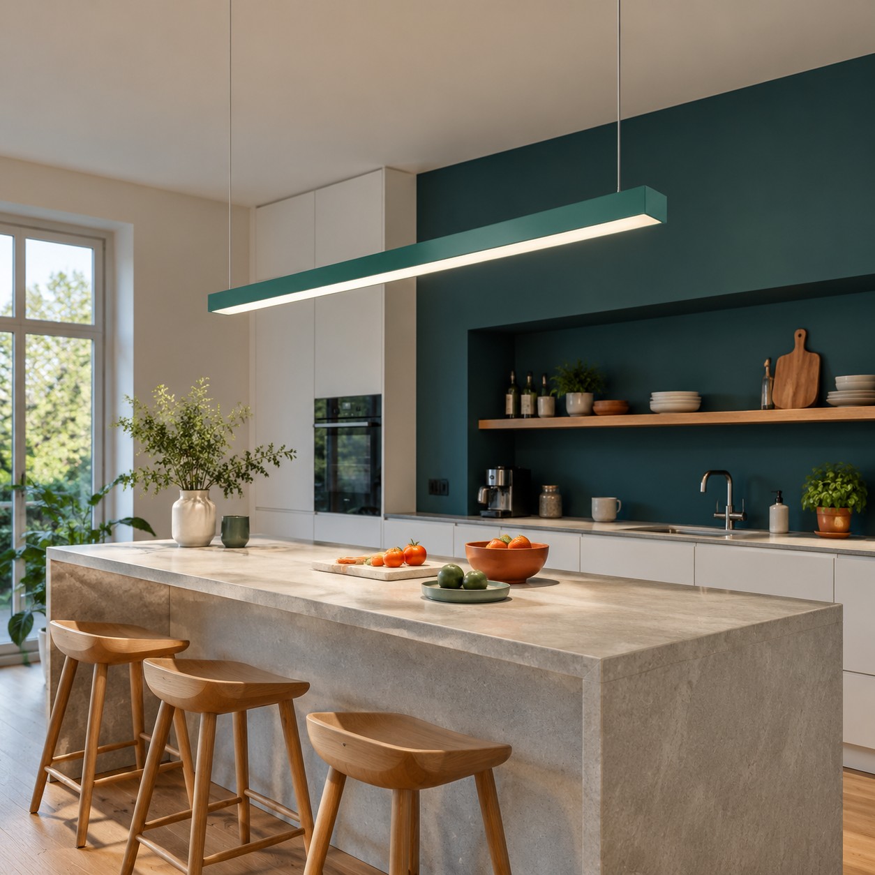
Color cannot rescue a shape that is wrong for the furniture. A straight bar works over a long island or table because it repeats the surface's direction. A tiered fixture adds more vertical movement and may suit a smaller, more sculptural zone. The Elara colorful tiered metal pendant is a useful comparison if the palette needs more texture.
For a softer rounded form, compare the Prismya colorful pebble ceiling light. These product pages are not a substitute for measurements, but they help separate a color decision from a shape decision.
Use the Palette in a Real Activity Zone
Trend colors feel more convincing when they belong to something people already do. Place the pendant over a breakfast bar, dining table, or desk rather than a decorative gap. The surface below gives the color a job and prevents the fixture from floating as a random accent.
For a smaller everyday application, read Breakfast Bar Lighting Ideas to Make an Everyday Corner Feel More Energetic. The point is not to reproduce a Pinterest photograph. It is to make one ordinary corner more legible and enjoyable.
Do Not Forget the Light Itself
A colored body changes the room's visual temperature, but it does not tell you how the source performs. Check output, controls, color temperature options, diffuser details, and glare from seated positions. A beautiful finish is not a reason to accept uncomfortable light over a table or work surface.
If the pendant is the only visible fixture, let quieter sources handle areas that need more dependable coverage. The ceiling can have one recognizable personality while the lighting plan remains layered and practical.
Use Trend Color Without a Trend Deadline
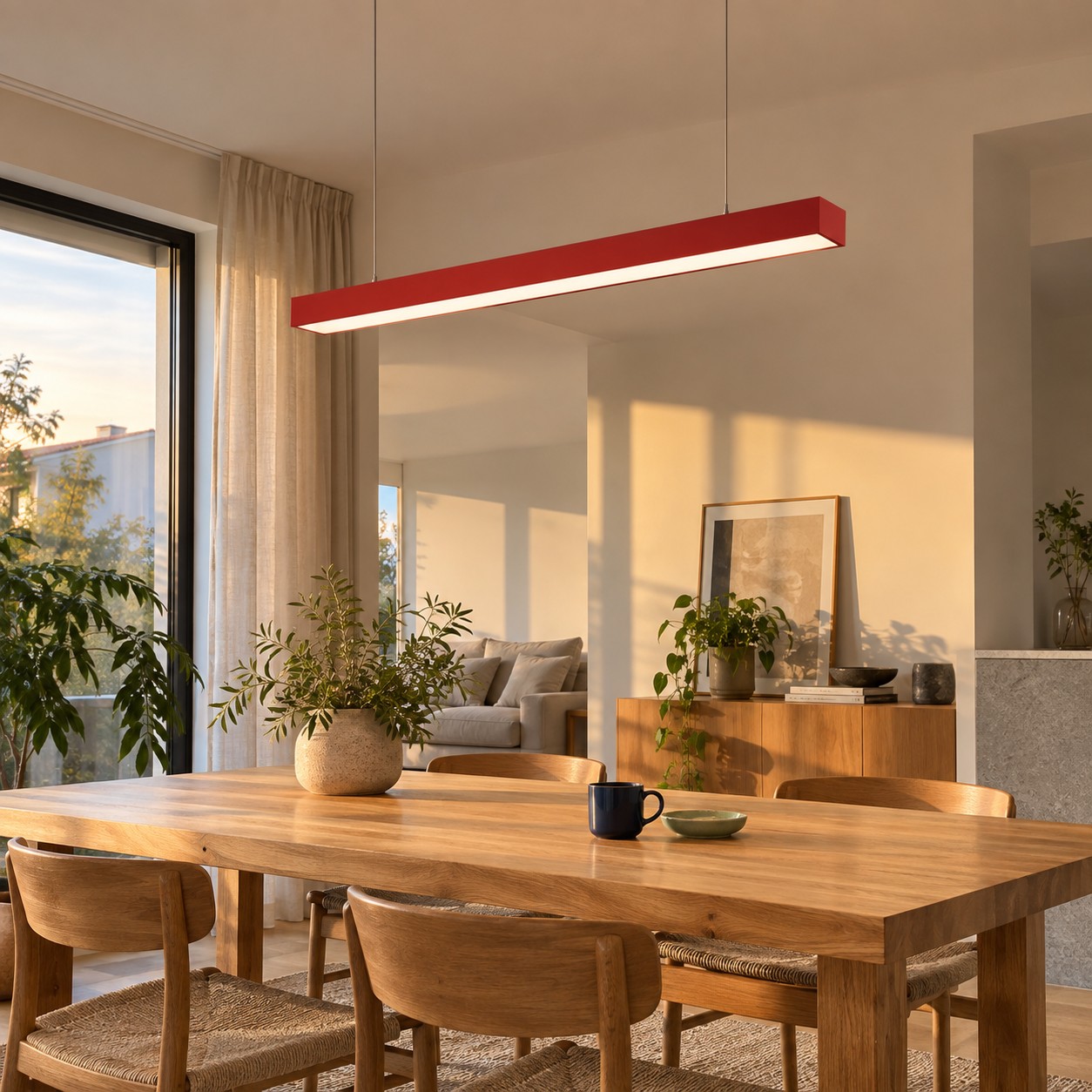
The easiest way to keep the palette from dating the room is to pair it with materials that are not tied to a single season: wood, stone, white ceramic, brushed metal, linen, and plants. If you change the supporting details later, the pendant can remain the one memorable note.
For a lower-cost way to make one color do more work, read Budget Lighting Ideas: Start with One Colorful Pendant for a High Impact Refresh. The strongest trend move is often the smallest one that changes the room's hierarchy.
The Palette Should Still Feel Like You
Mock up the fixture in full size, place a fabric or paint sample below it, and live with the combination for an evening. If the room feels clearer and warmer without looking dressed for a photo shoot, the palette is working. If every object starts competing, remove one repetition.
Which color is best for color trend lighting?
Choose the color that creates useful contrast with your fixed finishes. Cool blue, jade, and persimmon are starting points, not rules.
Should I use all three colors?
No. Let one lead and use the others as small supporting notes.
Can a colorful pendant become dated?
Any bold object can, but timeless materials and restrained repetition help it outlast a short trend cycle.