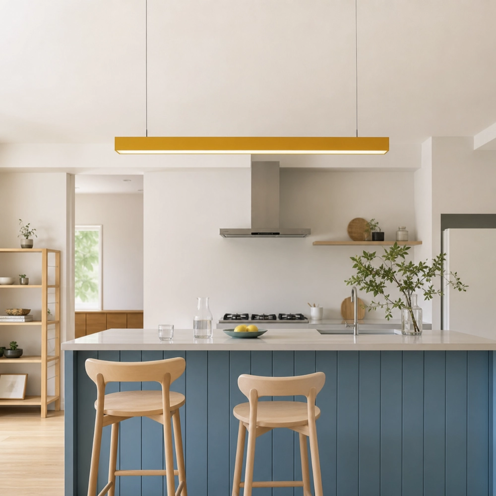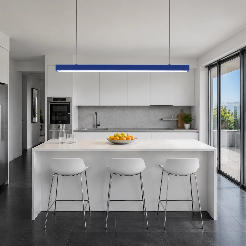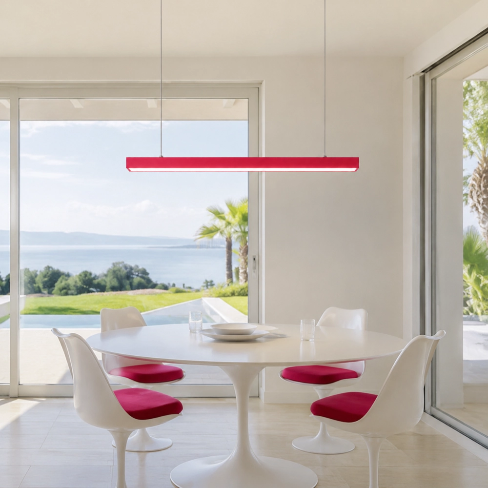

Color without surface clutter
Put the Color Overhead: The Statement Move That Leaves Your Surfaces Alone
The color-pop ceiling approach uses one visible colored fixture to make the upper part of a room memorable while tables, counters, walls, and shelves remain restrained. It is ideal for people who want personality but do not want more objects to arrange, dust, or store. In this article, “trend” describes a practical design direction, not a claim about market growth or a forecast supported by invented statistics.
What a Color-Pop Ceiling Actually Means
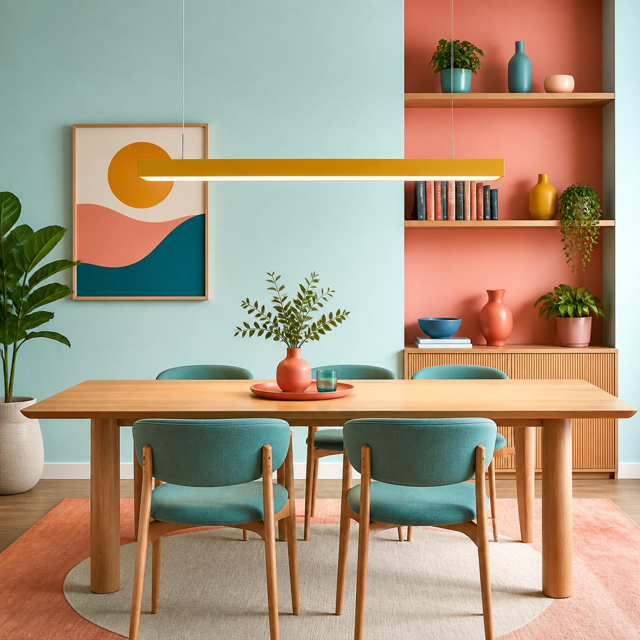
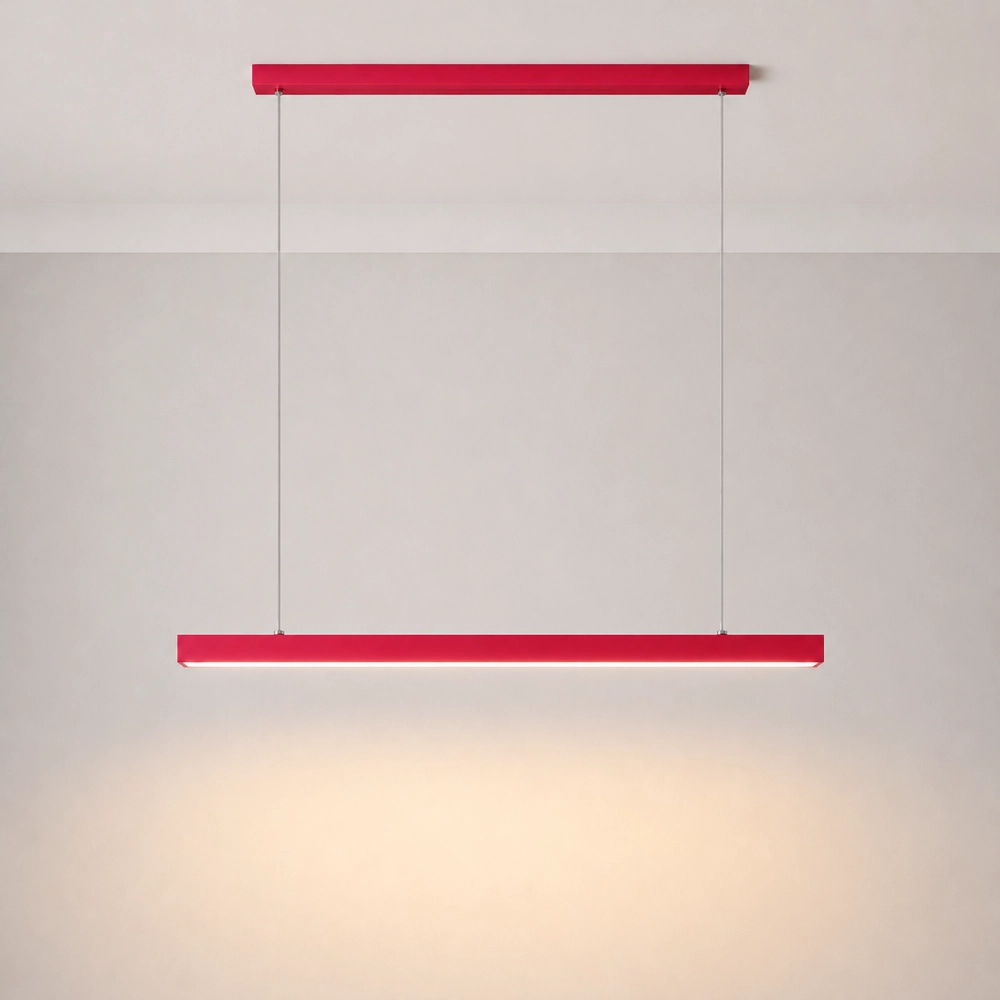
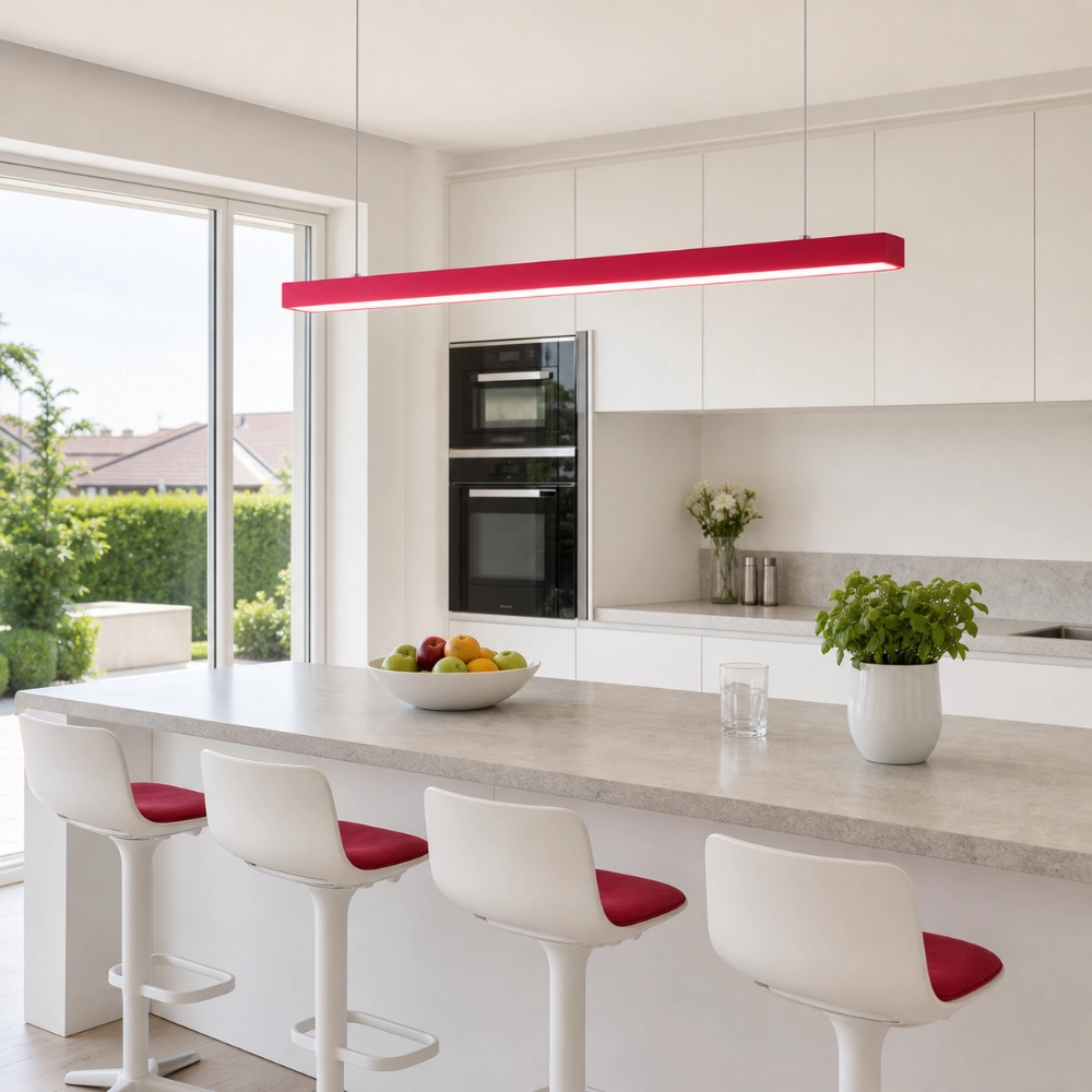
It is not a painted-ceiling rule, and it is not a demand for colorful decor throughout the room. The simplest version is one clean pendant in a decisive finish, placed over an island, table, or desk. The color lives above the working surface, where it can define a zone without consuming usable space.
The method works because the eye receives one strong instruction: look here. The Illuminating Engineering Society's definition of accent lighting describes light used to emphasize an object, surface feature, or part of the field of view. A colored pendant adds a twist: the luminaire can be the emphasized object as well as a source of light.
Why One High Focal Point Can Feel Calmer Than Ten Small Accents
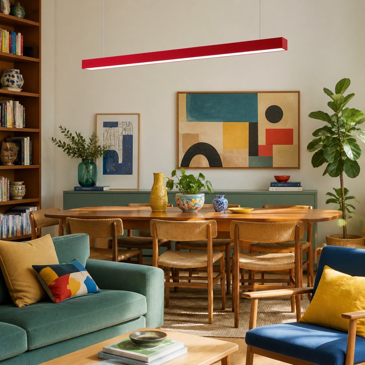
Small decor spreads attention across shelves, counters, walls, and furniture. A single overhead accent concentrates attention in one place and protects work surfaces from becoming display areas. This does not make the room objectively less cluttered; it simply gives the visual hierarchy a clearer leader.
The approach also separates decoration from lighting performance. A U.S. Department of Energy residential lighting guide explains the familiar ambient, task, and accent layers, with ambient light supporting general use and task light supporting activities such as food preparation. That framework prevents a common mistake: treating a striking pendant as the entire lighting plan. Keep the quiet background layer and necessary task sources, then let the colored fixture carry the identity.
Four Ways to Use the Idea Without Filling the Room
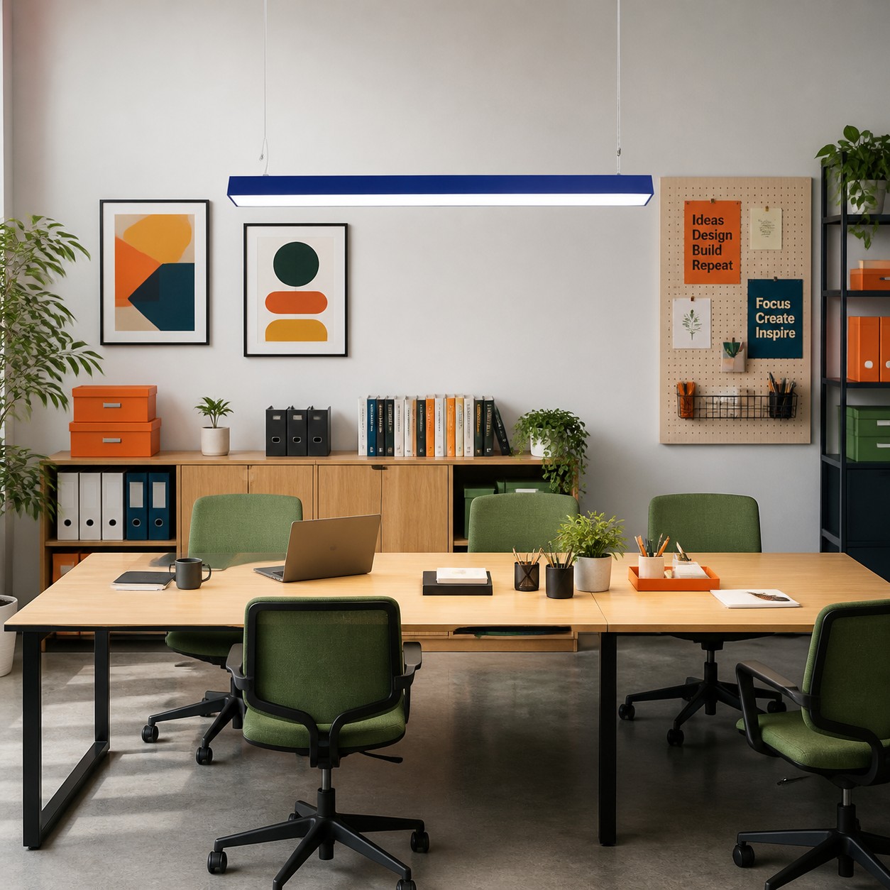
1. Draw a Line Over a Long Surface
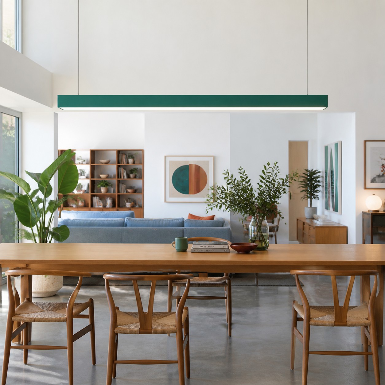
Use a straight rectangular pendant above an island, dining table, meeting table, or shared desk. Align it with the occupied surface so the color looks architectural rather than suspended at random.
2. Let One Finish Do the Talking
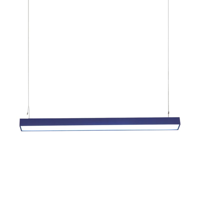
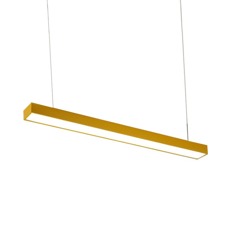
Select red, yellow, blue, or green, then keep large permanent surfaces quieter. The room can still contain other colors, but they should support rather than compete with the overhead line.
3. Repeat the Shape Before You Repeat the Color
A rectangular island, long rug, slim artwork, or horizontal cabinet line can connect to the pendant without copying its hue. Shape repetition often feels more deliberate than buying several matching accessories.
4. Keep the Floor and Worktop Editable
Choose furniture and accessories that can change independently. The ceiling focal point should free the room from constant styling, not force every future object to match it.
Match the Move to the Room, Not to a Trend Label
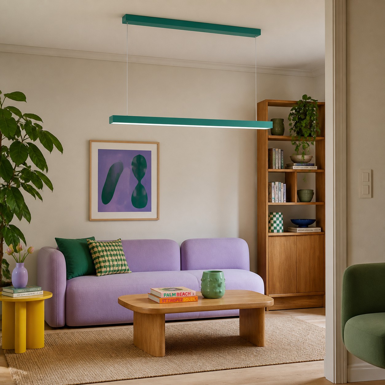
Minimal kitchens benefit when an island needs identity but countertops must stay practical. Dining rooms benefit when a table needs a clear centre without another feature wall. Creative studios can use a color connected to existing graphics or furniture. Home offices can gain a visible zone above a shared desk while storage remains quiet. For a white kitchen where the palette problem is more specific, White Kitchen Feels Generic? Use One Colorful Pendant to Break the Showroom Look turns that general principle into a focused color test.
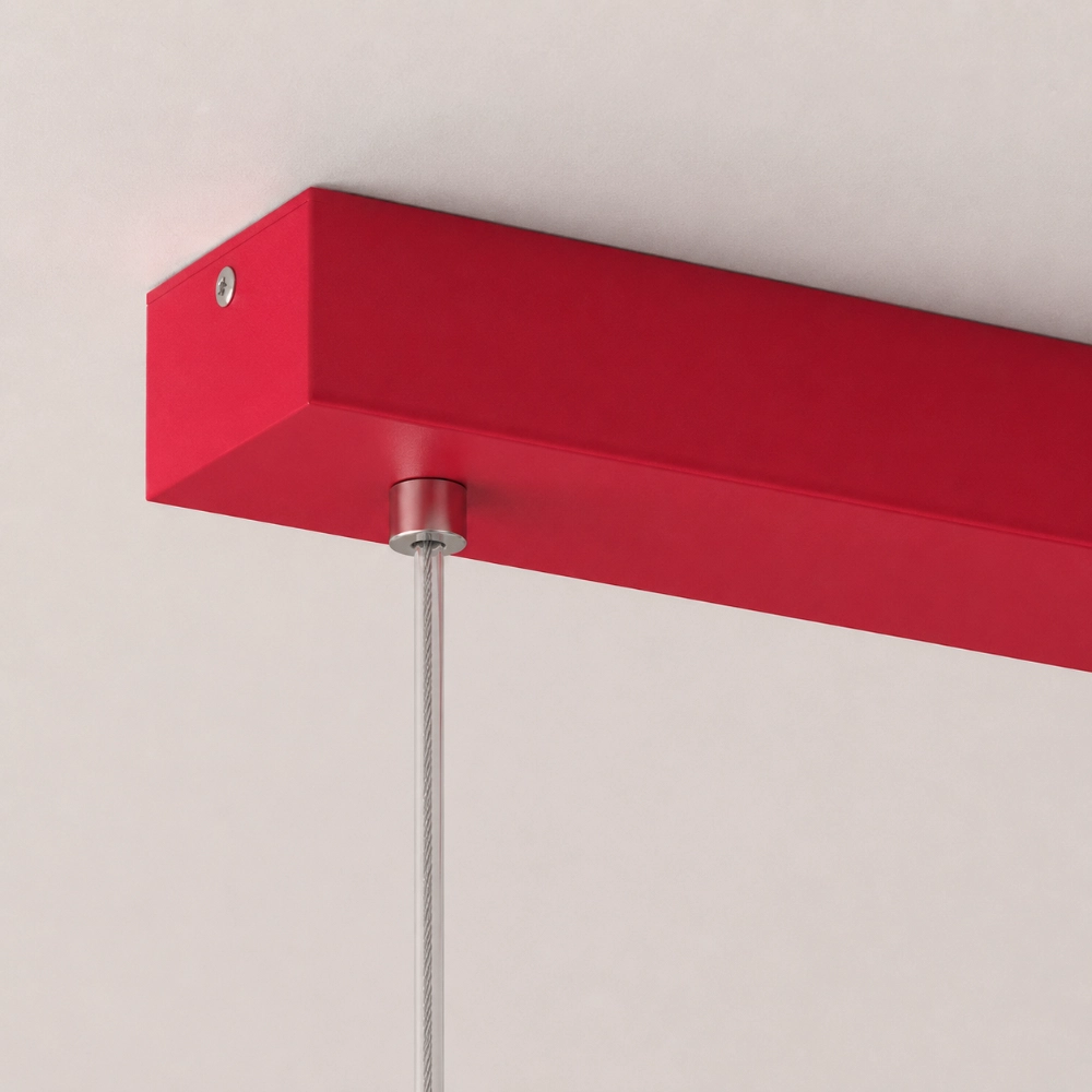
Small rooms are not automatically excluded. The key question is whether the complete fixture - bar, canopy, and both suspension cables - has enough visual breathing room. A low ceiling, awkward electrical point, or important cross-room sightline may make a suspended accent unsuitable. Use a full-size paper or tape mock-up before assuming that a slender form will disappear.
A Product That Behaves Like a Drawn Line
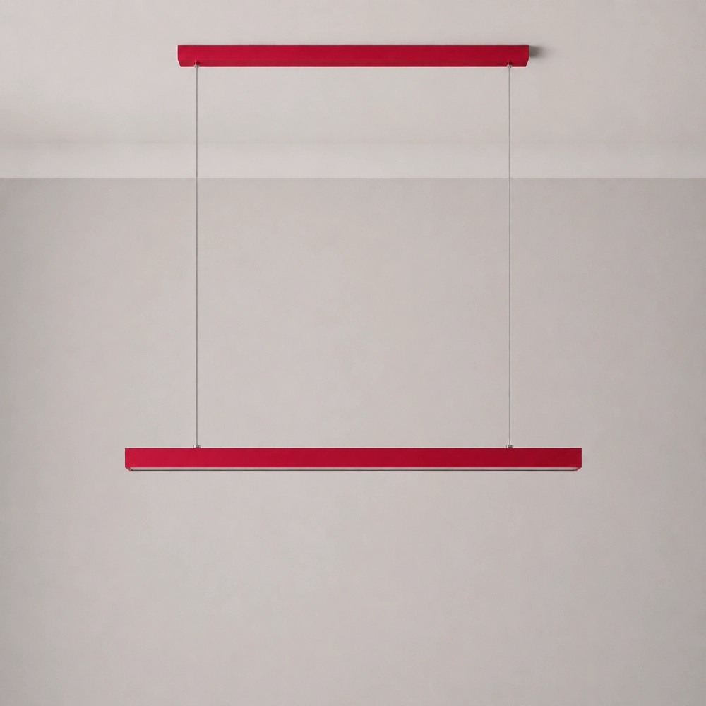
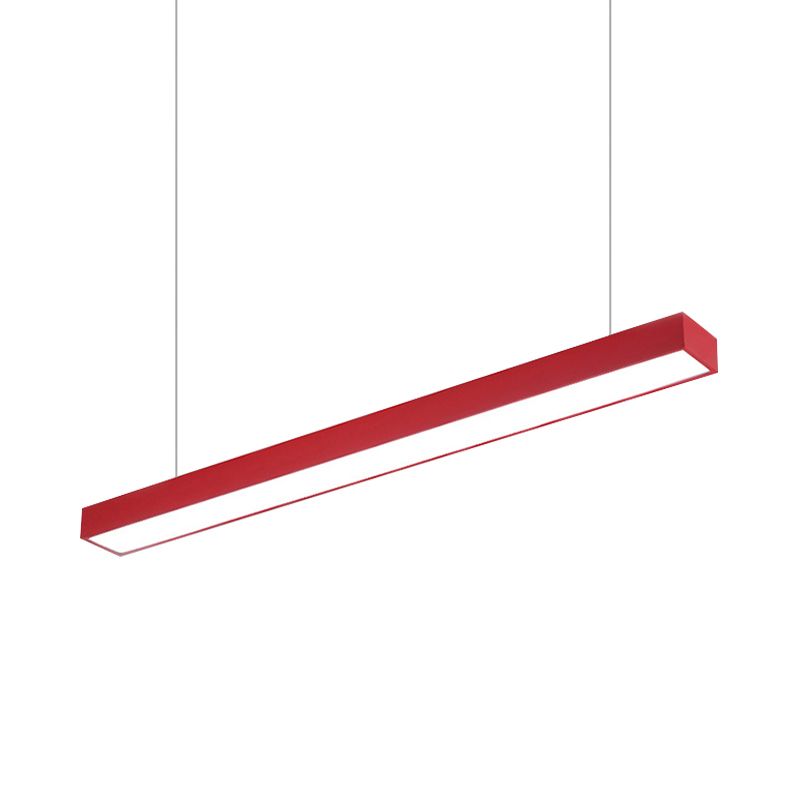
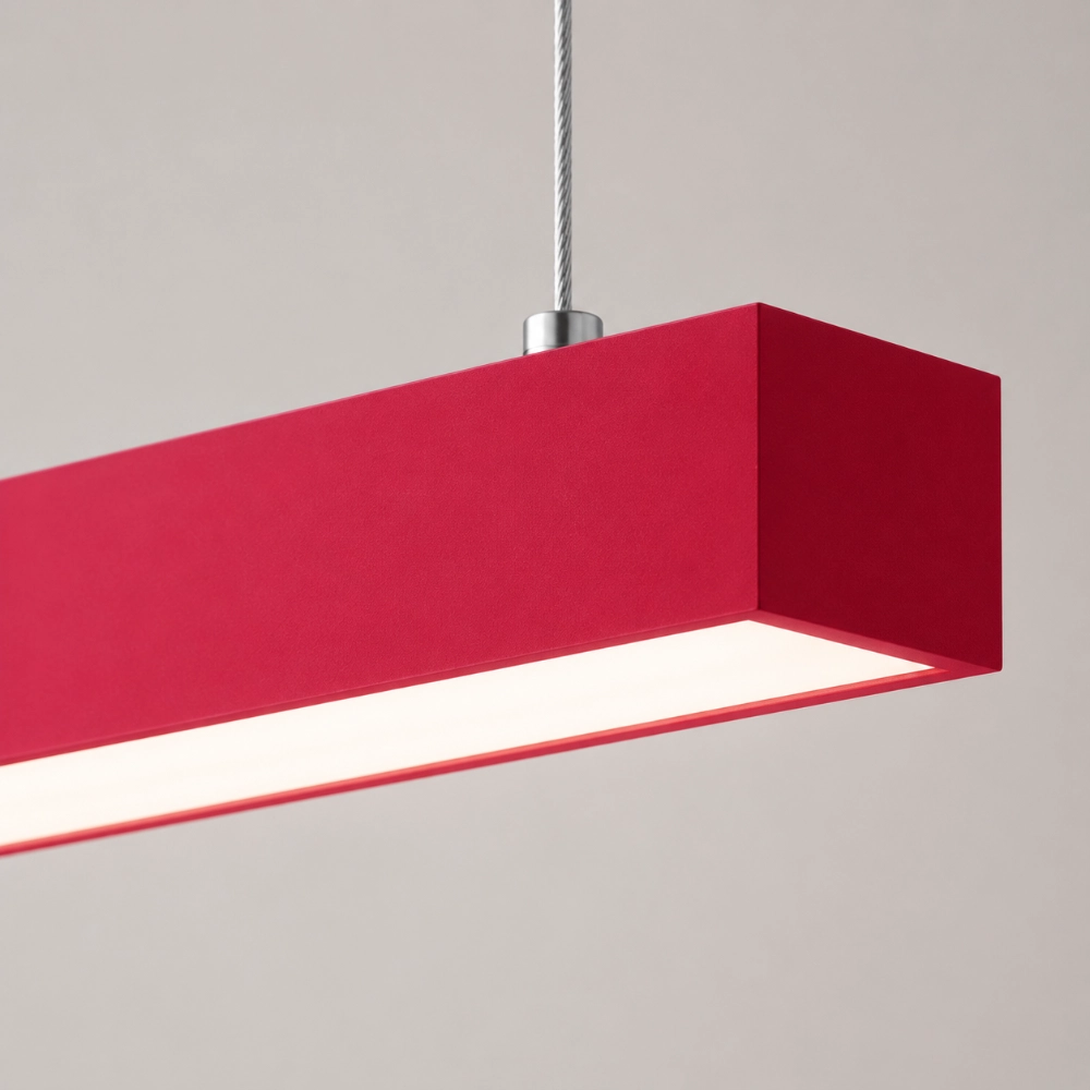
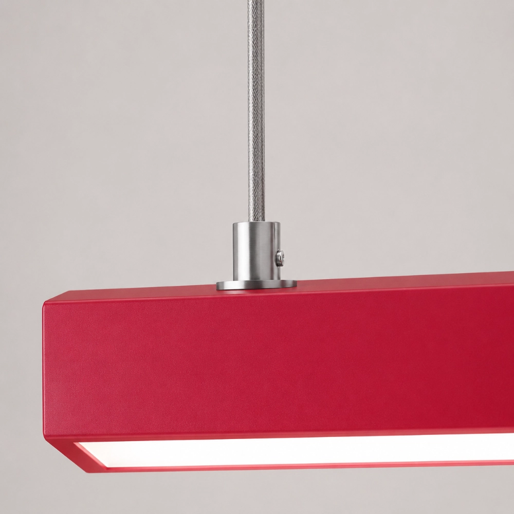
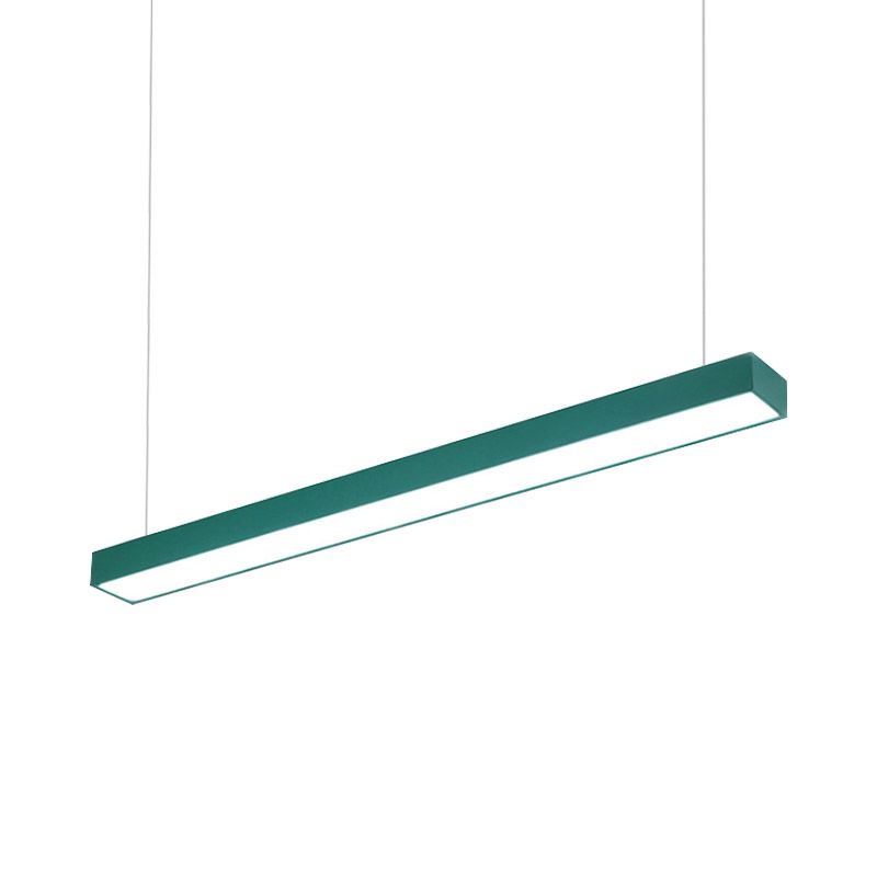
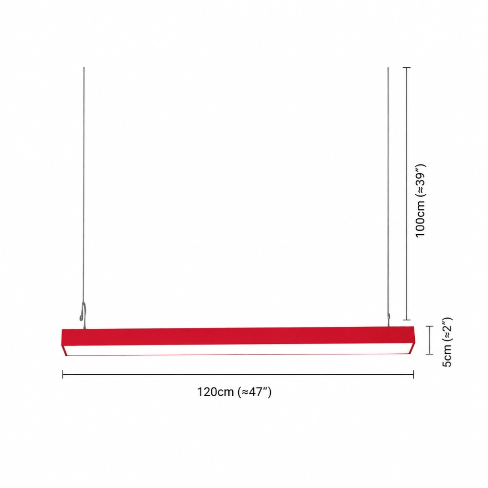
The Edge Office Linear Minimalist Rectangular Pendant Light is listed with one 120 cm by 5 cm metal body, an integrated underside LED source, hardwired installation, and red, yellow, blue, or green finish choices. Its ceiling canopy matches the rectangular body and two thin vertical cables support the straight horizontal bar. The page also lists warm light, white light, natural light, and a three-color-change selection.
Those details support the visual concept, but the page does not publish wattage, CRI, IP rating, certification, dimming, Kelvin values, photometric distribution, or a suspension adjustment range. Do not convert the slim form into performance promises. When the verified dimensions work in your mock-up, compare the current Edge configurations.
How to Keep the Look from Dating Quickly
Build the composition around relationships that survive trend cycles: alignment with a real surface, adequate lighting for the activity, comfortable sightlines, and a finish that connects to materials you already own. Avoid a room full of short-lived motifs chosen only because they appear beside the fixture in a social post.
Photograph the mock-up in color and in grayscale. The color image shows palette conflict; the grayscale image reveals whether too many objects have equal visual weight. If the pendant remains the clear leader while furniture and architecture still read well, the room is relying on hierarchy rather than novelty alone.
The No-Clutter Planning Sequence
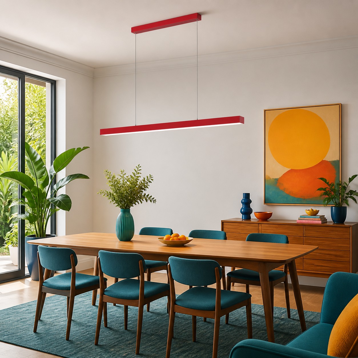
- Choose the surface or zone the pendant must define.
- Mock up the 120 cm bar, canopy, and suspension lines.
- Assign separate ambient and task lighting responsibilities.
- Select one finish and remove unnecessary matching accessories.
- Check the result from seated, standing, and adjoining-room views.
Before ordering, The Most Common Mistake With Long Pendant Lights Is Not the Size can help test the axis, canopy, and sightlines that the sequence above only summarizes. If the single overhead line provides enough visual identity, stop decorating. Then check the Edge listing for the current color and light selections.
Questions About Color on the Ceiling
Are colorful ceilings and fixtures a 2026 trend?
They are a visible design direction, but this article makes no numerical claim about adoption. Judge the idea by its fit with your room.
Will a colorful pendant make a minimalist room look busy?
Not necessarily. Keep one dominant overhead accent and reduce competing objects at the same visual strength.
Which color is best for a ceiling focal point?
The best option is the one that relates to existing materials and remains clear from adjoining rooms. Test physical samples when possible.
Should the pendant match other decor?
It can connect through shape, material, or one small color echo; exact matching is unnecessary.
Can one pendant replace ambient and task lighting?
Do not assume it can. Treat ambient, task, and accent functions separately and verify product-specific performance.